Build a Flutter layout
- Diagram the layout
- Create the app base code
- Add the Title section
- Add the Button section
- Add the Text section
- Add the Image section
- Congratulations
- Resources
- Next Steps
This tutorial explains how to design and build layouts in Flutter.
If you use the example code provided, you can build the following app.
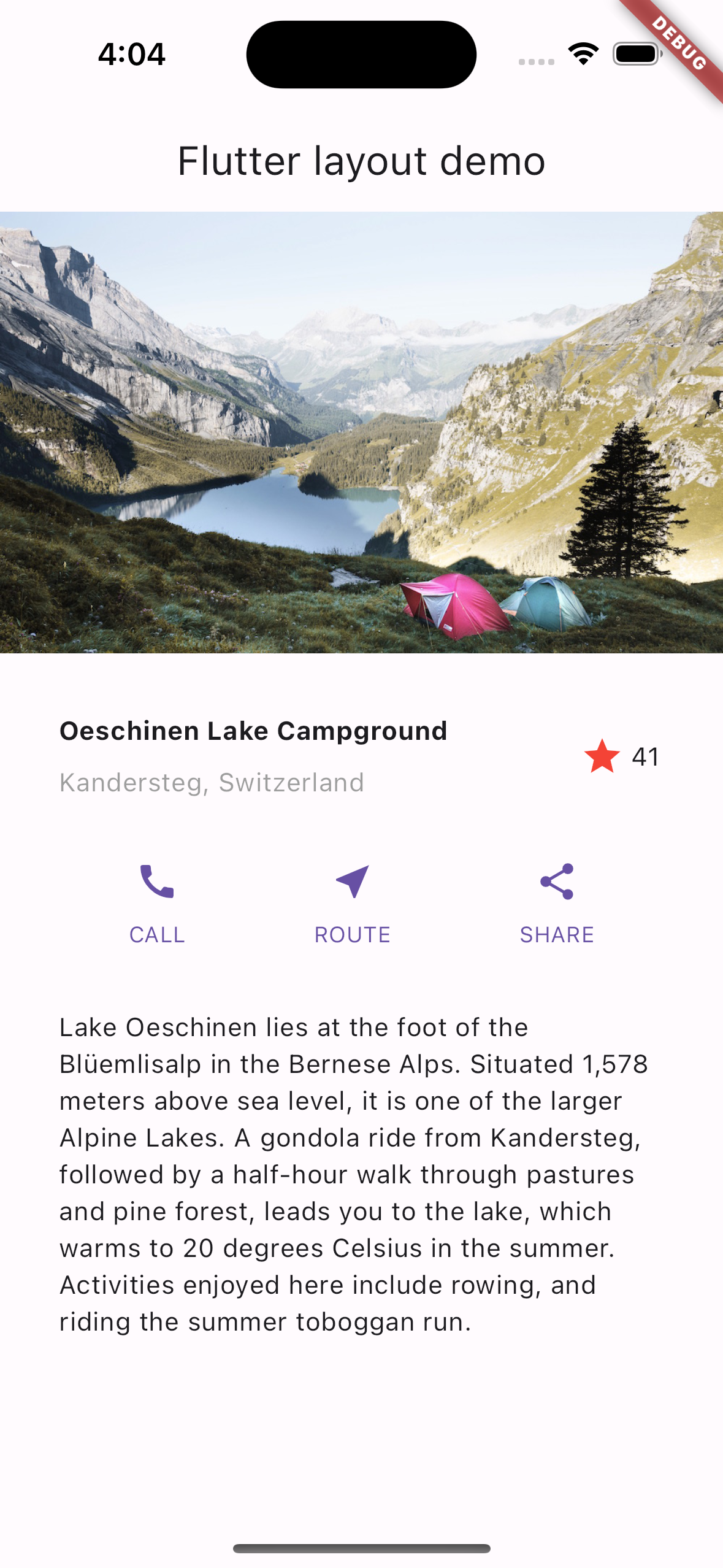
Photo by Dino Reichmuth on Unsplash. Text by Switzerland Tourism.
To get a better overview of the layout mechanism, start with Flutter's approach to layout.
Diagram the layout
#In this section, consider what type of user experience you want for your app users.
Consider how to position the components of your user interface. A layout consists of the total end result of these positionings. Consider planning your layout to speed up your coding. Using visual cues to know where something goes on screen can be a great help.
Use whichever method you prefer, like an interface design tool or a pencil and a sheet of paper. Figure out where you want to place elements on your screen before writing code. It's the programming version of the adage: "Measure twice, cut once."
Ask these questions to break the layout down to its basic elements.
- Can you identify the rows and columns?
- Does the layout include a grid?
- Are there overlapping elements?
- Does the UI need tabs?
- What do you need to align, pad, or border?
Identify the larger elements. In this example, you arrange the image, title, buttons, and description into a column.

Major elements in the layout: image, row, row, and text block Diagram each row.
Row 1, the Title section, has three children: a column of text, a star icon, and a number. Its first child, the column, contains two lines of text. That first column might need more space.

Title section with text blocks and an icon Row 2, the Button section, has three children: each child contains a column which then contains an icon and text.

The Button section with three labeled buttons
After diagramming the layout, consider how you would code it.
Would you write all the code in one class? Or, would you create one class for each part of the layout?
To follow Flutter best practices, create one class, or Widget, to contain each part of your layout. When Flutter needs to re-render part of a UI, it updates the smallest part that changes. This is why Flutter makes "everything a widget". If only the text changes in a Text widget, Flutter redraws only that text. Flutter changes the least amount of the UI possible in response to user input.
For this tutorial, write each element you have identified as its own widget.
Create the app base code
#In this section, shell out the basic Flutter app code to start your app.
Replace the contents of
lib/main.dartwith the following code. This app uses a parameter for the app title and the title shown on the app'sappBar. This decision simplifies the code.dartimport 'package:flutter/material.dart'; void main() => runApp(const MyApp()); class MyApp extends StatelessWidget { const MyApp({super.key}); @override Widget build(BuildContext context) { const String appTitle = 'Flutter layout demo'; return MaterialApp( title: appTitle, home: Scaffold( appBar: AppBar( title: const Text(appTitle), ), body: const Center( child: Text('Hello World'), ), ), ); } }
Add the Title section
#In this section, create a TitleSection widget that resembles the following layout.

Add the TitleSection Widget
#Add the following code after the MyApp class.
class TitleSection extends StatelessWidget {
  const TitleSection({
    super.key,
    required this.name,
    required this.location,
  });

  final String name;
  final String location;

  @override
  Widget build(BuildContext context) {
    return Padding(
      padding: const EdgeInsets.all(32),
      child: Row(
        children: [
          Expanded(
            /*1*/
            child: Column(
              crossAxisAlignment: CrossAxisAlignment.start,
              children: [
                /*2*/
                Padding(
                  padding: const EdgeInsets.only(bottom: 8),
                  child: Text(
                    name,
                    style: const TextStyle(
                      fontWeight: FontWeight.bold,
                    ),
                  ),
                ),
                Text(
                  location,
                  style: TextStyle(
                    color: Colors.grey[500],
                  ),
                ),
              ],
            ),
          ),
          /*3*/
          Icon(
            Icons.star,
            color: Colors.red[500],
          ),
          const Text('41'),
        ],
      ),
    );
  }
}- To use all remaining free space in the row, use the
Expandedwidget to stretch theColumnwidget. To place the column at the start of the row, set thecrossAxisAlignmentproperty toCrossAxisAlignment.start. - To add space between the rows of text, put those rows in a
Paddingwidget. - The title row ends with a red star icon and the text
41. The entire row falls inside aPaddingwidget and pads each edge by 32 pixels.
Change the app body to a scrolling view
#In the body property, replace the Center widget with a SingleChildScrollView widget. Within the SingleChildScrollView widget, replace the Text widget with a Column widget.
@@ -21,2 +17,3 @@ | |
21 | - body: const |
22 | - child: |
17 | + body: const SingleChildScrollView( |
18 | + child: Column( |
19 | + children: [ |
These code updates change the app in the following ways.
- A
SingleChildScrollViewwidget can scroll. This allows elements that don't fit on the current screen to display. - A
Columnwidget displays any elements within itschildrenproperty in the order listed. The first element listed in thechildrenlist displays at the top of the list. Elements in thechildrenlist display in array order on the screen from top to bottom.
Update the app to display the title section
#Add the TitleSection widget as the first element in the children list. This places it at the top of the screen. Pass the provided name and location to the TitleSection constructor.
@@ -23 +19,6 @@ | |
19 | + children: [ |
20 | + TitleSection( |
21 | + name: 'Oeschinen Lake Campground', |
22 | + location: 'Kandersteg, Switzerland', |
23 | + ), |
24 | + ], |
Add the Button section
#In this section, add the buttons that will add functionality to your app.
The Button section contains three columns that use the same layout: an icon over a row of text.

Plan to distribute these columns in one row so each takes the same amount of space. Paint all text and icons with the primary color.
Add the ButtonSection widget
#Add the following code after the TitleSection widget to contain the code to build the row of buttons.
class ButtonSection extends StatelessWidget {
  const ButtonSection({super.key});

  @override
  Widget build(BuildContext context) {
    final Color color = Theme.of(context).primaryColor;
// ···
  }
}
Create a widget to make buttons
#As the code for each column could use the same syntax, create a widget named ButtonWithText. The widget's constructor accepts a color, icon data, and a label for the button. Using these values, the widget builds a Column with an Icon and a stylized Text widget as its children. To help separate these children, a Padding widget the Text widget is wrapped with a Padding widget.
Add the following code after the ButtonSection class.
class ButtonSection extends StatelessWidget {
  const ButtonSection({super.key});
// ···
}

class ButtonWithText extends StatelessWidget {
  const ButtonWithText({
    super.key,
    required this.color,
    required this.icon,
    required this.label,
  });

  final Color color;
  final IconData icon;
  final String label;

  @override
  Widget build(BuildContext context) {
    return Column(
      mainAxisSize: MainAxisSize.min,
      mainAxisAlignment: MainAxisAlignment.center,
      children: [
        Icon(icon, color: color),
        Padding(
          padding: const EdgeInsets.only(top: 8),
          child: Text(
            label,
            style: TextStyle(
              fontSize: 12,
              fontWeight: FontWeight.w400,
              color: color,
            ),
          ),
        ),
      ],
    );
  }
Position the buttons with a Row widget
#Add the following code into the ButtonSection widget.
- Add three instances of the
ButtonWithTextwidget, once for each button. - Pass the color,
Icon, and text for that specific button. - Align the columns along the main axis with the
MainAxisAlignment.spaceEvenlyvalue. The main axis for aRowwidget is horizontal and the main axis for aColumnwidget is vertical. This value, then, tells Flutter to arrange the free space in equal amounts before, between, and after each column along theRow.
class ButtonSection extends StatelessWidget {
  const ButtonSection({super.key});

  @override
  Widget build(BuildContext context) {
    final Color color = Theme.of(context).primaryColor;
    return SizedBox(
      child: Row(
        mainAxisAlignment: MainAxisAlignment.spaceEvenly,
        children: [
          ButtonWithText(
            color: color,
            icon: Icons.call,
            label: 'CALL',
          ),
          ButtonWithText(
            color: color,
            icon: Icons.near_me,
            label: 'ROUTE',
          ),
          ButtonWithText(
            color: color,
            icon: Icons.share,
            label: 'SHARE',
          ),
        ],
      ),
    );
  }
}

class ButtonWithText extends StatelessWidget {
  const ButtonWithText({
    super.key,
    required this.color,
    required this.icon,
    required this.label,
  });

  final Color color;
  final IconData icon;
  final String label;

  @override
  Widget build(BuildContext context) {
    return Column(
// ···
    );
  }
}
Update the app to display the button section
#Add the button section to the children list.
@@ -5,6 +5,7 @@ | |
5 5 | name: 'Oeschinen Lake Campground', |
6 6 | location: 'Kandersteg, Switzerland', |
7 7 | ), |
8 | + ButtonSection(), |
8 9 | ], |
9 10 | ), |
10 11 | ), |
Add the Text section
#In this section, add the text description to this app.

Add the TextSection widget
#Add the following code as a separate widget after the ButtonSection widget.
class TextSection extends StatelessWidget {
  const TextSection({
    super.key,
    required this.description,
  });

  final String description;

  @override
  Widget build(BuildContext context) {
    return Padding(
      padding: const EdgeInsets.all(32),
      child: Text(
        description,
        softWrap: true,
      ),
    );
  }
}
By setting softWrap to true, text lines fill the column width before wrapping at a word boundary.
Update the app to display the text section
#Add a new TextSection widget as a child after the ButtonSection. When adding the TextSection widget, set its description property to the text of the location description.
@@ -6,6 +6,16 @@ | |
6 6 | location: 'Kandersteg, Switzerland', |
7 7 | ), |
8 8 | ButtonSection(), |
9 | + TextSection( |
10 | + description: |
11 | + 'Lake Oeschinen lies at the foot of the Blüemlisalp in the ' |
12 | + 'Bernese Alps. Situated 1,578 meters above sea level, it ' |
13 | + 'is one of the larger Alpine Lakes. A gondola ride from ' |
14 | + 'Kandersteg, followed by a half-hour walk through pastures ' |
15 | + 'and pine forest, leads you to the lake, which warms to 20 ' |
16 | + 'degrees Celsius in the summer. Activities enjoyed here ' |
17 | + 'include rowing, and riding the summer toboggan run.', |
18 | + ), |
9 19 | ], |
10 20 | ), |
11 21 | ), |
Add the Image section
#In this section, add the image file to complete your layout.
Configure your app to use supplied images
#To configure your app to reference images, modify its pubspec.yaml file.
Create an
imagesdirectory at the top of the project.Download the
lake.jpgimage and add it to the newimagesdirectory.To include images, add an
assetstag to thepubspec.yamlfile at the root directory of your app. When you addassets, it serves as the set of pointers to the images available to your code.{step4 → step5}/pubspec.yaml RENAMED@@ -19,3 +19,5 @@1919flutter:2020uses-material-design: true21+ assets:22+ - images/lake.jpg
Create the ImageSection widget
#Define the following ImageSection widget after the other declarations.
class ImageSection extends StatelessWidget {
  const ImageSection({super.key, required this.image});

  final String image;

  @override
  Widget build(BuildContext context) {
    return Image.asset(
      image,
      width: 600,
      height: 240,
      fit: BoxFit.cover,
    );
  }
}
The BoxFit.cover value tells Flutter to display the image with two constraints. First, display the image as small as possible. Second, cover all the space that the layout allotted, called the render box.
Update the app to display the image section
#Add an ImageSection widget as the first child in the children list. Set the image property to the path of the image you added in Configure your app to use supplied images.
@@ -1,6 +1,9 @@ | |
1 1 | body: const SingleChildScrollView( |
2 2 | child: Column( |
3 3 | children: [ |
4 | + ImageSection( |
5 | + image: 'images/lake.jpg', |
6 | + ), |
4 7 | TitleSection( |
5 8 | name: 'Oeschinen Lake Campground', |
6 9 | location: 'Kandersteg, Switzerland', |
Congratulations
#That's it! When you hot reload the app, your app should look like this.
Resources
#You can access the resources used in this tutorial from these locations:
Dart code: main.dart
Image: ch-photo
Pubspec: pubspec.yaml
Next Steps
#To add interactivity to this layout, follow the interactivity tutorial.