# Create widgets
> Learn about stateless widgets and how to build your own.
Learn to create custom widgets and use the most common SDK widgets like
Container, Center, and Text.
title: What you'll accomplish
items:
- title: Create a custom StatelessWidget
icon: widgets
- title: Make widgets reusable with constructor parameters
icon: tune
- title: Style widgets using Container and BoxDecoration
icon: palette
---
### Before you start
This app relies on a bit of game logic that isn't UI-related,
and thus is outside the scope of this tutorial.
Before you move on, you need to add this logic to your app.
1. Download the following Dart file and save it
as `lib/game.dart` in your project directory.
1. To enable access to the types defined in the `game.dart` library,
add an import to it from your `lib/main.dart` file:
```dart title="main.dart" highlightLines=3
import 'package:flutter/material.dart';
import 'game.dart';
```
:::note Game logic note
You might notice the
`legalGuesses` and `legalWords` lists only contain a few words.
The full lists combined have over 10,000 words and were omitted for brevity.
You don't need the full lists to continue the tutorial.
When you're testing your app, make sure to use the words from those lists.
Alternatively, you can find the full lists in
[this GitHub repository][full-words], as well as
instructions to import it into your project.
:::
[full-words]: https://github.com/ericwindmill/legal_wordle_words
### Anatomy of a stateless widget
A `Widget` is a Dart class that extends one of the Flutter widget classes,
in this case [`StatelessWidget`][].
Open your `main.dart` file and add this code below the `MainApp` class,
which defines a new widget called `Tile`.
```dart
class Tile extends StatelessWidget {
const Tile(this.letter, this.hitType, {super.key});
final String letter;
final HitType hitType;
@override
Widget build(BuildContext context) {
return Container();
}
}
```
[`StatelessWidget`]: https://api.flutter.dev/flutter/widgets/StatelessWidget-class.html
#### Constructor
The `Tile` class has a [constructor][] that defines
what data needs to be passed into the widget to render the widget.
In this case, the constructor accepts two parameters:
- A `String` representing the guessed letter of the tile.
- A `HitType` [enum value][] represent the guess result and
used to determine the color of the tile.
For example, `HitType.hit` results in a green tile.
Passing data into widget constructors is at the core of making widgets reusable.
[constructor]: https://dart.dev/language/constructors
[enum value]: https://dart.dev/language/enums
#### Build method
Finally, there's the all important `build` method, which must be defined on
every widget, and will always return another widget.
```dart
class Tile extends StatelessWidget {
const Tile(this.letter, this.hitType, {super.key});
final String letter;
final HitType hitType;
@override
Widget build(BuildContext context) {
// TODO: Replace Container with widgets.
return Container();
}
}
```
### Use the custom widget
When the app is finished,
there will be 25 instances of this widget on the screen.
For now, though, display just one so you can see the updates as they're made.
In the `MainApp.build` method, replace the `Text` widget with the following:
```dart
class MainApp extends StatelessWidget {
const MainApp({super.key});
@override
Widget build(BuildContext context) {
return const MaterialApp(
home: Scaffold(
body: Center(
child: Tile('A', HitType.hit), // NEW
),
),
);
}
}
```
At the moment, your app will be blank,
because the `Tile` widget returns an empty `Container`,
which doesn't display anything by default.
### The `Container` widget
The `Tile` widget consists of three of the most common core widgets:
`Container`, `Center`, and `Text`.
[`Container`][] is a convenience widget that wraps several core styling widgets,
such as [`Padding`][], [`ColoredBox`][], [`SizedBox`][], and [`DecoratedBox`][].
Because the finished UI contains 25 `Tile` widgets in neat columns and rows,
it should have an explicit size.
Set the width and height properties on the `Container`.
(You could also do this with a `SizedBox` widget, but you'll use
more properties of the `Container` next.)
```dart
class Tile extends StatelessWidget {
const Tile(this.letter, this.hitType, {super.key});
final String letter;
final HitType hitType;
@override
Widget build(BuildContext context) {
// NEW
return Container(
width: 60,
height: 60,
// TODO: Add needed widgets
);
}
}
```
[`Container`]: https://api.flutter.dev/flutter/widgets/Container-class.html
[`Padding`]: https://api.flutter.dev/flutter/widgets/Padding-class.html
[`ColoredBox`]: https://api.flutter.dev/flutter/widgets/ColoredBox-class.html
[`SizedBox`]: https://api.flutter.dev/flutter/widgets/SizedBox-class.html
[`DecoratedBox`]: https://api.flutter.dev/flutter/widgets/DecoratedBox-class.html
### BoxDecoration
Next, add a [`Border`][] to the box with the following code:
```dart
class Tile extends StatelessWidget {
const Tile(this.letter, this.hitType, {super.key});
final String letter;
final HitType hitType;
@override
Widget build(BuildContext context) {
// NEW
return Container(
width: 60,
height: 60,
decoration: BoxDecoration(
border: Border.all(color: Colors.grey.shade300),
// TODO: add background color
),
);
}
}
```
`BoxDecoration` is an object that knows how to
add any number of decorations to a widget, from
background color to borders to box shadows and more.
In this case, you've added a border.
When you hot reload, there should be
a lightly colored border around the white square.
When this game is complete,
the color of the tile will depend on the user's guess.
The tile will be green when the user has guessed correctly,
yellow when the letter is correct but the position is incorrect, and
gray if the guess is wrong in both respects.
The following figure shows all three possibilities.
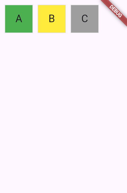 To achieve this in UI, use a [switch expression][] to
set the `color` of the `BoxDecoration`.
```dart
class Tile extends StatelessWidget {
const Tile(this.letter, this.hitType, {super.key});
final String letter;
final HitType hitType;
@override
Widget build(BuildContext context) {
return Container(
width: 60,
height: 60,
decoration: BoxDecoration(
border: Border.all(color: Colors.grey.shade300),
color: switch (hitType) {
HitType.hit => Colors.green,
HitType.partial => Colors.yellow,
HitType.miss => Colors.grey,
_ => Colors.white,
},
// TODO: add children
),
);
}
}
```
[`Border`]: https://api.flutter.dev/flutter/widgets/Container-class.html
[switch expression]: https://dart.dev/language/branches#switch-expressions
### Child widgets
Finally, add the `Center` and `Text` widgets to the `Container.child` property.
Most widgets in the Flutter SDK have a `child` or `children` property that's
meant to be passed a widget or a list of widgets, respectively.
It's the best practice to use the same naming convention in
your own custom widgets.
```dart
class Tile extends StatelessWidget {
const Tile(this.letter, this.hitType, {super.key});
final String letter;
final HitType hitType;
@override
Widget build(BuildContext context) {
return Container(
width: 60,
height: 60,
decoration: BoxDecoration(
border: Border.all(color: Colors.grey.shade300),
color: switch (hitType) {
HitType.hit => Colors.green,
HitType.partial => Colors.yellow,
HitType.miss => Colors.grey,
_ => Colors.white,
},
),
child: Center(
child: Text(
letter.toUpperCase(),
style: Theme.of(context).textTheme.titleLarge,
),
),
);
}
}
```
Hot reload and a green box appears. To toggle the color,
update and hot reload the `HitType` passed into the `Tile` you created:
```dart
// main.dart line ~16
// green
Tile('A', HitType.hit);
// grey
Tile('A', HitType.miss);
// yellow
Tile('A', HitType.partial);
```
Soon, this small box will be one of many widgets on the screen. In the next
lesson, you'll start building the game grid itself.
### Review
title: What you accomplished
subtitle: Here's a summary of what you built and learned in this lesson.
completed: true
items:
- title: Built a custom StatelessWidget
icon: widgets
details: >-
You created a new `Tile` widget by extending `StatelessWidget`.
Every widget has a constructor to accept data and
a `build` method that returns other widgets.
This pattern is fundamental to building user interfaces with Flutter.
- title: Made widgets reusable with constructor parameters
icon: tune
details: >-
By accepting `letter` and `hitType` as constructor parameters,
your `Tile` widget can display different content and colors.
Passing data through constructors is how you can
create flexible, reusable components.
- title: Styled widgets using Container and BoxDecoration
icon: palette
details: >-
You used `Container` to set the widget's size and
`BoxDecoration` to add borders and background colors.
Then to conditional style the tile's color,
you used a switch expression on the `hitType` value.
### Test yourself
- question: "What must every Flutter widget's `build` method return?"
options:
- text: A String describing the widget.
correct: false
explanation: "The `build` method returns a widget, not a String."
- text: Another widget.
correct: true
explanation: "The `build` method always returns another widget, which forms part of the widget tree."
- text: A boolean indicating success or failure.
correct: false
explanation: Widgets don't indicate success; they return other widgets to be rendered.
- text: Null if there's nothing to display.
correct: false
explanation: "The `build` method cannot return null; it must return a valid widget."
- question: Which object is used to add decorations like borders, background colors, and shadows to a Container?
options:
- text: ThemeData
correct: false
explanation: ThemeData is for app-wide styling, not individual container decorations.
- text: TextStyle
correct: false
explanation: TextStyle is for text formatting, not container decorations.
- text: BoxDecoration
correct: true
explanation: BoxDecoration can add borders, background colors, gradients, shadows, and more to a Container.
- text: EdgeInsets
correct: false
explanation: EdgeInsets is for specifying padding or margin, not visual decorations.
To achieve this in UI, use a [switch expression][] to
set the `color` of the `BoxDecoration`.
```dart
class Tile extends StatelessWidget {
const Tile(this.letter, this.hitType, {super.key});
final String letter;
final HitType hitType;
@override
Widget build(BuildContext context) {
return Container(
width: 60,
height: 60,
decoration: BoxDecoration(
border: Border.all(color: Colors.grey.shade300),
color: switch (hitType) {
HitType.hit => Colors.green,
HitType.partial => Colors.yellow,
HitType.miss => Colors.grey,
_ => Colors.white,
},
// TODO: add children
),
);
}
}
```
[`Border`]: https://api.flutter.dev/flutter/widgets/Container-class.html
[switch expression]: https://dart.dev/language/branches#switch-expressions
### Child widgets
Finally, add the `Center` and `Text` widgets to the `Container.child` property.
Most widgets in the Flutter SDK have a `child` or `children` property that's
meant to be passed a widget or a list of widgets, respectively.
It's the best practice to use the same naming convention in
your own custom widgets.
```dart
class Tile extends StatelessWidget {
const Tile(this.letter, this.hitType, {super.key});
final String letter;
final HitType hitType;
@override
Widget build(BuildContext context) {
return Container(
width: 60,
height: 60,
decoration: BoxDecoration(
border: Border.all(color: Colors.grey.shade300),
color: switch (hitType) {
HitType.hit => Colors.green,
HitType.partial => Colors.yellow,
HitType.miss => Colors.grey,
_ => Colors.white,
},
),
child: Center(
child: Text(
letter.toUpperCase(),
style: Theme.of(context).textTheme.titleLarge,
),
),
);
}
}
```
Hot reload and a green box appears. To toggle the color,
update and hot reload the `HitType` passed into the `Tile` you created:
```dart
// main.dart line ~16
// green
Tile('A', HitType.hit);
// grey
Tile('A', HitType.miss);
// yellow
Tile('A', HitType.partial);
```
Soon, this small box will be one of many widgets on the screen. In the next
lesson, you'll start building the game grid itself.
### Review
title: What you accomplished
subtitle: Here's a summary of what you built and learned in this lesson.
completed: true
items:
- title: Built a custom StatelessWidget
icon: widgets
details: >-
You created a new `Tile` widget by extending `StatelessWidget`.
Every widget has a constructor to accept data and
a `build` method that returns other widgets.
This pattern is fundamental to building user interfaces with Flutter.
- title: Made widgets reusable with constructor parameters
icon: tune
details: >-
By accepting `letter` and `hitType` as constructor parameters,
your `Tile` widget can display different content and colors.
Passing data through constructors is how you can
create flexible, reusable components.
- title: Styled widgets using Container and BoxDecoration
icon: palette
details: >-
You used `Container` to set the widget's size and
`BoxDecoration` to add borders and background colors.
Then to conditional style the tile's color,
you used a switch expression on the `hitType` value.
### Test yourself
- question: "What must every Flutter widget's `build` method return?"
options:
- text: A String describing the widget.
correct: false
explanation: "The `build` method returns a widget, not a String."
- text: Another widget.
correct: true
explanation: "The `build` method always returns another widget, which forms part of the widget tree."
- text: A boolean indicating success or failure.
correct: false
explanation: Widgets don't indicate success; they return other widgets to be rendered.
- text: Null if there's nothing to display.
correct: false
explanation: "The `build` method cannot return null; it must return a valid widget."
- question: Which object is used to add decorations like borders, background colors, and shadows to a Container?
options:
- text: ThemeData
correct: false
explanation: ThemeData is for app-wide styling, not individual container decorations.
- text: TextStyle
correct: false
explanation: TextStyle is for text formatting, not container decorations.
- text: BoxDecoration
correct: true
explanation: BoxDecoration can add borders, background colors, gradients, shadows, and more to a Container.
- text: EdgeInsets
correct: false
explanation: EdgeInsets is for specifying padding or margin, not visual decorations.