## Adaptation philosophy
In general, two cases of platform adaptiveness exist:
1. Things that are behaviors of the OS environment
(such as text editing and scrolling) and that
would be 'wrong' if a different behavior took place.
2. Things that are conventionally implemented in apps using
the OEM's SDKs (such as using parallel tabs on iOS or
showing an [`android.app.AlertDialog`][] on Android).
This article mainly covers the automatic adaptations
provided by Flutter in case 1 on Android and iOS.
For case 2, Flutter bundles the means to produce the
appropriate effects of the platform conventions but doesn't
adapt automatically when app design choices are needed.
For a discussion, see [issue #8410][] and the
[Material/Cupertino adaptive widget problem definition][].
For an example of an app using different information
architecture structures on Android and iOS but sharing
the same content code, see the [platform_design code samples][].
:::secondary
Preliminary guides addressing case 2
are being added to the UI components section.
You can request additional guides by commenting on [issue #8427][8427].
:::
[`android.app.AlertDialog`]: https://developer.android.com/reference/android/app/AlertDialog.html
[issue #8410]: https://github.com/flutter/flutter/issues/8410#issuecomment-468034023
[Material/Cupertino adaptive widget problem definition]: https://bit.ly/flutter-adaptive-widget-problem
[platform_design code samples]: https://github.com/flutter/samples/tree/main/platform_design
## Page navigation
Flutter provides the navigation patterns seen on Android
and iOS and also automatically adapts the navigation animation
to the current platform.
### Navigation transitions
On **Android**, the default [`Navigator.push()`][] transition
is modeled after [`startActivity()`][],
which generally has one bottom-up animation variant.
On **iOS**:
* The default [`Navigator.push()`][] API produces an
iOS Show/Push style transition that animates from
end-to-start depending on the locale's RTL setting.
The page behind the new route also parallax-slides
in the same direction as in iOS.
* A separate bottom-up transition style exists when
pushing a page route where [`PageRoute.fullscreenDialog`][]
is true. This represents iOS's Present/Modal style
transition and is typically used on fullscreen modal pages.
[`Navigator.push()`]: https://api.flutter.dev/flutter/widgets/Navigator/push.html
[`startActivity()`]: https://developer.android.com/reference/kotlin/android/app/Activity#startactivity
[`PageRoute.fullscreenDialog`]: https://api.flutter.dev/flutter/widgets/PageRoute-class.html
### Platform-specific transition details
On **Android**, Flutter uses the [`ZoomPageTransitionsBuilder`][] animation.
When the user taps on an item, the UI zooms in to a screen that features that item.
When the user taps to go back, the UI zooms out to the previous screen.
On **iOS** when the push style transition is used,
Flutter's bundled [`CupertinoNavigationBar`][]
and [`CupertinoSliverNavigationBar`][] nav bars
automatically animate each subcomponent to its corresponding
subcomponent on the next or previous page's
`CupertinoNavigationBar` or `CupertinoSliverNavigationBar`.
[`ZoomPageTransitionsBuilder`]: https://api.flutter.dev/flutter/material/ZoomPageTransitionsBuilder-class.html
[`CupertinoNavigationBar`]: https://api.flutter.dev/flutter/cupertino/CupertinoNavigationBar-class.html
[`CupertinoSliverNavigationBar`]: https://api.flutter.dev/flutter/cupertino/CupertinoSliverNavigationBar-class.html
### Back navigation
On **Android**,
the OS back button, by default, is sent to Flutter
and pops the top route of the [`WidgetsApp`][]'s Navigator.
On **iOS**,
an edge swipe gesture can be used to pop the top route.
[`WidgetsApp`]: https://api.flutter.dev/flutter/widgets/WidgetsApp-class.html
## Scrolling
Scrolling is an important part of the platform's
look and feel, and Flutter automatically adjusts
the scrolling behavior to match the current platform.
### Physics simulation
Android and iOS both have complex scrolling physics
simulations that are difficult to describe verbally.
Generally, iOS's scrollable has more weight and
dynamic friction but Android has more static friction.
Therefore iOS gains high speed more gradually but stops
less abruptly and is more slippery at slow speeds.
### Overscroll behavior
On **Android**,
scrolling past the edge of a scrollable shows an
[overscroll glow indicator][] (based on the color
of the current Material theme).
On **iOS**, scrolling past the edge of a scrollable
[overscrolls][] with increasing resistance and snaps back.
[overscroll glow indicator]: https://api.flutter.dev/flutter/widgets/GlowingOverscrollIndicator-class.html
[overscrolls]: https://api.flutter.dev/flutter/widgets/BouncingScrollPhysics-class.html
### Momentum
On **iOS**,
repeated flings in the same direction stacks momentum
and builds more speed with each successive fling.
There is no equivalent behavior on Android.
### Return to top
On **iOS**,
tapping the OS status bar scrolls the primary
scroll controller to the top position.
There is no equivalent behavior on Android.
## Typography
When using the Material package,
the typography automatically defaults to the
font family appropriate for the platform.
Android uses the Roboto font.
iOS uses the San Francisco font.
When using the Cupertino package, the [default theme][]
uses the San Francisco font.
The San Francisco font license limits its usage to
software running on iOS, macOS, or tvOS only.
Therefore a fallback font is used when running on Android
if the platform is debug-overridden to iOS or the
default Cupertino theme is used.
You might choose to adapt the text styling of Material
widgets to match the default text styling on iOS.
You can see widget-specific examples in the
[UI Component section](#ui-components).
[default theme]: https://github.com/flutter/flutter/blob/main/packages/flutter/lib/src/cupertino/text_theme.dart
## Iconography
When using the Material package,
certain icons automatically show different
graphics depending on the platform.
For instance, the overflow button's three dots
are horizontal on iOS and vertical on Android.
The back button is a simple chevron on iOS and
has a stem/shaft on Android.
The material library also provides a set of
platform-adaptive icons through [`Icons.adaptive`][].
[`Icons.adaptive`]: https://api.flutter.dev/flutter/material/PlatformAdaptiveIcons-class.html
## Haptic feedback
The Material and Cupertino packages automatically
trigger the platform appropriate haptic feedback in
certain scenarios.
For instance,
a word selection via text field long-press triggers a 'buzz'
vibrate on Android and not on iOS.
Scrolling through picker items on iOS triggers a
'light impact' knock and no feedback on Android.
## Text editing
Both the Material and Cupertino Text Input fields
support spellcheck and adapt to use the proper
spellcheck configuration for the platform,
and the proper spell check menu and highlight colors.
Flutter also makes the below adaptations while editing
the content of text fields to match the current platform.
### Keyboard gesture navigation
On **Android**,
horizontal swipes can be made on the soft keyboard's space key
to move the cursor in Material and Cupertino text fields.
On **iOS** devices with 3D Touch capabilities,
a force-press-drag gesture could be made on the soft
keyboard to move the cursor in 2D via a floating cursor.
This works on both Material and Cupertino text fields.
### Text selection toolbar
With **Material on Android**,
the Android style selection toolbar is shown when
a text selection is made in a text field.
With **Material on iOS** or when using **Cupertino**,
the iOS style selection toolbar is shown when a text
selection is made in a text field.
### Single tap gesture
With **Material on Android**,
a single tap in a text field puts the cursor at the
location of the tap.
A collapsed text selection also shows a draggable
handle to subsequently move the cursor.
With **Material on iOS** or when using **Cupertino**,
a single tap in a text field puts the cursor at the
nearest edge of the word tapped.
Collapsed text selections don't have draggable handles on iOS.
### Long-press gesture
With **Material on Android**,
a long press selects the word under the long press.
The selection toolbar is shown upon release.
With **Material on iOS** or when using **Cupertino**,
a long press places the cursor at the location of the
long press. The selection toolbar is shown upon release.
### Long-press drag gesture
With **Material on Android**,
dragging while holding the long press expands the words selected.
With **Material on iOS** or when using **Cupertino**,
dragging while holding the long press moves the cursor.
### Double tap gesture
On both Android and iOS,
a double tap selects the word receiving the
double tap and shows the selection toolbar.
## UI components
This section includes preliminary recommendations on how to adapt
Material widgets to deliver a natural and compelling experience on iOS.
Your feedback is welcomed on [issue #8427][8427].
[8427]: https://github.com/flutter/website/issues/8427
### Widgets with .adaptive() constructors
Several widgets support `.adaptive()` constructors.
The following table lists these widgets.
Adaptive constructors substitute the corresponding Cupertino components
when the app is run on an iOS device.
Widgets in the following table are used primarily for input,
selection, and to display system information.
Because these controls are tightly integrated with the operating system,
users have been trained to recognize and respond to them.
Therefore, we recommend that you follow platform conventions.
| Material widget | Cupertino widget | Adaptive constructor |
|---|---|---|
|
`Switch`|
`CupertinoSwitch`|[`Switch.adaptive()`][]|
|
`Slider`|
`CupertinoSlider`|[`Slider.adaptive()`][]|
|
`CircularProgressIndicator`|
`CupertinoActivityIndicator`|[`CircularProgressIndicator.adaptive()`][]|
|
`RefreshProgressIndicator`|
`CupertinoActivityIndicator`|[`RefreshIndicator.adaptive()`][]|
|
`Checkbox`| 
`CupertinoCheckbox`|[`Checkbox.adaptive()`][]|
|
`Radio`|
`CupertinoRadio`|[`Radio.adaptive()`][]|
|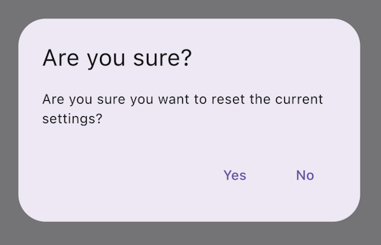
`AlertDialog`|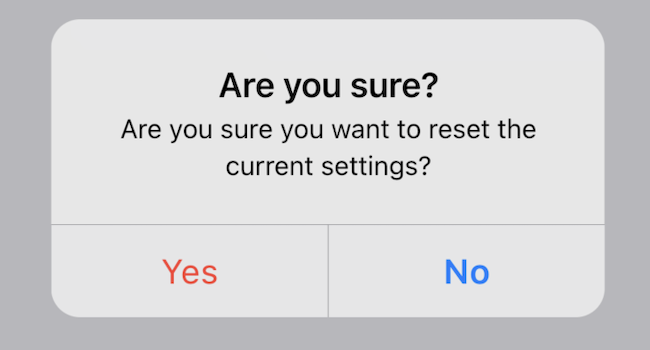
`CupertinoAlertDialog`|[`AlertDialog.adaptive()`][]|
[`AlertDialog.adaptive()`]: https://api.flutter.dev/flutter/material/AlertDialog/AlertDialog.adaptive.html
[`Checkbox.adaptive()`]: https://api.flutter.dev/flutter/material/Checkbox/Checkbox.adaptive.html
[`Radio.adaptive()`]: https://api.flutter.dev/flutter/material/Radio/Radio.adaptive.html
[`Switch.adaptive()`]: https://api.flutter.dev/flutter/material/Switch/Switch.adaptive.html
[`Slider.adaptive()`]: https://api.flutter.dev/flutter/material/Slider/Slider.adaptive.html
[`CircularProgressIndicator.adaptive()`]: https://api.flutter.dev/flutter/material/CircularProgressIndicator/CircularProgressIndicator.adaptive.html
[`RefreshIndicator.adaptive()`]: https://api.flutter.dev/flutter/material/RefreshIndicator/RefreshIndicator.adaptive.html
### Top app bar and navigation bar
Since Android 12, the default UI for top app
bars follows the design guidelines defined in [Material 3][mat-appbar].
On iOS, an equivalent component called "Navigation Bars"
is defined in [Apple's Human Interface Guidelines][hig-appbar] (HIG).
Certain properties of app bars in Flutter apps should be adapted,
like system icons and page transitions.
These are already automatically adapted when using
the Material `AppBar` and `SliverAppBar` widgets.
You can also further customize the properties of these widgets to better
match iOS platform styles, as shown below.
```dart
// Map the text theme to iOS styles
TextTheme cupertinoTextTheme = TextTheme(
headlineMedium: CupertinoThemeData()
.textTheme
.navLargeTitleTextStyle
// fixes a small bug with spacing
.copyWith(letterSpacing: -1.5),
titleLarge: CupertinoThemeData().textTheme.navTitleTextStyle)
...
// Use iOS text theme on iOS devices
ThemeData(
textTheme: Platform.isIOS ? cupertinoTextTheme : null,
...
)
...
// Modify AppBar properties
AppBar(
surfaceTintColor: Platform.isIOS ? Colors.transparent : null,
shadowColor: Platform.isIOS ? CupertinoColors.darkBackgroundGray : null,
scrolledUnderElevation: Platform.isIOS ? .1 : null,
toolbarHeight: Platform.isIOS ? 44 : null,
...
),
```
But, because app bars are displayed alongside
other content in your page, it's only recommended to adapt the styling
so long as it's cohesive with the rest of your application. You can see
additional code samples and a further explanation in
[the GitHub discussion on app bar adaptations][appbar-post].
[mat-appbar]: https://m3.material.io/components/top-app-bar/overview
[hig-appbar]: https://developer.apple.com/design/human-interface-guidelines/components/navigation-and-search/navigation-bars/
[appbar-post]: https://github.com/flutter/uxr/discussions/93
### Bottom navigation bars
Since Android 12, the default UI for bottom navigation
bars follow the design guidelines defined in [Material 3][mat-navbar].
On iOS, an equivalent component called "Tab Bars"
is defined in [Apple's Human Interface Guidelines][hig-tabbar] (HIG).
Since tab bars are persistent across your app, they should match your
own branding. However, if you choose to use Material's default
styling on Android, you might consider adapting to the default iOS
tab bars.
To implement platform-specific bottom navigation bars,
you can use Flutter's `NavigationBar` widget on Android
and the `CupertinoTabBar` widget on iOS.
Below is a code snippet you can
adapt to show a platform-specific navigation bars.
```dart
final Map _navigationItems = {
'Menu': Platform.isIOS ? Icon(CupertinoIcons.house_fill) : Icon(Icons.home),
'Order': Icon(Icons.adaptive.share),
};
...
Scaffold(
body: _currentWidget,
bottomNavigationBar: Platform.isIOS
? CupertinoTabBar(
currentIndex: _currentIndex,
onTap: (index) {
setState(() => _currentIndex = index);
_loadScreen();
},
items: _navigationItems.entries
.map(
(entry) => BottomNavigationBarItem(
icon: entry.value,
label: entry.key,
))
.toList(),
)
: NavigationBar(
selectedIndex: _currentIndex,
onDestinationSelected: (index) {
setState(() => _currentIndex = index);
_loadScreen();
},
destinations: _navigationItems.entries
.map((entry) => NavigationDestination(
icon: entry.value,
label: entry.key,
))
.toList(),
));
```
[mat-navbar]: https://m3.material.io/components/navigation-bar/overview
[hig-tabbar]: https://developer.apple.com/design/human-interface-guidelines/components/navigation-and-search/tab-bars/
### Text fields
Since Android 12, text fields follow the
[Material 3][m3-text-field] (M3) design guidelines.
On iOS, Apple's [Human Interface Guidelines][hig-text-field] (HIG) define
an equivalent component.
Since text fields require user input,
their design should follow platform conventions.
To implement a platform-specific `TextField`
in Flutter, you can adapt the styling of the
Material `TextField`.
```dart
Widget _createAdaptiveTextField() {
final _border = OutlineInputBorder(
borderSide: BorderSide(color: CupertinoColors.lightBackgroundGray),
);
final iOSDecoration = InputDecoration(
border: _border,
enabledBorder: _border,
focusedBorder: _border,
filled: true,
fillColor: CupertinoColors.white,
hoverColor: CupertinoColors.white,
contentPadding: EdgeInsets.fromLTRB(10, 0, 0, 0),
);
return Platform.isIOS
? SizedBox(
height: 36.0,
child: TextField(
decoration: iOSDecoration,
),
)
: TextField();
}
```
To learn more about adapting text fields, check out
[the GitHub discussion on text fields][text-field-post].
You can leave feedback or ask questions in the discussion.
[text-field-post]: https://github.com/flutter/uxr/discussions/95
[m3-text-field]: https://m3.material.io/components/text-fields/overview
[hig-text-field]: https://developer.apple.com/design/human-interface-guidelines/text-fields