:::secondary What you'll learn
* A staggered animation consists of sequential or overlapping
animations.
* To create a staggered animation, use multiple `Animation` objects.
* One `AnimationController` controls all of the `Animation`s.
* Each `Animation` object specifies the animation during an `Interval`.
* For each property being animated, create a `Tween`.
:::
:::tip Terminology
If the concept of tweens or tweening is new to you, see the
[Animations in Flutter tutorial][].
:::
Staggered animations are a straightforward concept: visual changes
happen as a series of operations, rather than all at once.
The animation might be purely sequential, with one change occurring after
the next, or it might partially or completely overlap. It might also
have gaps, where no changes occur.
This guide shows how to build a staggered animation in Flutter.
:::secondary Examples
This guide explains the basic_staggered_animation example.
You can also refer to a more complex example,
staggered_pic_selection.
[basic_staggered_animation][]
: Shows a series of sequential and overlapping animations
of a single widget. Tapping the screen begins an animation
that changes opacity, size, shape, color, and padding.
[staggered_pic_selection][]
: Shows deleting an image from a list of images displayed
in one of three sizes. This example uses two
[animation controllers][]: one for image selection/deselection,
and one for image deletion. The selection/deselection
animation is staggered. (To see this effect,
you might need to increase the `timeDilation` value.)
Select one of the largest images—it shrinks as it
displays a checkmark inside a blue circle.
Next, select one of the smallest images—the
large image expands as the checkmark disappears.
Before the large image has finished expanding,
the small image shrinks to display its checkmark.
This staggered behavior is similar to what you might
see in Google Photos.
:::
The following video demonstrates the animation performed by
basic_staggered_animation:
In the video, you see the following animation of a single widget,
which begins as a bordered blue square with slightly rounded corners.
The square runs through changes in the following order:
1. Fades in
1. Widens
1. Becomes taller while moving upwards
1. Transforms into a bordered circle
1. Changes color to orange
After running forward, the animation runs in reverse.
:::secondary New to Flutter?
This page assumes you know how to create a layout using Flutter's
widgets. For more information, see [Building Layouts in Flutter][].
:::
## Basic structure of a staggered animation
:::secondary What's the point?
* All of the animations are driven by the same
[`AnimationController`][].
* Regardless of how long the animation lasts in real time,
the controller's values must be between 0.0 and 1.0, inclusive.
* Each animation has an [`Interval`][]
between 0.0 and 1.0, inclusive.
* For each property that animates in an interval, create a
[`Tween`][]. The `Tween` specifies the start and end
values for that property.
* The `Tween` produces an [`Animation`][]
object that is managed by the controller.
:::
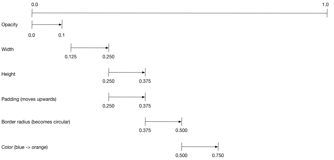
The following diagram shows the `Interval`s used in the
[basic_staggered_animation][] example.
You might notice the following characteristics:
* The opacity changes during the first 10% of the timeline.
* A tiny gap occurs between the change in opacity,
and the change in width.
* Nothing animates during the last 25% of the timeline.
* Increasing the padding makes the widget appear to rise upward.
* Increasing the border radius to 0.5,
transforms the square with rounded corners into a circle.
* The padding and height changes occur during
the same exact interval, but they don't have to.
To set up the animation:
* Create an `AnimationController` that manages all of the
`Animations`.
* Create a `Tween` for each property being animated.
* The `Tween` defines a range of values.
* The `Tween`'s `animate` method requires the
`parent` controller, and produces an `Animation`
for that property.
* Specify the interval on the `Animation`'s `curve` property.
When the controlling animation's value changes,
the new animation's value changes, triggering the UI to update.
The following code creates a tween for the `width` property.
It builds a [`CurvedAnimation`][],
specifying an eased curve. See [`Curves`][] for
other available pre-defined animation curves.
```dart
width = Tween(
begin: 50.0,
end: 150.0,
).animate(
CurvedAnimation(
parent: controller,
curve: const Interval(
0.125,
0.250,
curve: Curves.ease,
),
),
),
```
The `begin` and `end` values don't have to be doubles.
The following code builds the tween for the `borderRadius` property
(which controls the roundness of the square's corners),
using `BorderRadius.circular()`.
```dart
borderRadius = BorderRadiusTween(
begin: BorderRadius.circular(4),
end: BorderRadius.circular(75),
).animate(
CurvedAnimation(
parent: controller,
curve: const Interval(
0.375,
0.500,
curve: Curves.ease,
),
),
),
```
### Complete staggered animation
Like all interactive widgets, the complete animation consists
of a widget pair: a stateless and a stateful widget.
The stateless widget specifies the `Tween`s,
defines the `Animation` objects, and provides a `build()` function
responsible for building the animating portion of the widget tree.
The stateful widget creates the controller, plays the animation,
and builds the non-animating portion of the widget tree.
The animation begins when a tap is detected anywhere in the screen.
[Full code for basic_staggered_animation's main.dart][]
### Stateless widget: StaggerAnimation
In the stateless widget, `StaggerAnimation`,
the `build()` function instantiates an
[`AnimatedBuilder`][]—a general purpose widget for building
animations. The `AnimatedBuilder`
builds a widget and configures it using the `Tweens`' current values.
The example creates a function named `_buildAnimation()` (which performs
the actual UI updates), and assigns it to its `builder` property.
AnimatedBuilder listens to notifications from the animation controller,
marking the widget tree dirty as values change.
For each tick of the animation, the values are updated,
resulting in a call to `_buildAnimation()`.
```dart
[!class StaggerAnimation extends StatelessWidget!] {
StaggerAnimation({super.key, required this.controller}) :
// Each animation defined here transforms its value during the subset
// of the controller's duration defined by the animation's interval.
// For example the opacity animation transforms its value during
// the first 10% of the controller's duration.
[!opacity = Tween!](
begin: 0.0,
end: 1.0,
).animate(
CurvedAnimation(
parent: controller,
curve: const Interval(
0.0,
0.100,
curve: Curves.ease,
),
),
),
// ... Other tween definitions ...
);
[!final AnimationController controller;!]
[!final Animation opacity;!]
[!final Animation width;!]
[!final Animation height;!]
[!final Animation padding;!]
[!final Animation borderRadius;!]
[!final Animation color;!]
// This function is called each time the controller "ticks" a new frame.
// When it runs, all of the animation's values will have been
// updated to reflect the controller's current value.
[!Widget _buildAnimation(BuildContext context, Widget? child)!] {
return Container(
padding: padding.value,
alignment: Alignment.bottomCenter,
child: Opacity(
opacity: opacity.value,
child: Container(
width: width.value,
height: height.value,
decoration: BoxDecoration(
color: color.value,
border: Border.all(
color: Colors.indigo[300]!,
width: 3,
),
borderRadius: borderRadius.value,
),
),
),
);
}
@override
[!Widget build(BuildContext context)!] {
return [!AnimatedBuilder!](
[!builder: _buildAnimation!],
animation: controller,
);
}
}
```
### Stateful widget: StaggerDemo
The stateful widget, `StaggerDemo`, creates the `AnimationController`
(the one who rules them all), specifying a 2000 ms duration. It plays
the animation, and builds the non-animating portion of the widget tree.
The animation begins when a tap is detected in the screen.
The animation runs forward, then backward.
```dart
[!class StaggerDemo extends StatefulWidget!] {
@override
State createState() => _StaggerDemoState();
}
class _StaggerDemoState extends State
with TickerProviderStateMixin {
late AnimationController _controller;
@override
void initState() {
super.initState();
_controller = AnimationController(
duration: const Duration(milliseconds: 2000),
vsync: this,
);
}
// ...Boilerplate...
[!Future _playAnimation() async!] {
try {
[!await _controller.forward().orCancel;!]
[!await _controller.reverse().orCancel;!]
} on TickerCanceled {
// The animation got canceled, probably because it was disposed of.
}
}
@override
[!Widget build(BuildContext context)!] {
timeDilation = 10.0; // 1.0 is normal animation speed.
return Scaffold(
appBar: AppBar(
title: const Text('Staggered Animation'),
),
body: GestureDetector(
behavior: HitTestBehavior.opaque,
onTap: () {
_playAnimation();
},
child: Center(
child: Container(
width: 300,
height: 300,
decoration: BoxDecoration(
color: Colors.black.withValues(alpha: 0.1),
border: Border.all(
color: Colors.black.withValues(alpha: 0.5),
),
),
child: StaggerAnimation(controller:_controller.view),
),
),
),
);
}
}
```
[`Animation`]: https://api.flutter.dev/flutter/animation/Animation-class.html
[animation controllers]: https://api.flutter.dev/flutter/animation/AnimationController-class.html
[`AnimationController`]: https://api.flutter.dev/flutter/animation/AnimationController-class.html
[`AnimatedBuilder`]: https://api.flutter.dev/flutter/widgets/AnimatedBuilder-class.html
[Animations in Flutter tutorial]: /ui/animations/tutorial
[basic_staggered_animation]: https://github.com/flutter/website/tree/main/examples/_animation/basic_staggered_animation
[Building Layouts in Flutter]: /ui/layout
[staggered_pic_selection]: https://github.com/flutter/website/tree/main/examples/_animation/staggered_pic_selection
[`CurvedAnimation`]: https://api.flutter.dev/flutter/animation/CurvedAnimation-class.html
[`Curves`]: https://api.flutter.dev/flutter/animation/Curves-class.html
[Full code for basic_staggered_animation's main.dart]: https://github.com/flutter/website/tree/main/examples/_animation/basic_staggered_animation/lib/main.dart
[`Interval`]: https://api.flutter.dev/flutter/animation/Interval-class.html
[`Tween`]: https://api.flutter.dev/flutter/animation/Tween-class.html