# Layouts in Flutter

> Learn how Flutter's layout mechanism works and how to build your app's layout.


## Overview

:::secondary What's the point?
* Layouts in Flutter are built with widgets.
* Widgets are classes used to build UIs.
* Widgets are also used to build UI elements.
* Compose simple widgets to build complex widgets.
:::

The core of Flutter's layout mechanism is widgets.
In Flutter, almost everything is a widget&mdash;even
layout models are widgets. The images, icons,
and text that you see in a Flutter app are all widgets.
But things you don't see are also widgets,
such as the rows, columns, and grids that arrange,
constrain, and align the visible widgets.
You create a layout by composing widgets to build more
complex widgets.

## Conceptual example

In the following example, the first screenshot displays
three icons with labels and the second screenshot includes
the visual layout for rows and columns. In the second
screenshot, `debugPaintSizeEnabled` is set to `true` so you
can see the visual layout.

<div class="side-by-side">
  <div class="centered-rows">
    <img src='/assets/images/docs/ui/layout/lakes-icons.png' alt="Sample layout">
  </div>
  <div class="centered-rows">
    <img src='/assets/images/docs/ui/layout/lakes-icons-visual.png' alt="Sample layout with visual debugging">
  </div>
</div>

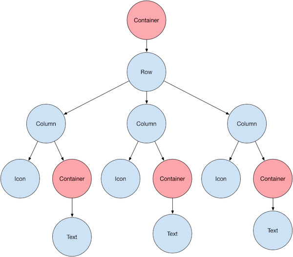
Here's a diagram of the widget tree for the previous
example:

<img src='/assets/images/docs/ui/layout/sample-flutter-layout.png' class="text-center diagram-wrap" alt="Node tree">

Most of this should look as you might expect, but you might be wondering
about the containers (shown in pink). [`Container`][] is a widget class
that allows you to customize its child widget. Use a `Container` when
you want to add padding, margins, borders, or background color,
to name some of its capabilities.

Each [`Text`][] widget is placed in a `Container`
to add margins. The entire [`Row`][] is also placed in a
`Container` to add padding around the row.

The rest of the UI is controlled by properties.
Set an [`Icon`][]'s color using its `color` property.
Use the `Text.style` property to set the font, its color, weight, and so on.
Columns and rows have properties that allow you to specify how their
children are aligned vertically or horizontally, and how much space
the children should occupy.

:::note
Most of the screenshots in this tutorial are displayed with
`debugPaintSizeEnabled` set to `true` so you can see the
visual layout. For more information, see
[Debugging layout issues visually][].
:::

[`Container`]: https://api.flutter.dev/flutter/widgets/Container-class.html
[Debugging layout issues visually]: /tools/devtools/inspector#debugging-layout-issues-visually
[`Icon`]: https://api.flutter.dev/flutter/material/Icons-class.html
[`Row`]: https://api.flutter.dev/flutter/widgets/Row-class.html
[`Text`]: https://api.flutter.dev/flutter/widgets/Text-class.html

## Lay out a widget

How do you lay out a single widget in Flutter? This section
shows you how to create and display a simple widget.
It also shows the entire code for a simple Hello World app.

In Flutter, it takes only a few steps to put text, an icon,
or an image on the screen.

### 1. Select a layout widget

Choose from a variety of [layout widgets][] based
on how you want to align or constrain a visible widget,
as these characteristics are typically passed on to the
contained widget.

For example, you could use the
[`Center`][] layout widget to center a visible widget
horizontally and vertically:

```dart
Center(
  // Content to be centered here.
)
```

[`Center`]: https://api.flutter.dev/flutter/widgets/Center-class.html
[layout widgets]: /ui/widgets/layout

### 2. Create a visible widget

Choose a [visible widget][] for your app to contain
visible elements, such as [text][], [images][], or
[icons][].

For example, you could use the [`Text`][] widget display
some text:

```dart
Text('Hello World')
```

[icons]: https://api.flutter.dev/flutter/material/Icons-class.html
[images]: https://api.flutter.dev/flutter/widgets/Image-class.html
[text]: https://api.flutter.dev/flutter/widgets/Text-class.html
[`Text`]: https://api.flutter.dev/flutter/widgets/Text-class.html
[visible widget]: /ui/widgets

### 3. Add the visible widget to the layout widget

<?code-excerpt path-base="layout/base"?>

All layout widgets have either of the following:

* A `child` property if they take a single child&mdash;for example,
  `Center` or `Container`
* A `children` property if they take a list of widgets&mdash;for example,
  `Row`, `Column`, `ListView`, or `Stack`.

Add the `Text` widget to the `Center` widget:

<?code-excerpt "lib/main.dart (centered-text)" replace="/body: //g"?>
```dart
const Center(
  child: Text('Hello World'),
),
```

### 4. Add the layout widget to the page

A Flutter app is itself a widget, and most widgets have a [`build()`][]
method. Instantiating and returning a widget in the app's `build()` method
displays the widget.
<a id="non-material-apps" aria-hidden="true"></a>
<a id="material-apps" aria-hidden="true"></a>
<a id="cupertino-apps" aria-hidden="true"></a>

<Tabs key="app-type-tabs" wrapped="true">

<Tab name="Standard apps">

For a general app, you can add the `Container` widget to
the app's `build()` method:

<?code-excerpt path-base="layout/non_material"?>
<?code-excerpt "lib/main.dart (my-app)"?>
```dart
class MyApp extends StatelessWidget {
  const MyApp({super.key});

  @override
  Widget build(BuildContext context) {
    return Container(
      decoration: const BoxDecoration(color: Colors.white),
      child: const Center(
        child: Text(
          'Hello World',
          textDirection: TextDirection.ltr,
          style: TextStyle(fontSize: 32, color: Colors.black87),
        ),
      ),
    );
  }
}
```

By default, a general app doesn't include an `AppBar`,
title, or background color. If you want these features in a
general app, you have to build them yourself. This app
changes the background color to white and the text to
dark grey to mimic a Material app.

</Tab>

<Tab name="Material apps">

For a `Material` app, you can use a [`Scaffold`][] widget;
it provides a default banner, background color,
and has API for adding drawers, snack bars, and bottom sheets.
Then you can add the `Center` widget directly to the `body`
property for the home page.

<?code-excerpt path-base="layout/base"?>
<?code-excerpt "lib/main.dart (my-app)"?>
```dart
class MyApp extends StatelessWidget {
  const MyApp({super.key});

  @override
  Widget build(BuildContext context) {
    const String appTitle = 'Flutter layout demo';
    return MaterialApp(
      title: appTitle,
      home: Scaffold(
        appBar: AppBar(title: const Text(appTitle)),
        body: const Center(
          child: Text('Hello World'),
        ),
      ),
    );
  }
}
```

:::note
The [Material library][] implements widgets that follow [Material
Design][] principles. When designing your UI, you can exclusively use
widgets from the standard [widgets library][], or you can use
widgets from the Material library. You can mix widgets from both
libraries, you can customize existing widgets,
or you can build your own set of custom widgets.
:::

</Tab>

<Tab name="Cupertino apps">

To create a `Cupertino` app,
use the `CupertinoApp` and [`CupertinoPageScaffold`][] widgets.

Unlike `Material`, it doesn't provide a default banner or background color.
You need to set these yourself.

* To set default colors, pass in a configured [`CupertinoThemeData`][]
  to your app's `theme` property.
* To add an iOS-styled navigation bar to the top of your app, add a
  [`CupertinoNavigationBar`][] widget to the `navigationBar`
  property of your scaffold.
  You can use the colors that [`CupertinoColors`][] provides to
  configure your widgets to match iOS design.

* To lay out the body of your app, set the `child` property of your scaffold
  with the desired widget as its value, like `Center` or `Column`.

To learn what other UI components you can add, check out the
[Cupertino library][].

<?code-excerpt "lib/cupertino.dart (my-app)"?>
```dart
class MyApp extends StatelessWidget {
  const MyApp({super.key});

  @override
  Widget build(BuildContext context) {
    return const CupertinoApp(
      title: 'Flutter layout demo',
      theme: CupertinoThemeData(
        brightness: Brightness.light,
        primaryColor: CupertinoColors.systemBlue,
      ),
      home: CupertinoPageScaffold(
        navigationBar: CupertinoNavigationBar(
          backgroundColor: CupertinoColors.systemGrey,
          middle: Text('Flutter layout demo'),
        ),
        child: Center(
          child: Column(
            mainAxisAlignment: MainAxisAlignment.center,
            children: [Text('Hello World')],
          ),
        ),
      ),
    );
  }
}
```

:::note
The [Cupertino library][] implements widgets that follow
[Apple's Human Interface Guidelines for iOS][].
When designing your UI, you can use
widgets from the standard [widgets library][] or the Cupertino library.
You can mix widgets from both libraries, you can customize existing widgets,
or you can build your own set of custom widgets.
:::

</Tab>

</Tabs>

[`CupertinoColors`]: https://api.flutter.dev/flutter/cupertino/CupertinoColors-class.html
[`CupertinoPageScaffold`]: https://api.flutter.dev/flutter/cupertino/CupertinoPageScaffold-class.html
[`CupertinoThemeData`]: https://api.flutter.dev/flutter/cupertino/CupertinoThemeData-class.html
[`CupertinoNavigationBar`]: https://api.flutter.dev/flutter/cupertino/CupertinoNavigationBar-class.html
[Cupertino library]: https://api.flutter.dev/flutter/cupertino/cupertino-library.html
[Apple's Human Interface Guidelines for iOS]: https://developer.apple.com/design/human-interface-guidelines/designing-for-ios
[`build()`]: https://api.flutter.dev/flutter/widgets/StatelessWidget/build.html
[Material library]: https://api.flutter.dev/flutter/material/material-library.html
[`Scaffold`]: https://api.flutter.dev/flutter/material/Scaffold-class.html
[widgets library]: https://api.flutter.dev/flutter/widgets/widgets-library.html

### 5. Run your app

<div class="side-by-side">
<div>

After you've added your widgets, run your app. When you run
the app, you should see _Hello World_.

App source code:

* [Material app](https://github.com/flutter/website/tree/main/examples/layout/base)
* [Non-Material app](https://github.com/flutter/website/tree/main/examples/layout/non_material)

</div>
<DashImage figure image="ui/layout/hello-world.png" alt="Screenshot of app displaying Hello World" img-style="max-height: 400px;"  />
</div>
<hr>

## Lay out multiple widgets vertically and horizontally

<?code-excerpt path-base=""?>

One of the most common layout patterns is to arrange
widgets vertically or horizontally. You can use a
`Row` widget to arrange widgets horizontally,
and a `Column` widget to arrange widgets vertically.

:::secondary What's the point?
* `Row` and `Column` are two of the most commonly used layout patterns.
* `Row` and `Column` each take a list of child widgets.
* A child widget can itself be a `Row`, `Column`,
    or other complex widget.
* You can specify how a `Row` or `Column` aligns its children,
    both vertically and horizontally.
* You can stretch or constrain specific child widgets.
* You can specify how child widgets use the `Row`'s or
    `Column`'s available space.
:::

To create a row or column in Flutter, you add a list of children
widgets to a [`Row`][] or [`Column`][] widget. In turn,
each child can itself be a row or column, and so on.
The following example shows how it is possible to nest rows or
columns inside of rows or columns.

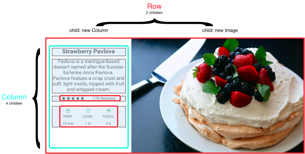
This layout is organized as a `Row`. The row contains two children:
a column on the left, and an image on the right:

<img src='/assets/images/docs/ui/layout/pavlova-diagram.png' class="diagram-wrap" alt="Screenshot with callouts showing the row containing two children">

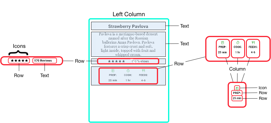
The left column's widget tree nests rows and columns.
<img src='/assets/images/docs/ui/layout/pavlova-left-column-diagram.png' class="diagram-wrap" alt="Diagram showing a left column broken down to its sub-rows and sub-columns">

You'll implement some of Pavlova's layout code in
[Nesting rows and columns](#nesting-rows-and-columns).

:::note
`Row` and `Column` are basic primitive widgets for horizontal
and vertical layouts&mdash;these low-level widgets allow for maximum
customization. Flutter also offers specialized, higher-level widgets
that might be sufficient for your needs. For example,
instead of `Row` you might prefer [`ListTile`][],
an easy-to-use widget with properties for leading and trailing icons,
and up to 3 lines of text.  Instead of Column, you might prefer
[`ListView`][], a column-like layout that automatically scrolls
if its content is too long to fit the available space.
For more information, see [Common layout widgets][].
:::

[Common layout widgets]: #common-layout-widgets
[`Column`]: https://api.flutter.dev/flutter/widgets/Column-class.html
[`ListTile`]: https://api.flutter.dev/flutter/material/ListTile-class.html
[`ListView`]: https://api.flutter.dev/flutter/widgets/ListView-class.html
[`Row`]: https://api.flutter.dev/flutter/widgets/Row-class.html

### Aligning widgets

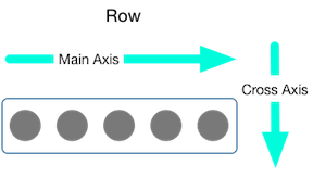
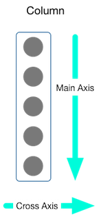
You control how a row or column aligns its children using the
`mainAxisAlignment` and `crossAxisAlignment` properties.
For a row, the main axis runs horizontally and the cross axis runs
vertically. For a column, the main axis runs vertically and the cross
axis runs horizontally.
<div class="side-by-side">
  <div class="centered-rows">
    <img src='/assets/images/docs/ui/layout/row-diagram.png' class="diagram-wrap" alt="Diagram showing the main axis and cross axis for a row">
  </div>
  <div class="centered-rows">
    <img src='/assets/images/docs/ui/layout/column-diagram.png' class="diagram-wrap" alt="Diagram showing the main axis and cross axis for a column">
  </div>
</div>

The [`MainAxisAlignment`][] and [`CrossAxisAlignment`][]
enums offer a variety of constants for controlling alignment.

:::note
When you add images to your project,
you need to update the `pubspec.yaml` file to access
them&mdash;this example uses `Image.asset` to display
the images.  For more information, see this example's
[`pubspec.yaml` file][] or [Adding assets and images][].
You don't need to do this if you're referencing online
images using `Image.network`.
:::

In the following example, each of the 3 images is 100 pixels wide.
The render box (in this case, the entire screen)
is more than 300 pixels wide, so setting the main axis
alignment to `spaceEvenly` divides the free horizontal
space evenly between, before, and after each image.

<div class="code-and-content">
<div>

<?code-excerpt "layout/row_column/lib/main.dart (row)" replace="/Row/[!$&!]/g"?>
```dart
[!Row!](
  mainAxisAlignment: MainAxisAlignment.spaceEvenly,
  children: [
    Image.asset('images/pic1.jpg'),
    Image.asset('images/pic2.jpg'),
    Image.asset('images/pic3.jpg'),
  ],
);
```

</div>
<div>
  <img src='/assets/images/docs/ui/layout/row-spaceevenly-visual.png' class="small-diagram-wrap" alt="Row with 3 evenly spaced images">

  **App source:** [row_column](https://github.com/flutter/website/tree/main/examples/layout/row_column)
</div>
</div>

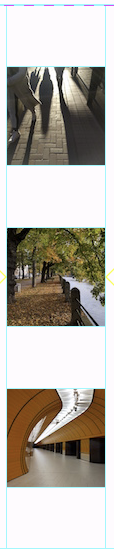
Columns work the same way as rows. The following example shows a column
of 3 images, each is 100 pixels high. The height of the render box
(in this case, the entire screen) is more than 300 pixels, so
setting the main axis alignment to `spaceEvenly` divides the free vertical
space evenly between, above, and below each image.

<div class="code-and-content">
<div>

  <?code-excerpt "layout/row_column/lib/main.dart (column)" replace="/Column/[!$&!]/g"?>
  ```dart
  [!Column!](
    mainAxisAlignment: MainAxisAlignment.spaceEvenly,
    children: [
      Image.asset('images/pic1.jpg'),
      Image.asset('images/pic2.jpg'),
      Image.asset('images/pic3.jpg'),
    ],
  );
  ```

</div>
<div class="text-center">
  <img src='/assets/images/docs/ui/layout/column-visual.png' height="250px" class="small-diagram-wrap" alt="Column showing 3 images spaced evenly">

  **App source:** [row_column](https://github.com/flutter/website/tree/main/examples/layout/row_column)
</div>
</div>

[`CrossAxisAlignment`]: https://api.flutter.dev/flutter/rendering/CrossAxisAlignment.html
[`MainAxisAlignment`]: https://api.flutter.dev/flutter/rendering/MainAxisAlignment.html
[`pubspec.yaml` file]: https://github.com/flutter/website/tree/main/examples/layout/row_column/pubspec.yaml

### Sizing widgets

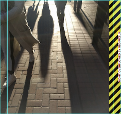
When a layout is too large to fit a device, a yellow
and black striped pattern appears along the affected edge.
Here is an [example][sizing] of a row that is too wide:

<img src='/assets/images/docs/ui/layout/layout-too-large.png' class="text-center" style="max-height: 15rem;" alt="Overly-wide row">

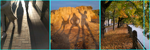
Widgets can be sized to fit within a row or column by using the
[`Expanded`][] widget. To fix the previous example where the
row of images is too wide for its render box,
wrap each image with an `Expanded` widget.
<div class="code-and-content">
<div>

  <?code-excerpt "layout/sizing/lib/main.dart (expanded-images)" replace="/Expanded/[!$&!]/g"?>
  ```dart
  Row(
    crossAxisAlignment: CrossAxisAlignment.center,
    children: [
      [!Expanded!](child: Image.asset('images/pic1.jpg')),
      [!Expanded!](child: Image.asset('images/pic2.jpg')),
      [!Expanded!](child: Image.asset('images/pic3.jpg')),
    ],
  );
  ```

</div>
<div>
  <img src='/assets/images/docs/ui/layout/row-expanded-2-visual.png' class="small-diagram-wrap" alt="Row of 3 images that are too wide, but each is constrained to take only 1/3 of the space">

  **App source:** [sizing](https://github.com/flutter/website/tree/main/examples/layout/sizing)
</div>
</div>

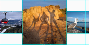
Perhaps you want a widget to occupy twice as much space as its
siblings. For this, use the `Expanded` widget `flex` property,
an integer that determines the flex factor for a widget.
The default flex factor is 1. The following code sets
the flex factor of the middle image to 2:

<div class="code-and-content">
<div>

  <?code-excerpt "layout/sizing/lib/main.dart (expanded-images-with-flex)" replace="/flex.*/[!$&!]/g"?>
  ```dart
  Row(
    crossAxisAlignment: CrossAxisAlignment.center,
    children: [
      Expanded(child: Image.asset('images/pic1.jpg')),
      Expanded([!flex: 2, child: Image.asset('images/pic2.jpg')),!]
      Expanded(child: Image.asset('images/pic3.jpg')),
    ],
  );
  ```

</div>
<div>
  <img src='/assets/images/docs/ui/layout/row-expanded-visual.png' class="small-diagram-wrap" alt="Row of 3 images with the middle image twice as wide as the others">

  **App source:** [sizing](https://github.com/flutter/website/tree/main/examples/layout/sizing)

</div>
</div>

[`Expanded`]: https://api.flutter.dev/flutter/widgets/Expanded-class.html
[sizing]: https://github.com/flutter/website/tree/main/examples/layout/sizing

### Packing widgets

By default, a row or column occupies as much space along its main axis
as possible, but if you want to pack the children closely together,
set its `mainAxisSize` to `MainAxisSize.min`. The following example
uses this property to pack the star icons together.

<div class="code-and-content">
<div>

  <?code-excerpt "layout/pavlova/lib/main.dart (stars)" replace="/mainAxisSize.*/[!$&!]/g; /\w+ \w+ = //g; /;//g"?>
  ```dart
  Row(
    [!mainAxisSize: MainAxisSize.min,!]
    children: [
      Icon(Icons.star, color: Colors.green[500]),
      Icon(Icons.star, color: Colors.green[500]),
      Icon(Icons.star, color: Colors.green[500]),
      const Icon(Icons.star, color: Colors.black),
      const Icon(Icons.star, color: Colors.black),
    ],
  )
  ```

</div>
<div>
  <img src='/assets/images/docs/ui/layout/packed.png' class="small-diagram-wrap" alt="Row of 5 stars, packed together in the middle of the row">

  **App source:** [pavlova](https://github.com/flutter/website/tree/main/examples/layout/pavlova)
</div>
</div>

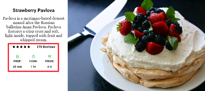
### Nesting rows and columns

The layout framework allows you to nest rows and columns
inside of rows and columns as deeply as you need.
Let's look at the code for the outlined
section of the following layout:

<img src='/assets/images/docs/ui/layout/pavlova-large-annotated.png' class="border text-center" alt="Screenshot of the pavlova app, with the ratings and icon rows outlined in red">

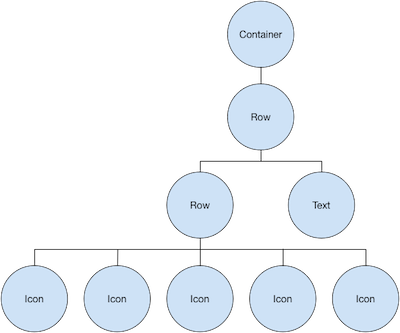
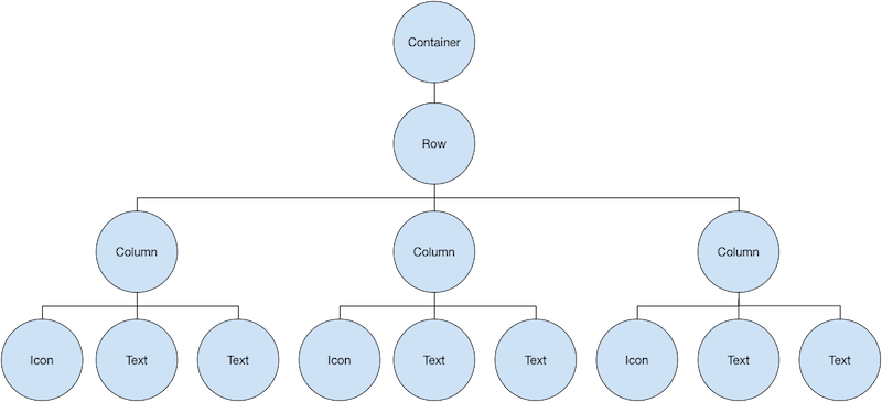
The outlined section is implemented as two rows. The ratings row contains
five stars and the number of reviews. The icons row contains three
columns of icons and text.

The widget tree for the ratings row:
<img src='/assets/images/docs/ui/layout/widget-tree-pavlova-rating-row.png' class="text-center diagram-wrap" alt="Ratings row widget tree">

The `ratings` variable creates a row containing a smaller row
of 5-star icons, and text:

<?code-excerpt "layout/pavlova/lib/main.dart (ratings)" replace="/ratings/[!$&!]/g"?>
```dart
final stars = Row(
  mainAxisSize: MainAxisSize.min,
  children: [
    Icon(Icons.star, color: Colors.green[500]),
    Icon(Icons.star, color: Colors.green[500]),
    Icon(Icons.star, color: Colors.green[500]),
    const Icon(Icons.star, color: Colors.black),
    const Icon(Icons.star, color: Colors.black),
  ],
);

final [!ratings!] = Container(
  padding: const EdgeInsets.all(20),
  child: Row(
    mainAxisAlignment: MainAxisAlignment.spaceEvenly,
    children: [
      stars,
      const Text(
        '170 Reviews',
        style: TextStyle(
          color: Colors.black,
          fontWeight: FontWeight.w800,
          fontFamily: 'Roboto',
          letterSpacing: 0.5,
          fontSize: 20,
        ),
      ),
    ],
  ),
);
```

:::tip
To minimize the visual confusion that can result from
heavily nested layout code, implement pieces of the UI
in variables and functions.
:::

The icons row, below the ratings row, contains 3 columns;
each column contains an icon and two lines of text,
as you can see in its widget tree:
<img src='/assets/images/docs/ui/layout/widget-tree-pavlova-icon-row.png' class="text-center diagram-wrap" alt="Icon widget tree">

The `iconList` variable defines the icons row:

<?code-excerpt "layout/pavlova/lib/main.dart (icon-list)" replace="/iconList/[!$&!]/g"?>
```dart
const descTextStyle = TextStyle(
  color: Colors.black,
  fontWeight: FontWeight.w800,
  fontFamily: 'Roboto',
  letterSpacing: 0.5,
  fontSize: 18,
  height: 2,
);

// DefaultTextStyle.merge() allows you to create a default text
// style that is inherited by its child and all subsequent children.
final [!iconList!] = DefaultTextStyle.merge(
  style: descTextStyle,
  child: Container(
    padding: const EdgeInsets.all(20),
    child: Row(
      mainAxisAlignment: MainAxisAlignment.spaceEvenly,
      children: [
        Column(
          children: [
            Icon(Icons.kitchen, color: Colors.green[500]),
            const Text('PREP:'),
            const Text('25 min'),
          ],
        ),
        Column(
          children: [
            Icon(Icons.timer, color: Colors.green[500]),
            const Text('COOK:'),
            const Text('1 hr'),
          ],
        ),
        Column(
          children: [
            Icon(Icons.restaurant, color: Colors.green[500]),
            const Text('FEEDS:'),
            const Text('4-6'),
          ],
        ),
      ],
    ),
  ),
);
```

The `leftColumn` variable contains the ratings and icons rows,
as well as the title and text that describes the Pavlova:

<?code-excerpt "layout/pavlova/lib/main.dart (left-column)" replace="/leftColumn/[!$&!]/g"?>
```dart
final [!leftColumn!] = Container(
  padding: const EdgeInsets.fromLTRB(20, 30, 20, 20),
  child: Column(children: [titleText, subTitle, ratings, iconList]),
);
```

The left column is placed in a `SizedBox` to constrain its width.
Finally, the UI is constructed with the entire row (containing the
left column and the image) inside a `Card`.

The [Pavlova image][] is from [Pixabay][].
You can embed an image from the net using `Image.network()` but,
for this example, the image is saved to an images directory in the project,
added to the [pubspec file][], and accessed using `Images.asset()`.
For more information, see [Adding assets and images][].

<?code-excerpt "layout/pavlova/lib/main.dart (body)"?>
```dart
body: Center(
  child: Container(
    margin: const EdgeInsets.fromLTRB(0, 40, 0, 30),
    height: 600,
    child: Card(
      child: Row(
        crossAxisAlignment: CrossAxisAlignment.start,
        children: [
          SizedBox(width: 440, child: leftColumn),
          mainImage,
        ],
      ),
    ),
  ),
),
```

:::tip
The Pavlova example runs best horizontally on a wide device,
such as a tablet.  If you are running this example in the iOS simulator,
you can select a different device using the **Hardware > Device** menu.
For this example, we recommend the iPad Pro.
You can change its orientation to landscape mode using
**Hardware > Rotate**. You can also change the size of the
simulator window (without changing the number of logical pixels)
using **Window > Scale**.
:::

**App source:** [pavlova](https://github.com/flutter/website/tree/main/examples/layout/pavlova)
<hr>

[Pavlova image]: https://pixabay.com/en/photos/pavlova
[Pixabay]: https://pixabay.com/en/photos/pavlova
[pubspec file]: https://github.com/flutter/website/tree/main/examples/layout/pavlova/pubspec.yaml

## Common layout widgets

Flutter has a rich library of layout widgets.
Here are a few of those most commonly used.
The intent is to get you up and running as quickly as possible,
rather than overwhelm you with a complete list.
For information on other available widgets,
refer to the [Widget catalog][],
or use the Search box in the [API reference docs][].
Also, the widget pages in the API docs often make suggestions
about similar widgets that might better suit your needs.

The following widgets fall into two categories: standard widgets
from the [widgets library][], and specialized widgets from the
[Material library][]. Any app can use the widgets library but
only Material apps can use the Material Components library.

<a id="standard-widgets" aria-hidden="true"></a>
<a id="materials-widgets" aria-hidden="true"></a>

<Tabs key="widget-types-tabs" wrapped="true">

<Tab name="Standard widgets">

[`Container`](#container)
: Adds padding, margins, borders,
  background color, or other decorations to a widget.

[`GridView`](#gridview)
: Lays widgets out as a scrollable grid.

[`ListView`](#listview)
: Lays widgets out as a scrollable list.

[`Stack`](#stack)
: Overlaps a widget on top of another.

</Tab>

<Tab name="Material widgets">

[`Scaffold`][]
: Provides a structured layout framework
  with slots for common Material Design app elements.

[`AppBar`][]
: Creates a horizontal bar that's typically
  displayed at the top of a screen.

[`Card`](#card)
: Organizes related info into a box with
  rounded corners and a drop shadow.

[`ListTile`](#listtile)
: Organizes up to 3 lines of text,
  and optional leading and trailing icons, into a row.

</Tab>

<Tab name="Cupertino widgets">

[`CupertinoPageScaffold`][]
: Provides the basic layout structure for an iOS-style page.

[`CupertinoNavigationBar`][]
: Creates an iOS-style  navigation bar at the top of the screen.

[`CupertinoSegmentedControl`][]
: Creates a segmented control for selecting.

[`CupertinoTabBar`][] and [`CupertinoTabScaffold`][]
: Creates the characteristic iOS bottom tab bar.

</Tab>

</Tabs>

[`Scaffold`]: https://api.flutter.dev/flutter/material/Scaffold-class.html
[`AppBar`]: https://api.flutter.dev/flutter/material/AppBar-class.html
[`Container`]: https://api.flutter.dev/flutter/widgets/Container-class.html
[`CupertinoPageScaffold`]: https://api.flutter.dev/flutter/cupertino/CupertinoPageScaffold-class.html
[`CupertinoNavigationBar`]: https://api.flutter.dev/flutter/cupertino/CupertinoNavigationBar-class.html
[`CupertinoSegmentedControl`]: https://api.flutter.dev/flutter/cupertino/CupertinoSegmentedControl-class.html
[`CupertinoTabBar`]: https://api.flutter.dev/flutter/cupertino/CupertinoTabBar-class.html
[`CupertinoTabScaffold`]: https://api.flutter.dev/flutter/cupertino/CupertinoTabScaffold-class.html
[`GridView`]: https://api.flutter.dev/flutter/widgets/GridView-class.html
[`ListTile`]: https://api.flutter.dev/flutter/material/ListTile-class.html
[`ListView`]: https://api.flutter.dev/flutter/widgets/ListView-class.html
[Material library]: https://api.flutter.dev/flutter/material/material-library.html
[widgets library]: https://api.flutter.dev/flutter/widgets/widgets-library.html

### Container

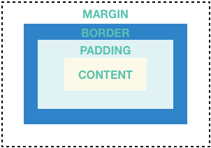
Many layouts make liberal use of [`Container`][]s to separate
widgets using padding, or to add borders or margins.
You can change the device's background by placing the
entire layout into a `Container` and changing its background
color or image.

<div class="side-by-side">
<div>

[`Container`]: https://api.flutter.dev/flutter/widgets/Container-class.html

#### Summary (Container)

* Add padding, margins, borders
* Change background color or image
* Contains a single child widget, but that child can be a `Row`,
  `Column`, or even the root of a widget tree

</div>
<div class="text-center">
  <img src='/assets/images/docs/ui/layout/margin-padding-border.png' class="diagram-wrap" alt="Diagram showing: margin, border, padding, and content">
</div>
</div>

#### Examples (Container)

This layout consists of a column with two rows, each containing
2 images. A [`Container`][] is used to change the background color
of the column to a lighter grey.

<div class="code-and-content">
<div>

  <?code-excerpt "layout/container/lib/main.dart (column)" replace="/\bContainer/[!$&!]/g;"?>
  ```dart
  Widget _buildImageColumn() {
    return [!Container!](
      decoration: const BoxDecoration(color: Colors.black26),
      child: Column(children: [_buildImageRow(1), _buildImageRow(3)]),
    );
  }
  ```

</div>
<div class="text-center">
  <img src='/assets/images/docs/ui/layout/container.png' class="mb-4" width="230px" alt="Screenshot showing 2 rows, each containing 2 images">
</div>
</div>

A `Container` is also used to add a rounded border and margins
to each image:

<?code-excerpt "layout/container/lib/main.dart (row)" replace="/\bContainer/[!$&!]/g;"?>
```dart
Widget _buildDecoratedImage(int imageIndex) => Expanded(
  child: [!Container!](
    decoration: BoxDecoration(
      border: Border.all(width: 10, color: Colors.black38),
      borderRadius: const BorderRadius.all(Radius.circular(8)),
    ),
    margin: const EdgeInsets.all(4),
    child: Image.asset('images/pic$imageIndex.jpg'),
  ),
);

Widget _buildImageRow(int imageIndex) => Row(
  children: [
    _buildDecoratedImage(imageIndex),
    _buildDecoratedImage(imageIndex + 1),
  ],
);
```

You can find more `Container` examples in the [tutorial][].

**App source:** [container](https://github.com/flutter/website/tree/main/examples/layout/container)

<hr>

[`Container`]: https://api.flutter.dev/flutter/widgets/Container-class.html
[tutorial]: /ui/layout/tutorial

### GridView

Use [`GridView`][] to lay widgets out as a two-dimensional
list. `GridView` provides two pre-fabricated lists,
or you can build your own custom grid. When a `GridView`
detects that its contents are too long to fit the render box,
it automatically scrolls.

[`GridView`]: https://api.flutter.dev/flutter/widgets/GridView-class.html

#### Summary (GridView)

* Lays widgets out in a grid
* Detects when the column content exceeds the render box
  and automatically provides scrolling
* Build your own custom grid, or use one of the provided grids:
  * `GridView.count` allows you to specify the number of columns
  * `GridView.extent` allows you to specify the maximum pixel
  width of a tile


:::note
When displaying a two-dimensional list where it's important which
row and column a cell occupies (for example,
it's the entry in the "calorie" column for the "avocado" row), use
[`Table`][] or [`DataTable`][].
:::

[`DataTable`]: https://api.flutter.dev/flutter/material/DataTable-class.html
[`Table`]: https://api.flutter.dev/flutter/widgets/Table-class.html

#### Examples (GridView)

<div class="side-by-side">
<div>
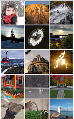
  <img src='/assets/images/docs/ui/layout/gridview-extent.png' class="text-center" alt="A 3-column grid of photos" height="440px">

  Uses `GridView.extent` to create a grid with tiles a maximum
  150 pixels wide.

  **App source:** [grid_and_list](https://github.com/flutter/website/tree/main/examples/layout/grid_and_list)
</div>
<div>
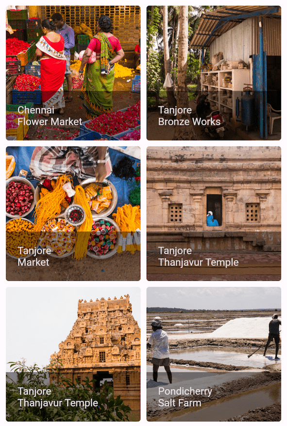
  <img src='/assets/images/docs/ui/layout/gridview-count-flutter-gallery.png' class="text-center" alt="A 2 column grid with footers" height="440px">

  Uses `GridView.count` to create a grid that's 2 tiles
  wide in portrait mode, and 3 tiles wide in landscape mode.
  The titles are created by setting the `footer` property for
  each [`GridTile`][].

  **Dart code:**
  [`grid_list_demo.dart`](https://github.com/flutter/website/tree/main/examples/layout/gallery/lib/grid_list_demo.dart)
</div>
</div>

<?code-excerpt "layout/grid_and_list/lib/main.dart (grid)" replace="/\GridView/[!$&!]/g;"?>
```dart
Widget _buildGrid() => [!GridView!].extent(
  maxCrossAxisExtent: 150,
  padding: const EdgeInsets.all(4),
  mainAxisSpacing: 4,
  crossAxisSpacing: 4,
  children: _buildGridTileList(30),
);

// The images are saved with names pic0.jpg, pic1.jpg...pic29.jpg.
// The List.generate() constructor allows an easy way to create
// a list when objects have a predictable naming pattern.
List<Widget> _buildGridTileList(int count) =>
    List.generate(count, (i) => Image.asset('images/pic$i.jpg'));
```

<hr>

[`GridTile`]: https://api.flutter.dev/flutter/material/GridTile-class.html

### ListView

[`ListView`][], a column-like widget, automatically
provides scrolling when its content is too long for
its render box.

[`ListView`]: https://api.flutter.dev/flutter/widgets/ListView-class.html

#### Summary (ListView)

* A specialized [`Column`][] for organizing a list of boxes
* Can be laid out horizontally or vertically
* Detects when its content won't fit and provides scrolling
* Less configurable than `Column`, but easier to use and
  supports scrolling

[`Column`]: https://api.flutter.dev/flutter/widgets/Column-class.html

#### Examples (ListView)

<div class="side-by-side">
<div>
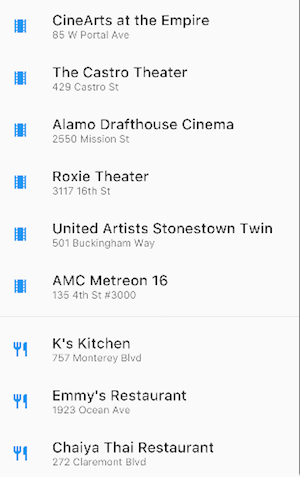
  <img src='/assets/images/docs/ui/layout/listview.png' height="400px" class="simple-border text-center" alt="ListView containing movie theaters and restaurants">

  Uses `ListView` to display a list of businesses using
  `ListTile`s. A `Divider` separates the theaters from
  the restaurants.

  **App source:** [grid_and_list](https://github.com/flutter/website/tree/main/examples/layout/grid_and_list)
</div>
<div>
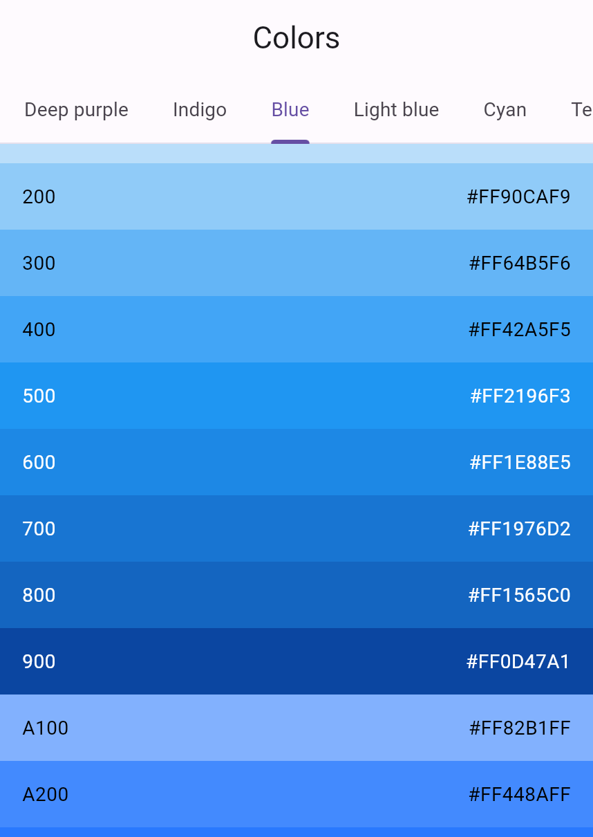
  <img src='/assets/images/docs/ui/layout/listview-color-gallery.png' height="400px" class="simple-border text-center" alt="ListView containing shades of blue">

  Uses `ListView` to display the [`Colors`][] from
  the [Material 2 Design palette][]
  for a particular color family.

  **Dart code:**
  [`colors_demo.dart`](https://github.com/flutter/website/tree/main/examples/layout/gallery/lib/colors_demo.dart)

</div>
</div>

<?code-excerpt "layout/grid_and_list/lib/main.dart (list)" replace="/\ListView/[!$&!]/g;"?>
```dart
Widget _buildList() {
  return [!ListView!](
    children: [
      _tile('CineArts at the Empire', '85 W Portal Ave', Icons.theaters),
      _tile('The Castro Theater', '429 Castro St', Icons.theaters),
      _tile('Alamo Drafthouse Cinema', '2550 Mission St', Icons.theaters),
      _tile('Roxie Theater', '3117 16th St', Icons.theaters),
      _tile(
        'United Artists Stonestown Twin',
        '501 Buckingham Way',
        Icons.theaters,
      ),
      _tile('AMC Metreon 16', '135 4th St #3000', Icons.theaters),
      const Divider(),
      _tile('K\'s Kitchen', '757 Monterey Blvd', Icons.restaurant),
      _tile('Emmy\'s Restaurant', '1923 Ocean Ave', Icons.restaurant),
      _tile('Chaiya Thai Restaurant', '272 Claremont Blvd', Icons.restaurant),
      _tile('La Ciccia', '291 30th St', Icons.restaurant),
    ],
  );
}

ListTile _tile(String title, String subtitle, IconData icon) {
  return ListTile(
    title: Text(
      title,
      style: const TextStyle(fontWeight: FontWeight.w500, fontSize: 20),
    ),
    subtitle: Text(subtitle),
    leading: Icon(icon, color: Colors.blue[500]),
  );
}
```

<hr>

[`Colors`]: https://api.flutter.dev/flutter/material/Colors-class.html
[Material 2 Design palette]: https://m2.material.io/design/color/the-color-system.html#tools-for-picking-colors

### Stack

Use [`Stack`][] to arrange widgets on top of a base
widget&mdash;often an image. The widgets can completely
or partially overlap the base widget.

[`Stack`]: https://api.flutter.dev/flutter/widgets/Stack-class.html

#### Summary (Stack)

* Use for widgets that overlap another widget
* The first widget in the list of children is the base widget;
  subsequent children are overlaid on top of that base widget
* A `Stack`'s content can't scroll
* You can choose to clip children that exceed the render box

#### Examples (Stack)

<div class="side-by-side">
<div>
  <img src='/assets/images/docs/ui/layout/stack.png' class="text-center" height="200px" alt="Circular avatar image with a label">

  Uses `Stack` to overlay a `Container`
  (that displays its `Text` on a translucent
  black background) on top of a `CircleAvatar`.
  The `Stack` offsets the text using the `alignment` property and
  `Alignment`s.

  **App source:** [card_and_stack](https://github.com/flutter/website/tree/main/examples/layout/card_and_stack)

</div>
<div>
  <img src='/assets/images/docs/ui/layout/stack-flutter-gallery.png' class="text-center" height="200px" alt="An image with a icon overlaid on top">

  Uses `Stack` to overlay an icon on top of an image.

  **Dart code:**
  [`bottom_navigation_demo.dart`](https://github.com/flutter/website/tree/main/examples/layout/gallery/lib/bottom_navigation_demo.dart)
</div>
</div>

<?code-excerpt "layout/card_and_stack/lib/main.dart (stack)" replace="/\bStack/[!$&!]/g;"?>
```dart
Widget _buildStack() {
  return [!Stack!](
    alignment: const Alignment(0.6, 0.6),
    children: [
      const CircleAvatar(
        backgroundImage: AssetImage('images/pic.jpg'),
        radius: 100,
      ),
      Container(
        decoration: const BoxDecoration(color: Colors.black45),
        child: const Text(
          'Mia B',
          style: TextStyle(
            fontSize: 20,
            fontWeight: FontWeight.bold,
            color: Colors.white,
          ),
        ),
      ),
    ],
  );
}
```

<hr>

### Card

A [`Card`][], from the [Material library][],
contains related nuggets of information and can
be composed of almost any widget, but is often used with
[`ListTile`][]. `Card` has a single child,
but its child can be a column, row, list, grid,
or other widget that supports multiple children.
By default, a `Card` shrinks its size to 0 by 0 pixels.
You can use [`SizedBox`][] to constrain the size of a card.

In Flutter, a `Card` features slightly rounded corners
and a drop shadow, giving it a 3D effect.
Changing a `Card`'s `elevation` property allows you to control
the drop shadow effect. Setting the elevation to 24,
for example, visually lifts the `Card` further from the
surface and causes the shadow to become more dispersed.
For a list of supported elevation values, see [Elevation][] in the
[Material guidelines][Material Design].
Specifying an unsupported value disables the drop shadow entirely.

[`Card`]: https://api.flutter.dev/flutter/material/Card-class.html
[Elevation]: https://m3.material.io/styles/elevation
[`ListTile`]: https://api.flutter.dev/flutter/material/ListTile-class.html
[Material Design]: https://m3.material.io/styles
[`SizedBox`]: https://api.flutter.dev/flutter/widgets/SizedBox-class.html
[Material library]: https://api.flutter.dev/flutter/material/material-library.html

#### Summary (Card)

* Implements a [Material card][]
* Used for presenting related nuggets of information
* Accepts a single child, but that child can be a `Row`,
  `Column`, or other widget that holds a list of children
* Displayed with rounded corners and a drop shadow
* A `Card`'s content can't scroll
* From the [Material library][]

[Material card]: https://m3.material.io/components/cards
[Material library]: https://api.flutter.dev/flutter/material/material-library.html

#### Examples (Card)

<div class="side-by-side">
<div>
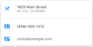
  <img src='/assets/images/docs/ui/layout/card.png' height="200px" class="text-center" alt="Card containing 3 ListTiles">

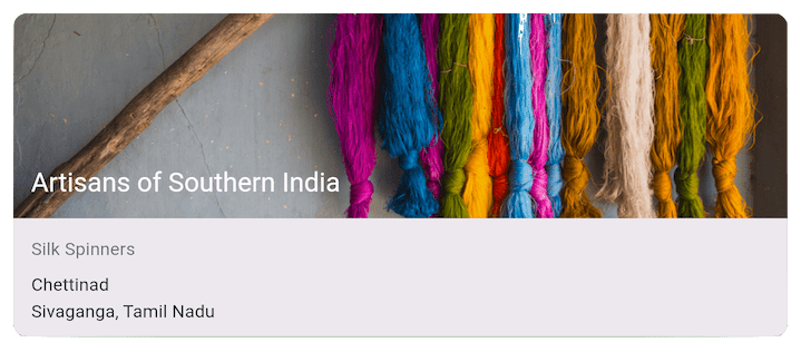
  A `Card` containing 3 ListTiles and sized by wrapping
  it with a `SizedBox`. A `Divider` separates the first
  and second `ListTiles`.

  **App source:** [card_and_stack](https://github.com/flutter/website/tree/main/examples/layout/card_and_stack)
</div>
<div>
  <img src='/assets/images/docs/ui/layout/card-flutter-gallery.png' height="200px" class="text-center" alt="Tappable card containing an image and multiple forms of text">

  A `Card` containing an image and text.

  **Dart code:**
  [`cards_demo.dart`](https://github.com/flutter/website/tree/main/examples/layout/gallery/lib/cards_demo.dart)
</div>
</div>

<?code-excerpt "layout/card_and_stack/lib/main.dart (card)" replace="/\bCard/[!$&!]/g;"?>
```dart
Widget _buildCard() {
  return SizedBox(
    height: 210,
    child: [!Card!](
      child: Column(
        children: [
          ListTile(
            title: const Text(
              '1625 Main Street',
              style: TextStyle(fontWeight: FontWeight.w500),
            ),
            subtitle: const Text('My City, CA 99984'),
            leading: Icon(Icons.restaurant_menu, color: Colors.blue[500]),
          ),
          const Divider(),
          ListTile(
            title: const Text(
              '(408) 555-1212',
              style: TextStyle(fontWeight: FontWeight.w500),
            ),
            leading: Icon(Icons.contact_phone, color: Colors.blue[500]),
          ),
          ListTile(
            title: const Text('costa@example.com'),
            leading: Icon(Icons.contact_mail, color: Colors.blue[500]),
          ),
        ],
      ),
    ),
  );
}
```

<hr>

### ListTile

Use [`ListTile`][], a specialized row widget from the
[Material library][], for an easy way to create a row
containing up to 3 lines of text and optional leading
and trailing icons. `ListTile` is most commonly used in
[`Card`][] or [`ListView`][], but can be used elsewhere.

[`Card`]: https://api.flutter.dev/flutter/material/Card-class.html
[`ListTile`]: https://api.flutter.dev/flutter/material/ListTile-class.html
[`ListView`]: https://api.flutter.dev/flutter/widgets/ListView-class.html
[Material library]: https://api.flutter.dev/flutter/material/material-library.html

#### Summary (ListTile)

* A specialized row that contains up to 3 lines of text and
  optional icons
* Less configurable than `Row`, but easier to use
* From the [Material library][]

[Material library]: https://api.flutter.dev/flutter/material/material-library.html

#### Examples (ListTile)

<div class="side-by-side">
<div>
  <img src='/assets/images/docs/ui/layout/card.png' class="text-center" alt="Card containing 3 ListTiles">

  A `Card` containing 3 `ListTile`s.

  **App source:** [card_and_stack](https://github.com/flutter/website/tree/main/examples/layout/card_and_stack)
</div>
<div>
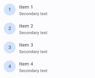
  <img src='/assets/images/docs/ui/layout/listtile-flutter-gallery.png' height="200px" class="simple-border text-center" alt="4 ListTiles, each containing a leading avatar">

  Uses `ListTile` with leading widgets.

  **Dart code:**
  [`list_demo.dart`](https://github.com/flutter/website/tree/main/examples/layout/gallery/lib/list_demo.dart)
</div>
</div>

<hr>

## Constraints

To fully understand Flutter's layout system, you need
to learn how Flutter positions and sizes
the components in a layout. For more information,
see [Understanding constraints][].

[Understanding constraints]: /ui/layout/constraints

## Videos

The following videos, part of the
[Flutter in Focus][] series,
explain `Stateless` and `Stateful` widgets.

<YouTubeEmbed id="wE7khGHVkYY" title="How to create stateless widgets"></YouTubeEmbed>

<YouTubeEmbed id="AqCMFXEmf3w" title="How and when stateful widgets are best used"></YouTubeEmbed>

[Flutter in Focus playlist](https://www.youtube.com/playlist?list=PLjxrf2q8roU2HdJQDjJzOeO6J3FoFLWr2)

---

Each episode of the [Widget of the Week series][] focuses on a widget.
Several of them include layout widgets.

<YouTubeEmbed id="b_sQ9bMltGU" title="Introducing widget of the week"></YouTubeEmbed>

[Flutter Widget of the Week playlist](https://www.youtube.com/playlist?list=PLjxrf2q8roU23XGwz3Km7sQZFTdB996iG)

[Widget of the Week series]: https://www.youtube.com/playlist?list=PLjxrf2q8roU23XGwz3Km7sQZFTdB996iG
[Flutter in Focus]: https://www.youtube.com/watch?v=wgTBLj7rMPM&list=PLjxrf2q8roU2HdJQDjJzOeO6J3FoFLWr2

## Other resources

The following resources might help when writing layout code.

[Layout tutorial][]
: Learn how to build a layout.

[Widget catalog][]
: Describes many of the widgets available in Flutter.

[HTML/CSS Analogs in Flutter][]
: For those familiar with web programming,
  this page maps HTML/CSS functionality to Flutter features.

[API reference docs][]
: Reference documentation for all of the Flutter libraries.

[Adding assets and images][]
: Explains how to add images and other assets to your app's package.

[Zero to One with Flutter][]
: One person's experience writing their first Flutter app.

[Layout tutorial]: /ui/layout/tutorial
[Widget catalog]: /ui/widgets
[HTML/CSS Analogs in Flutter]: /flutter-for/web-devs
[API reference docs]: https://api.flutter.dev/flutter
[Adding assets and images]: /ui/assets/assets-and-images
[Zero to One with Flutter]: https://medium.com/@mravn/zero-to-one-with-flutter-43b13fd7b354