Work with tabs
How to implement tabs in a layout.
Working with tabs is a common pattern in apps that follow the Material Design guidelines. Flutter includes a convenient way to create tab layouts as part of the material library.
This recipe creates a tabbed example using the following steps;
- Create a
TabController. - Create the tabs.
- Create content for each tab.
1. Create a TabController
#
For tabs to work, you need to keep the selected tab and content
sections in sync.
This is the job of the TabController.
Either create a TabController manually,
or automatically by using a DefaultTabController
widget.
Using DefaultTabController is the simplest option, since it
creates a TabController and makes it available to all descendant widgets.
return MaterialApp(
  home: DefaultTabController(length: 3, child: Scaffold()),
);
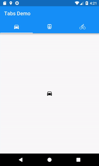
2. Create the tabs
#
When a tab is selected, it needs to display content.
You can create tabs using the TabBar
widget.
In this example, create a TabBar with three
Tab
widgets and place it within an AppBar.
return MaterialApp(
  home: DefaultTabController(
    length: 3,
    child: Scaffold(
      appBar: AppBar(
        bottom: const TabBar(
          tabs: [
            Tab(icon: Icon(Icons.directions_car)),
            Tab(icon: Icon(Icons.directions_transit)),
            Tab(icon: Icon(Icons.directions_bike)),
          ],
        ),
      ),
    ),
  ),
);
By default, the TabBar looks up the widget tree for the nearest
DefaultTabController. If you're manually creating a TabController,
pass it to the TabBar.
3. Create content for each tab
#
Now that you have tabs, display content when a tab is selected.
For this purpose, use the TabBarView
widget.
body: const TabBarView(
  children: [
    Icon(Icons.directions_car),
    Icon(Icons.directions_transit),
    Icon(Icons.directions_bike),
  ],
),
Interactive example
#import 'package:flutter/material.dart';
void main() {
runApp(const TabBarDemo());
}
class TabBarDemo extends StatelessWidget {
const TabBarDemo({super.key});
@override
Widget build(BuildContext context) {
return MaterialApp(
home: DefaultTabController(
length: 3,
child: Scaffold(
appBar: AppBar(
bottom: const TabBar(
tabs: [
Tab(icon: Icon(Icons.directions_car)),
Tab(icon: Icon(Icons.directions_transit)),
Tab(icon: Icon(Icons.directions_bike)),
],
),
title: const Text('Tabs Demo'),
),
body: const TabBarView(
children: [
Icon(Icons.directions_car),
Icon(Icons.directions_transit),
Icon(Icons.directions_bike),
],
),
),
),
);
}
}
Unless stated otherwise, the documentation on this site reflects Flutter 3.44.0. Page last updated on 2026-05-05. View source or report an issue.