Large screen devices
Things to keep in mind when adapting apps to large screens.
This page provides guidance on optimizing your app to improve its behavior on large screens.
Flutter, like Android, defines large screens as tablets, foldables, and ChromeOS devices running Android. Flutter also defines large screen devices as web, desktop, and iPads.
Layout with GridView
#
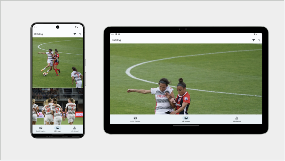
Consider the following screenshots of an app.
The app displays its UI in a ListView.
The image on the left shows the app running
on a mobile device. The image on the right shows the
app running on a large screen device
before the advice on this page was applied.

This is not optimal.
The Android Large Screen App Quality Guidelines and the iOS equivalent say that neither text nor boxes should take up the full screen width. How to solve this in an adaptive way?
A common solution uses GridView, as shown in the next section.
GridView
#
You can use the GridView widget to transform
your existing ListView into more reasonably-sized items.
GridView is similar to the ListView
widget,
but instead of handling only a list of widgets arranged linearly,
GridView can arrange widgets in a two-dimensional array.
GridView also has constructors that are similar to ListView.
The ListView default constructor maps to GridView.count,
and ListView.builder is similar to GridView.builder.
GridView has some additional constructors for more custom layouts.
To learn more, visit the GridView
API page.
For example, if your original app used a ListView.builder,
swap that out for a GridView.builder.
If your app has a large number of items,
it's recommended to use this builder constructor to only
build the item widgets that are actually visible.
Most of the parameters in the constructor are the same between
the two widgets, so it's a straightforward swap.
However, you need to figure out what to set for the gridDelegate.
Flutter provides powerful premade gridDelegates
that you can use, namely:
-
SliverGridDelegateWithFixedCrossAxisCount Lets you assign a specific number of columns to your grid.
-
SliverGridDelegateWithMaxCrossAxisExtent Lets you define a max item width.
Other solutions
#
Another way to approach these situations is to
use the maxWidth property of BoxConstraints.
This involves the following:
-
Wrap the
GridViewin aConstrainedBoxand give it aBoxConstraintswith a maximum width set. -
Use a
Containerinstead of aConstrainedBoxif you want other functionality like setting the background color.
For choosing the maximum width value, consider using the values recommended by Material 3 in the Applying layout guide.
Foldables
#As mentioned previously, Android and Flutter both recommend in their design guidance not to lock screen orientation, but some apps lock screen orientation anyway. Be aware that this can cause problems when running your app on a foldable device.
When running on a foldable, the app might look ok when the device is folded. But when unfolding, you might find the app letterboxed.
As described in the SafeArea & MediaQuery page, letterboxing means that the app's window is locked to the center of the screen while the window is surrounded with black.
Why can this happen?
This can happen when using MediaQuery to figure out
the window size for your app. When the device is folded,
orientation is restricted to portrait mode.
Under the hood, setPreferredOrientations causes
Android to use a portrait compatibility mode and the app
is displayed in a letterboxed state.
In the letterboxed state, MediaQuery never receives
the larger window size that allows the UI to expand.
You can solve this in one of two ways:
- Support all orientations.
- Use the dimensions of the physical display. In fact, this is one of the few situations where you would use the physical display dimensions and not the window dimensions.
How to obtain the physical screen dimensions?
You can use the Display
API, which contains the
size, pixel ratio, and refresh rate of the physical device.
The following sample code retrieves a Display object:
/// AppState object.
ui.FlutterView? _view;
@override
void didChangeDependencies() {
super.didChangeDependencies();
_view = View.maybeOf(context);
}
void didChangeMetrics() {
final ui.Display? display = _view?.display;
}
The important thing is to find the display of the view that you care about. This creates a forward-looking API that should handle current and future multi-display and multi-view devices.
Adaptive input
#Adding support for more screens, also means expanding input controls.
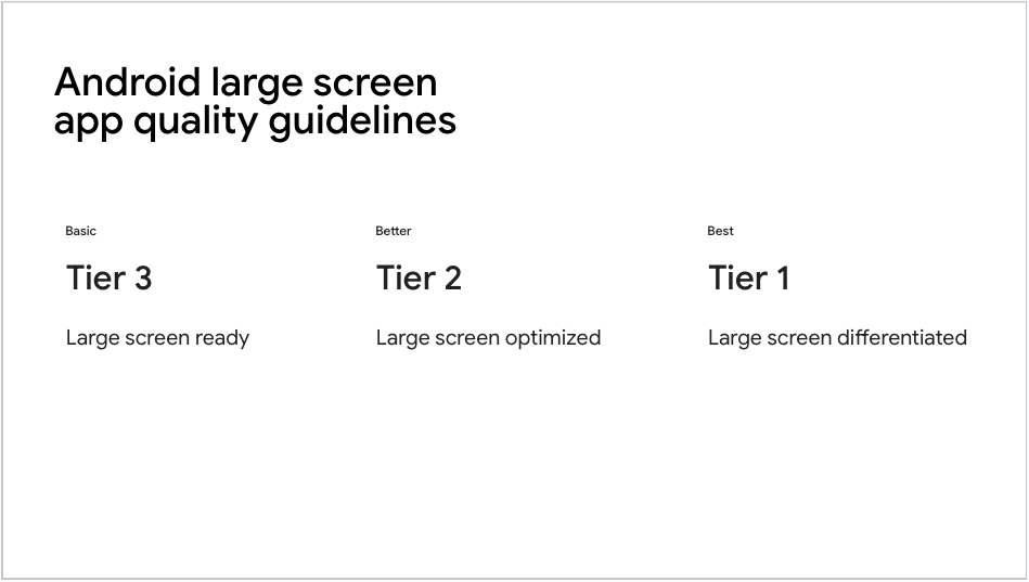
Android guidelines describe three tiers of large format device support.

Tier 3, the lowest level of support, includes support for mouse and stylus input (Material 3 guidelines, Apple guidelines).
If your app uses Material 3 and its buttons and selectors, then your app already has built-in support for various additional input states.
But what if you have a custom widget? Check out the User input page for guidance on adding input support for widgets.
Navigation
#
Navigation can create unique challenges when working with a variety of
differently-sized devices. Generally, you want to switch between
a BottomNavigationBar
and a NavigationRail
depending on
available screen space.
For more information (and corresponding example code), check out Problem: Navigation rail, a section in the Developing Flutter apps for Large screens article.
Unless stated otherwise, the documentation on this site reflects Flutter 3.41.5. Page last updated on 2026-03-24. View source or report an issue.