Add a drawer to a screen
How to implement a Material Drawer.
In apps that use Material Design, there are two primary options for navigation: tabs and drawers. When there is insufficient space to support tabs, drawers provide a handy alternative.
In Flutter, use the Drawer
widget in combination with a
Scaffold
to create a layout with a Material Design drawer.
This recipe uses the following steps:
- Create a
Scaffold. - Add a drawer.
- Populate the drawer with items.
- Close the drawer programmatically.
1. Create a Scaffold
#
To add a drawer to the app, wrap it in a Scaffold
widget.
The Scaffold widget provides a consistent visual structure to apps that
follow the Material Design Guidelines.
It also supports special Material Design
components, such as Drawers, AppBars, and SnackBars.
In this example, create a Scaffold with a drawer:
Scaffold(
  appBar: AppBar(title: const Text('AppBar without hamburger button')),
  drawer: // Add a Drawer here in the next step.
);
2. Add a drawer
#
Now add a drawer to the Scaffold. A drawer can be any widget,
but it's often best to use the Drawer widget from the
material library,
which adheres to the Material Design spec.
Scaffold(
  appBar: AppBar(title: const Text('AppBar with hamburger button')),
  drawer: Drawer(
    child: // Populate the Drawer in the next step.
  ),
);
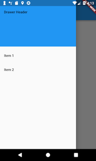
3. Populate the drawer with items
#
Now that you have a Drawer in place, add content to it.
For this example, use a ListView.
While you could use a Column widget,
ListView is handy because it allows users to scroll
through the drawer if the
content takes more space than the screen supports.
Populate the ListView with a DrawerHeader
and two ListTile
widgets.
For more information on working with Lists,
see the list recipes.
Drawer(
  // Add a ListView to the drawer. This ensures the user can scroll
  // through the options in the drawer if there isn't enough vertical
  // space to fit everything.
  child: ListView(
    // Important: Remove any padding from the ListView.
    padding: EdgeInsets.zero,
    children: [
      const DrawerHeader(
        decoration: BoxDecoration(color: Colors.blue),
        child: Text('Drawer Header'),
      ),
      ListTile(
        title: const Text('Item 1'),
        onTap: () {
          // Update the state of the app.
          // ...
        },
      ),
      ListTile(
        title: const Text('Item 2'),
        onTap: () {
          // Update the state of the app.
          // ...
        },
      ),
    ],
  ),
);
4. Open the drawer programmatically
#
Typically, you don't need to write any code to open a drawer,
Because when the leading widget is null, the default implementation in
AppBar is DrawerButton.
But if you want to have free control of the drawer.
You can do this by using the Builder call Scaffold.of(context).openDrawer().
Scaffold(
  appBar: AppBar(
    title: const Text('AppBar with hamburger button'),
    leading: Builder(
      builder: (context) {
        return IconButton(
          icon: const Icon(Icons.menu),
          onPressed: () {
            Scaffold.of(context).openDrawer();
          },
        );
      },
    ),
  ),
  drawer: Drawer(
    child: // Populate the Drawer in the last step.
  ),
);
5. Close the drawer programmatically
#
After a user taps an item, you might want to close the drawer.
You can do this by using the Navigator.
When a user opens the drawer, Flutter adds the drawer to the navigation
stack. Therefore, to close the drawer, call Navigator.pop(context).
ListTile(
  title: const Text('Item 1'),
  onTap: () {
    // Update the state of the app
    // ...
    // Then close the drawer
    Navigator.pop(context);
  },
),
Interactive example
#
This example shows a Drawer
as it is used within a Scaffold
widget.
The Drawer
has three ListTile
items.
The _onItemTapped function changes the selected item's index
and displays the corresponding text in the center of the Scaffold.
import 'package:flutter/material.dart';

void main() => runApp(const MyApp());

class MyApp extends StatelessWidget {
  const MyApp({super.key});

  static const appTitle = 'Drawer Demo';

  @override
  Widget build(BuildContext context) {
    return const MaterialApp(
      title: appTitle,
      home: MyHomePage(title: appTitle),
    );
  }
}

class MyHomePage extends StatefulWidget {
  const MyHomePage({super.key, required this.title});

  final String title;

  @override
  State<MyHomePage> createState() => _MyHomePageState();
}

class _MyHomePageState extends State<MyHomePage> {
  int _selectedIndex = 0;
  static const TextStyle optionStyle = TextStyle(
    fontSize: 30,
    fontWeight: FontWeight.bold,
  );
  static const List<Widget> _widgetOptions = <Widget>[
    Text('Index 0: Home', style: optionStyle),
    Text('Index 1: Business', style: optionStyle),
    Text('Index 2: School', style: optionStyle),
  ];

  void _onItemTapped(int index) {
    setState(() {
      _selectedIndex = index;
    });
  }

  @override
  Widget build(BuildContext context) {
    return Scaffold(
      appBar: AppBar(
        title: Text(widget.title),
        leading: Builder(
          builder: (context) {
            return IconButton(
              icon: const Icon(Icons.menu),
              onPressed: () {
                Scaffold.of(context).openDrawer();
              },
            );
          },
        ),
      ),
      body: Center(child: _widgetOptions[_selectedIndex]),
      drawer: Drawer(
        // Add a ListView to the drawer. This ensures the user can scroll
        // through the options in the drawer if there isn't enough vertical
        // space to fit everything.
        child: ListView(
          // Important: Remove any padding from the ListView.
          padding: EdgeInsets.zero,
          children: [
            const DrawerHeader(
              decoration: BoxDecoration(color: Colors.blue),
              child: Text('Drawer Header'),
            ),
            ListTile(
              title: const Text('Home'),
              selected: _selectedIndex == 0,
              onTap: () {
                // Update the state of the app
                _onItemTapped(0);
                // Then close the drawer
                Navigator.pop(context);
              },
            ),
            ListTile(
              title: const Text('Business'),
              selected: _selectedIndex == 1,
              onTap: () {
                // Update the state of the app
                _onItemTapped(1);
                // Then close the drawer
                Navigator.pop(context);
              },
            ),
            ListTile(
              title: const Text('School'),
              selected: _selectedIndex == 2,
              onTap: () {
                // Update the state of the app
                _onItemTapped(2);
                // Then close the drawer
                Navigator.pop(context);
              },
            ),
          ],
        ),
      ),
    );
  }
}
Unless stated otherwise, the documentation on this site reflects Flutter 3.44.0. Page last updated on 2026-05-05. View source or report an issue.