Animate the properties of a container
How to animate properties of a container using implicit animations.
The Container
class provides a convenient way
to create a widget with specific properties:
width, height, background color, padding, borders, and more.
Simple animations often involve changing these properties over time. For example, you might want to animate the background color from grey to green to indicate that an item has been selected by the user.
To animate these properties,
Flutter provides the AnimatedContainer
widget.
Like the Container widget, AnimatedContainer allows you to define
the width, height, background colors, and more. However, when the
AnimatedContainer is rebuilt with new properties, it automatically
animates between the old and new values. In Flutter, these types of
animations are known as "implicit animations."
This recipe describes how to use an AnimatedContainer to animate the size,
background color, and border radius when the user taps a button
using the following steps:
- Create a StatefulWidget with default properties.
- Build an
AnimatedContainerusing the properties. - Start the animation by rebuilding with new properties.
1. Create a StatefulWidget with default properties
#
To start, create StatefulWidget
and State classes.
Use the custom State class to define the properties that change over
time. In this example, that includes the width, height, color, and border
radius. You can also define the default value of each property.
These properties belong to a custom State class so they
can be updated when the user taps a button.
class AnimatedContainerApp extends StatefulWidget {
const AnimatedContainerApp({super.key});
@override
State<AnimatedContainerApp> createState() => _AnimatedContainerAppState();
}
class _AnimatedContainerAppState extends State<AnimatedContainerApp> {
// Define the various properties with default values. Update these properties
// when the user taps a FloatingActionButton.
double _width = 50;
double _height = 50;
Color _color = Colors.green;
BorderRadiusGeometry _borderRadius = BorderRadius.circular(8);
@override
Widget build(BuildContext context) {
// Fill this out in the next steps.
}
}
2. Build an AnimatedContainer using the properties
#
Next, build the AnimatedContainer using the properties defined in the
previous step. Furthermore, provide a duration that defines how long
the animation should run.
AnimatedContainer(
  // Use the properties stored in the State class.
  width: _width,
  height: _height,
  decoration: BoxDecoration(
    color: _color,
    borderRadius: _borderRadius,
  ),
  // Define how long the animation should take.
  duration: const Duration(seconds: 1),
  // Provide an optional curve to make the animation feel smoother.
  curve: Curves.fastOutSlowIn,
)
3. Start the animation by rebuilding with new properties
#
Finally, start the animation by rebuilding the
AnimatedContainer with the new properties.
How to trigger a rebuild?
Use the setState()
method.
Add a button to the app. When the user taps the button, update
the properties with a new width, height, background color and border radius
inside a call to setState().
A real app typically transitions between fixed values (for example, from a grey to a green background). For this app, generate new values each time the user taps the button.
FloatingActionButton(
// When the user taps the button
onPressed: () {
// Use setState to rebuild the widget with new values.
setState(() {
// Create a random number generator.
final random = Random();
// Generate a random width and height.
_width = random.nextInt(300).toDouble();
_height = random.nextInt(300).toDouble();
// Generate a random color.
_color = Color.fromRGBO(
random.nextInt(256),
random.nextInt(256),
random.nextInt(256),
1,
);
// Generate a random border radius.
_borderRadius = BorderRadius.circular(
random.nextInt(100).toDouble(),
);
});
},
child: const Icon(Icons.play_arrow),
)
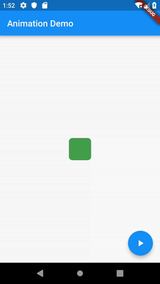
Interactive example
#import 'dart:math';
import 'package:flutter/material.dart';
void main() => runApp(const AnimatedContainerApp());
class AnimatedContainerApp extends StatefulWidget {
const AnimatedContainerApp({super.key});
@override
State<AnimatedContainerApp> createState() => _AnimatedContainerAppState();
}
class _AnimatedContainerAppState extends State<AnimatedContainerApp> {
// Define the various properties with default values. Update these properties
// when the user taps a FloatingActionButton.
double _width = 50;
double _height = 50;
Color _color = Colors.green;
BorderRadiusGeometry _borderRadius = BorderRadius.circular(8);
@override
Widget build(BuildContext context) {
return MaterialApp(
home: Scaffold(
appBar: AppBar(title: const Text('AnimatedContainer Demo')),
body: Center(
child: AnimatedContainer(
// Use the properties stored in the State class.
width: _width,
height: _height,
decoration: BoxDecoration(
color: _color,
borderRadius: _borderRadius,
),
// Define how long the animation should take.
duration: const Duration(seconds: 1),
// Provide an optional curve to make the animation feel smoother.
curve: Curves.fastOutSlowIn,
),
),
floatingActionButton: FloatingActionButton(
// When the user taps the button
onPressed: () {
// Use setState to rebuild the widget with new values.
setState(() {
// Create a random number generator.
final random = Random();
// Generate a random width and height.
_width = random.nextInt(300).toDouble();
_height = random.nextInt(300).toDouble();
// Generate a random color.
_color = Color.fromRGBO(
random.nextInt(256),
random.nextInt(256),
random.nextInt(256),
1,
);
// Generate a random border radius.
_borderRadius = BorderRadius.circular(
random.nextInt(100).toDouble(),
);
});
},
child: const Icon(Icons.play_arrow),
),
),
);
}
}
Unless stated otherwise, the documentation on this site reflects Flutter 3.44.7. Page last updated on 2026-05-05. View source or report an issue.