Flutter Property Editor
Learn how to use the Flutter Property Editor to view and modify the properties of your widgets.
What is it?
#The Flutter Property Editor is a powerful IDE-tool that lets you view and modify widget properties directly from a visual interface.
It allows you to quickly discover and modify your widgets' existing and available constructor arguments, eliminating the need to jump-to-definition or manually edit the source code. Furthermore, its integration with the Flutter inspector and hot reload enables you to view changes in real time, speeding up UI development and iteration.
How to access the Flutter Property Editor
#-
Open the Flutter Property Editor in your supported IDE (VS Code, Android Studio/IntelliJ).
-
Locate a widget constructor invocation in your Flutter code.
-
Move your cursor anywhere inside the widget constructor invocation.
For example, in the following
buildmethod, place your cursor anywhere between theTofTextand the ending parenthesis)afterTextOverflow.clip:dart@override Widget build(BuildContext context) { return Text( 'Hello World!', overflow: TextOverflow.clip, ); } -
The Flutter Property Editor panel automatically updates to display the properties of the widget at your cursor location.
Runtime usage
#Integration with the Flutter inspector
#The Flutter Property Editor can be used in conjunction with the Flutter inspector to inspect your widgets simultaneously in both tools.
-
From your preferred IDE, run and debug your Flutter application.
Open the Flutter inspector in your IDE.
You can then use the Flutter inspector to load a widget in the Flutter Property Editor by either:
-
Selecting a widget in tree:
- Click on a widget in the inspector's widget tree.
-
Selecting a widget in your app:
- Enable "Select Widget Mode" in the inspector.
- Click on a widget in your running application.
Both actions will automatically:
- Jump to the widget's declaration in your source code.
- Load the selected widget in the Flutter Property Editor.
Integration with hot reload
#The Flutter Property Editor can be used in conjunction with hot reload to view changes in real time.
-
From your preferred IDE, enable autosave and hot reloads on save.
VS Code
Add the following to your
.vscode/settings.jsonfile:json"files.autoSave": "afterDelay", "dart.flutterHotReloadOnSave": "all",Android Studio and IntelliJ
Open
Settings > Tools > Actions on Saveand selectConfigure autosave options.- Check the option to
Save files if the IDE is idle for X seconds. - Recommended: Set a small delay duration. For example, 2 seconds.
- Check the option to
Open
Settings > Languages & Frameworks > Flutter.- Check the option to
Perform hot reload on save.
- Check the option to
-
Run and debug your Flutter application.
-
Any changes you make from the Flutter Property Editor are automatically reflected in your running app.
Feature set
#The Flutter Property Editor comes equipped with several features designed to speed up the development process.
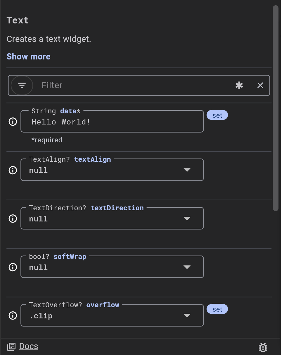
Viewing widget documentation
#When a widget is selected in the Flutter Property Editor, its documentation is displayed at the top. This allows you to quickly read the widget documentation, without needing to jump-to-definition or search online.
By default, the widget documentation is truncated. Click on "Show more" to expand the widget documentation.

Editing widget properties
#The Flutter Property Editor contains input fields tailored to the type of each constructor argument.
-
string, double, and int properties:
- These are represented by text input fields.
- Simply type the new value into the field.
- Press ••Tab•• or ••Enter•• to apply the edit directly to your source code.
-
boolean and enum properties:
- These are represented by dropdown menus.
- Click the dropdown to see the available options (
true/falsefor booleans, or the various enum values). - Select the desired value from the list to apply it to your code.
-
object properties (for example,
TextStyle,EdgeInsets,Color):- Currently not supported. The Flutter Property Editor does not yet allow direct editing of complex object properties. You will need to edit these directly in your source code.
Understanding the property inputs
#Each property input in the Flutter Property Editor is accompanied by information to help you understand its usage.
-
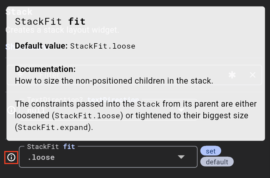
Type and name: The type (for example,
StackFit) and the name (for example,fit) of the constructor parameter are displayed as a label for each input field.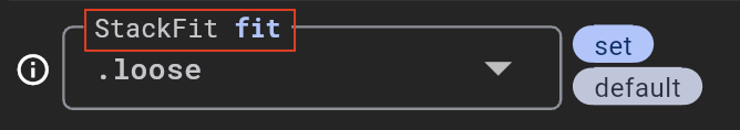
-
Info tooltip (ⓘ):
- Hovering over the info icon next to a property input displays a tooltip.
- The information in the tooltip includes:
- The default value of the property, if one is defined in the widget's constructor.
- Any documentation for that property.
-
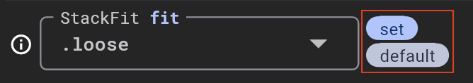
"Set" and "default" labels:
- The "set" label appears next to an input if the property has been explicitly set in your source code. This means there is a corresponding argument provided in the widget constructor call.
- The "default" label appears next to an input if the current property value matches the default parameter value as defined in the widget.
:::tip If a property input has both a "set" and a "default" label, it means you have explicitly provided a value in your code, but this value is the same as the widget's default value for that property. In such cases, you can safely remove this argument from your code to make it more concise, as the widget will use the default value anyway. :::
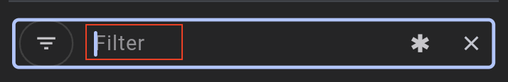
Filtering properties
#For widgets with many properties, the filter bar can help to quickly locate properties of interest.
-
Filter by text:
- Simply type into the filter bar. The list of properties will dynamically update to show only those that match your input.
- You can filter by a property's name, its current value, or its type. For
example:
- Typing "main" would filter to
mainAxisAlignment,mainAxisSize, or other properties with "main" in their name. - Typing "true" would filter to all boolean properties currently set to
true. - Typing "double" would filter to all properties of type
double.
- Typing "main" would filter to
-
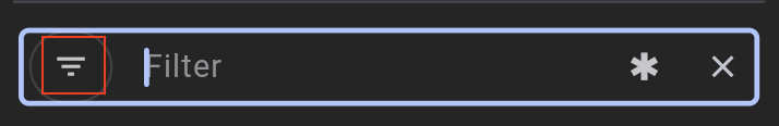
Filter by "set" properties:
- Use the filter menu button to open the filter options. Check "Only include properties that are set in the code."
- This hides all properties that have not been explicitly set in your code, allowing you to focus only on the properties you have explicitly set.
-
Filter with a regex:
- The regex toggle (an
*icon button) allows you to toggle on regex mode for the filter input. - When enabled, your filter text will be interpreted as a regular expression.
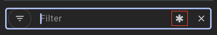
- The regex toggle (an
-
Clear the current filter:
- The clear button (an
Xicon button) clears out any active filters, displaying all properties of the widget again.
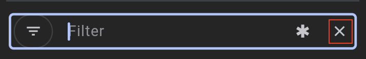
- The clear button (an
Unless stated otherwise, the documentation on this site reflects Flutter 3.44.0. Page last updated on 2026-05-05. View source or report an issue.