Material component widgets
A catalog of Flutter's material component widgets. Visual, behavioral, and motion-rich widgets implementing the Material 3 design specification.
Flutter provides a variety of visual, behavioral, and motion-rich widgets that implement the Material 3 design specification. Material 3 is the default design language of Flutter, enabling you to design and build beautiful, usable apps that can adapt to any platform.
To catch these and other widgets in action, check out the Material 3 demo web app.
Actions
Clickable blocks that start an action, such as sending an email, sharing a document, or liking a comment.
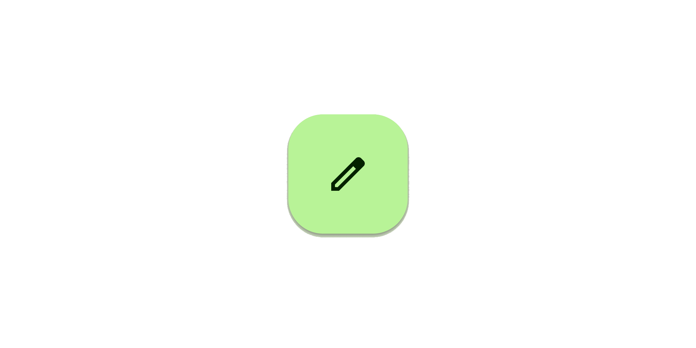
Clickable block containing an icon that keeps a key action always in reach.
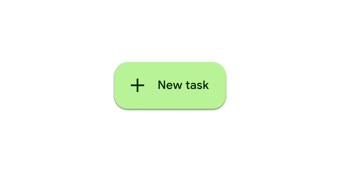
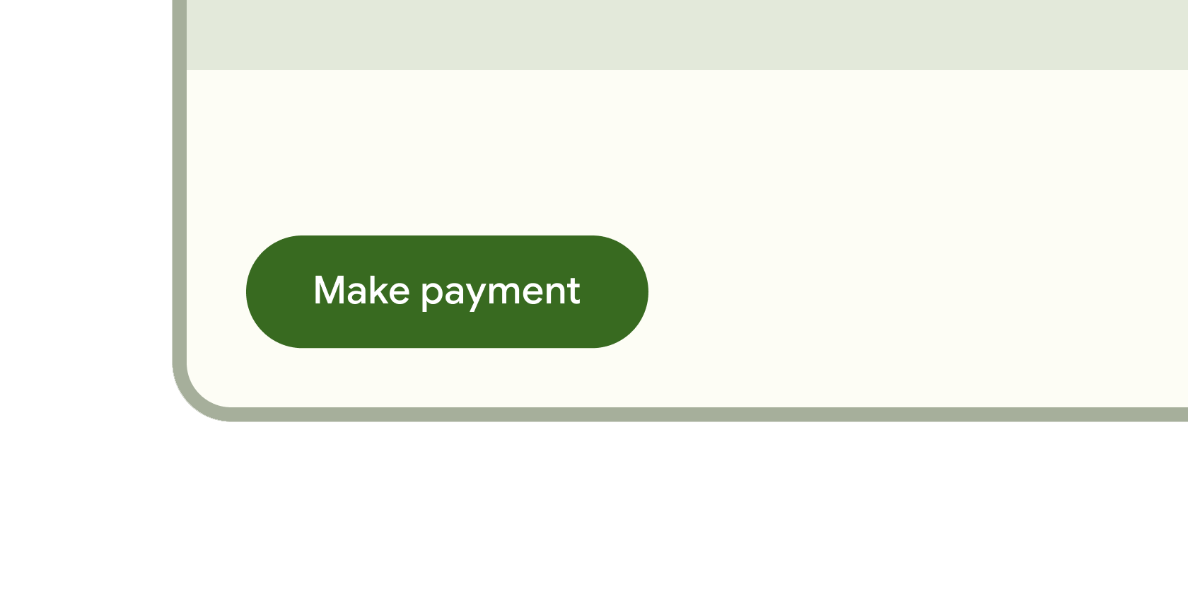
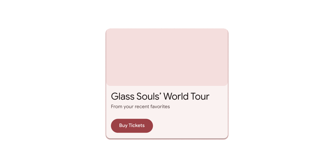
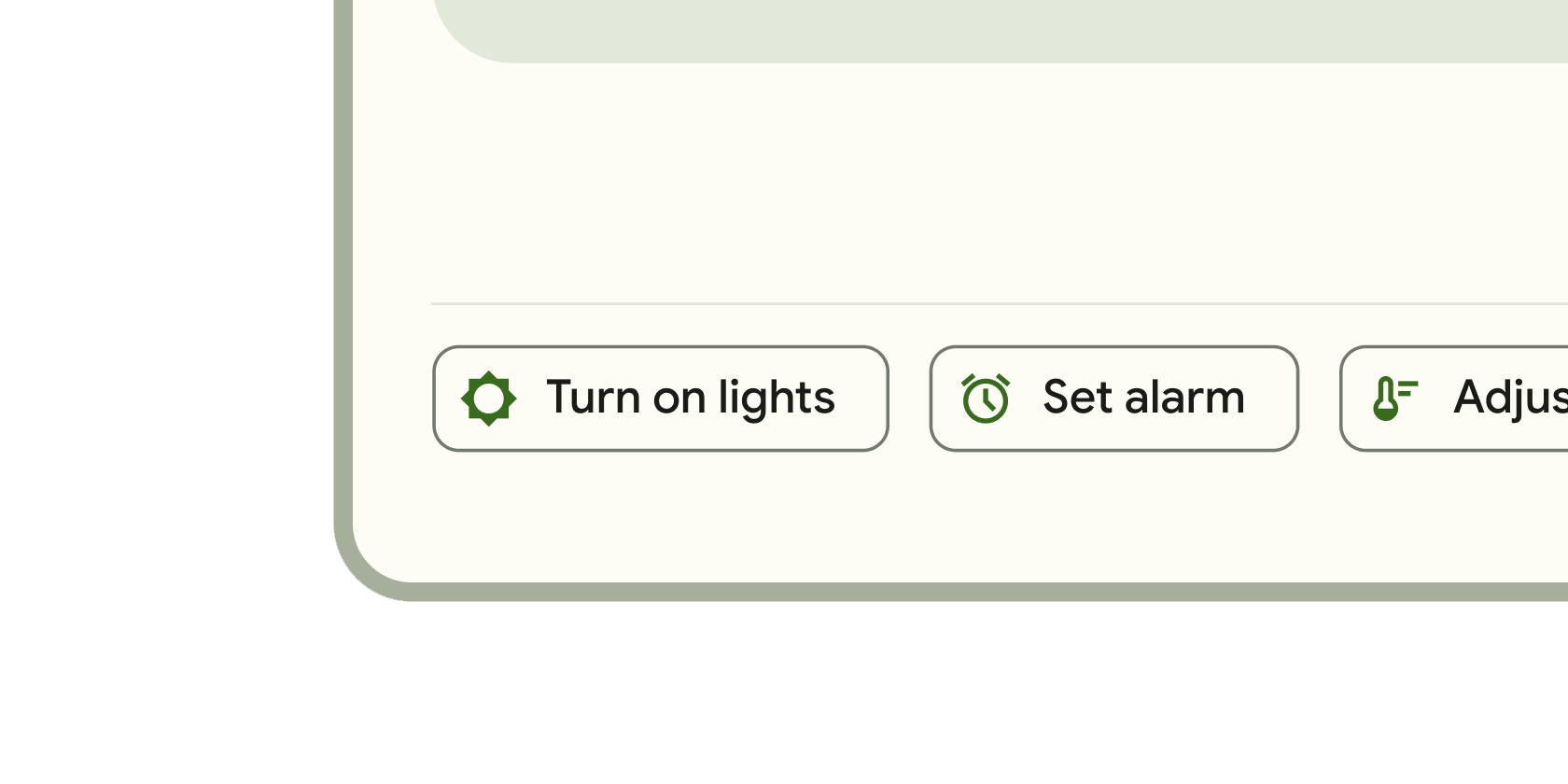
Clickable block that triggers an action. These wider blocks can fit a text label and provide a larger target area.
Clickable icons to prompt app users to take supplementary actions.
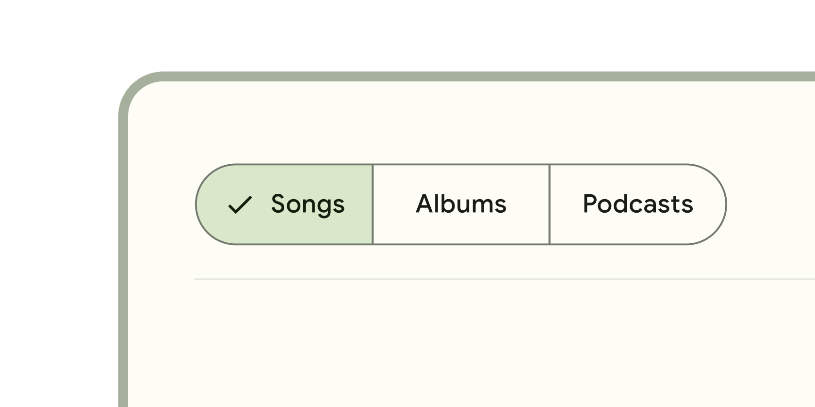
Single or multiple selected clickable blocks to help people select options, switch views, or sort elements.
Communication
Icon-like block that conveys dynamic content such as counts or status. It can include labels or numbers.
Vertical line that changes color as an ongoing process, such as loading an app or submitting a form, completes.
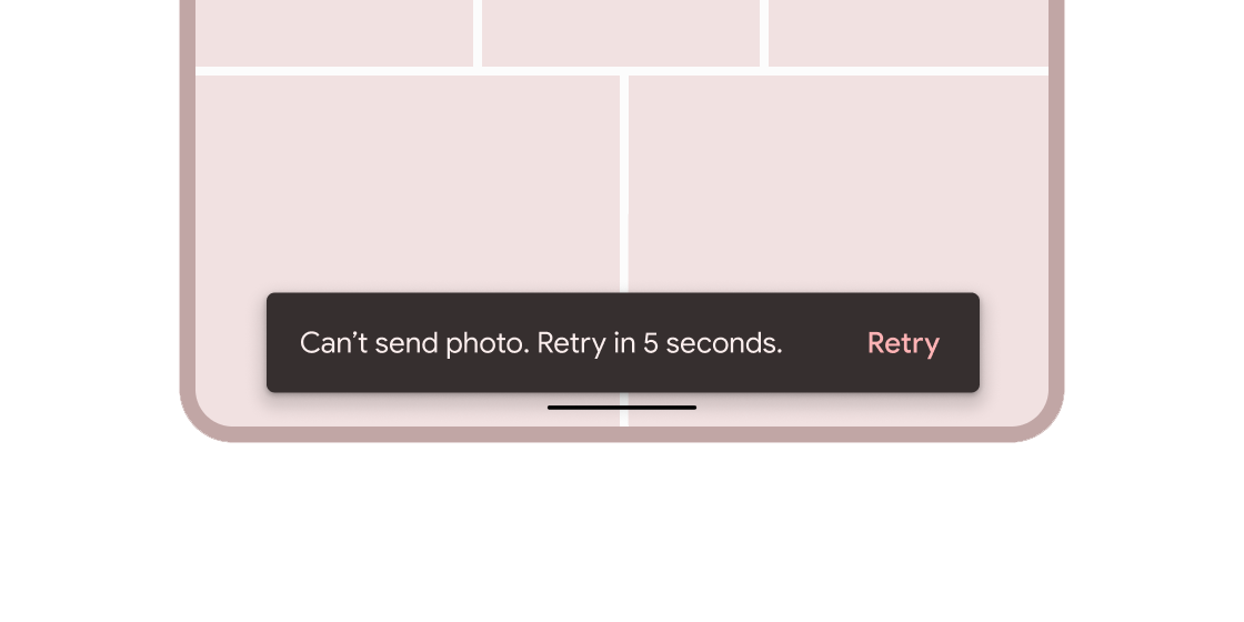
Brief messages about app processes that display at the bottom of the screen.
Containment
Hovering containers that prompt app users to provide more data or make a decision.
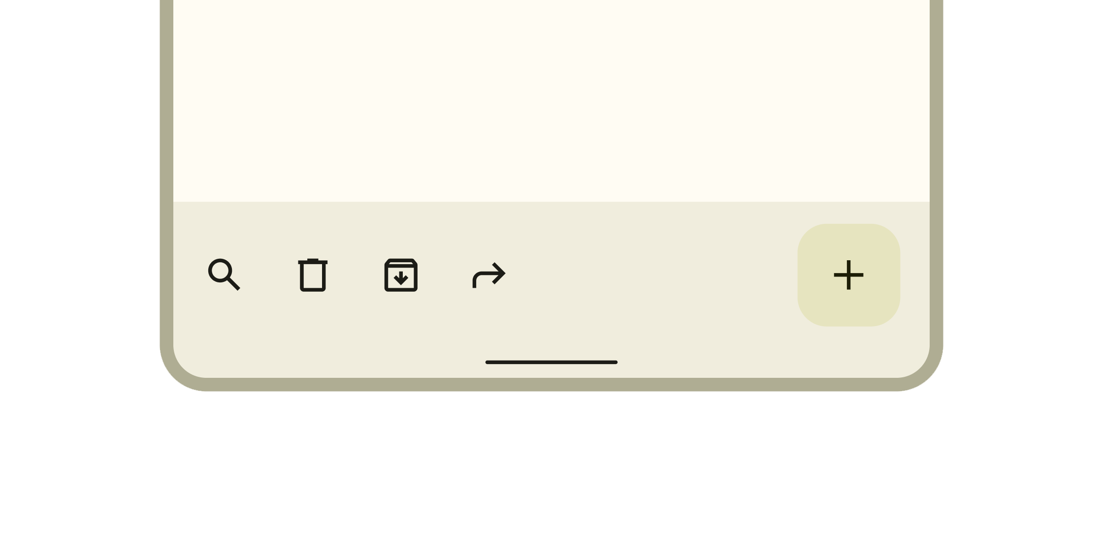
Containers that anchor supplementary content to the bottom of the screen.
Container for short, related pieces of content displayed in a box with rounded corners and a drop shadow.
Thin line that groups content in lists and containers.
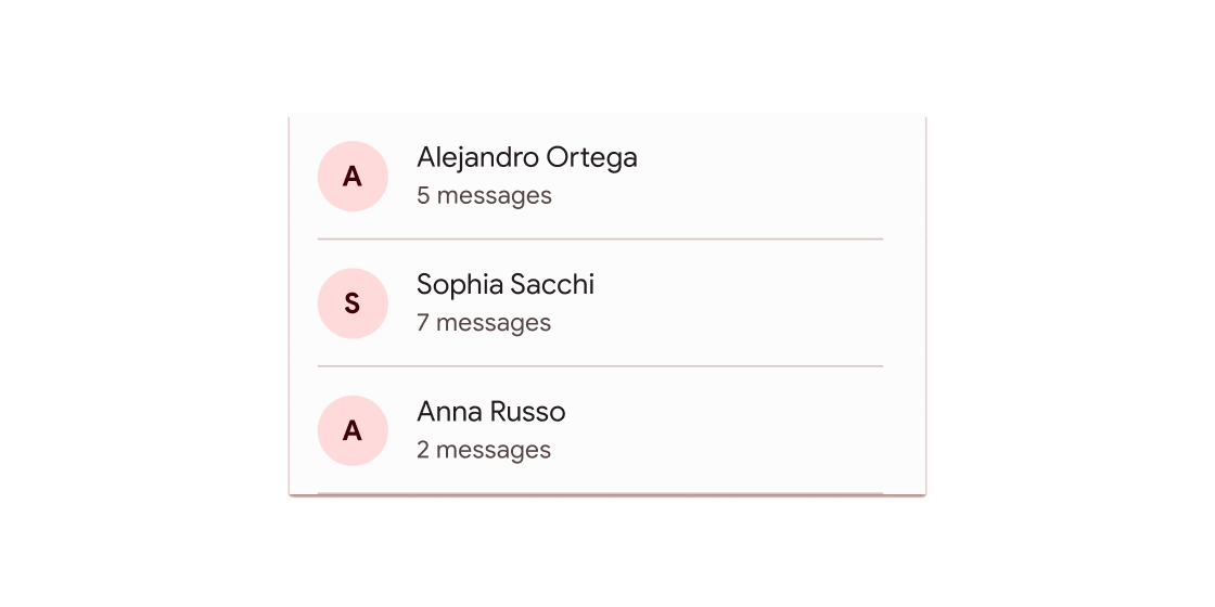
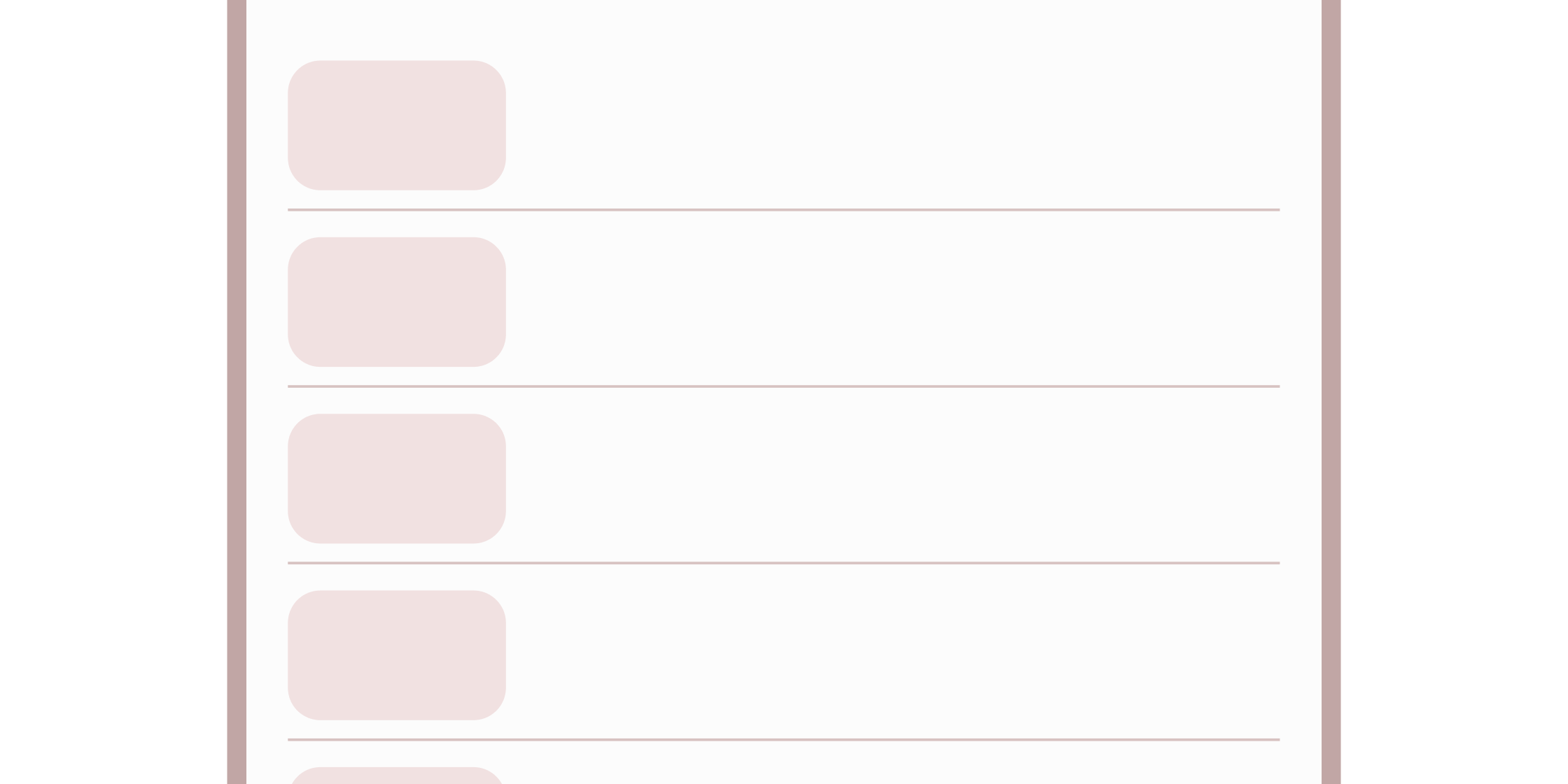
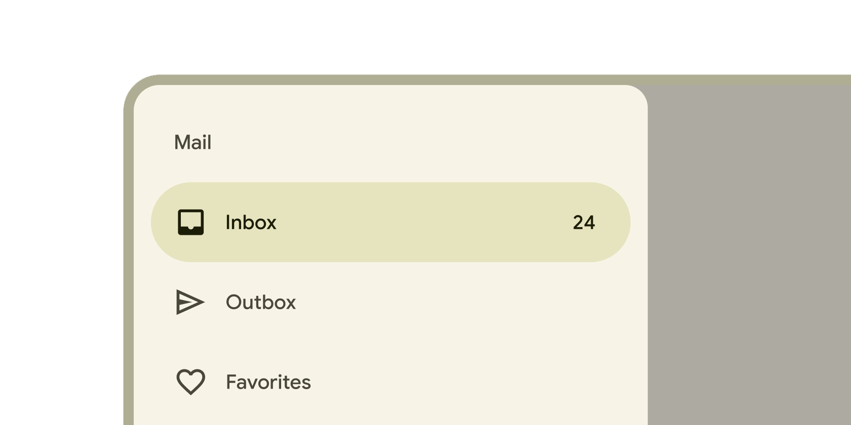
A single fixed-height row that typically contains some text as well as a leading or trailing icon.
Navigation
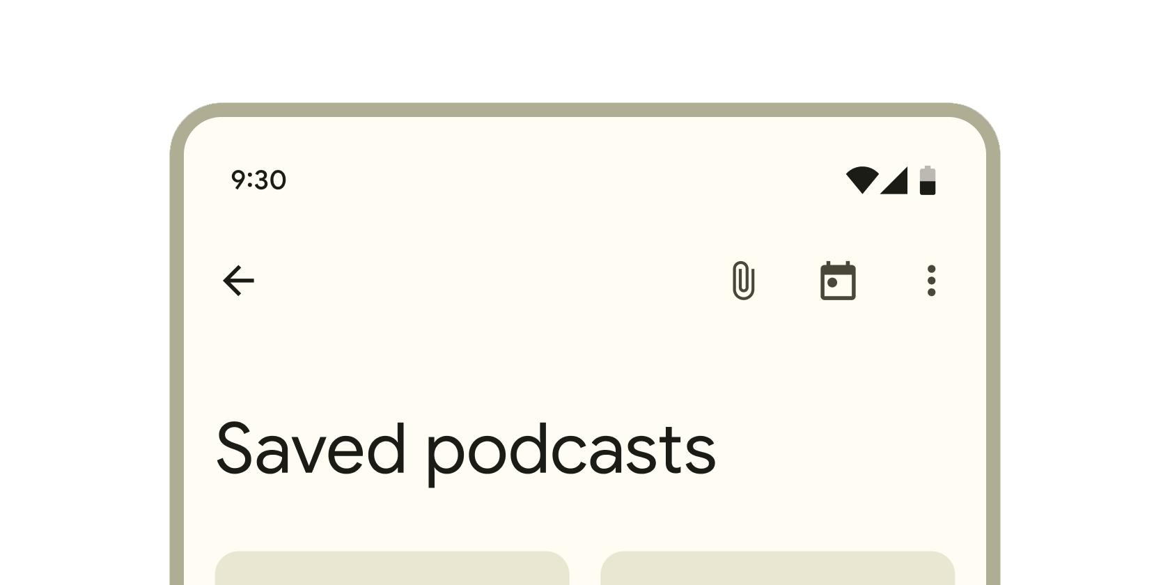
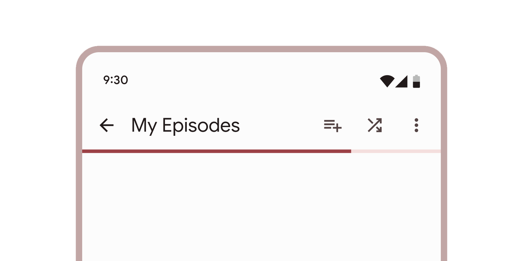
Container that displays content and actions at the top of a screen.
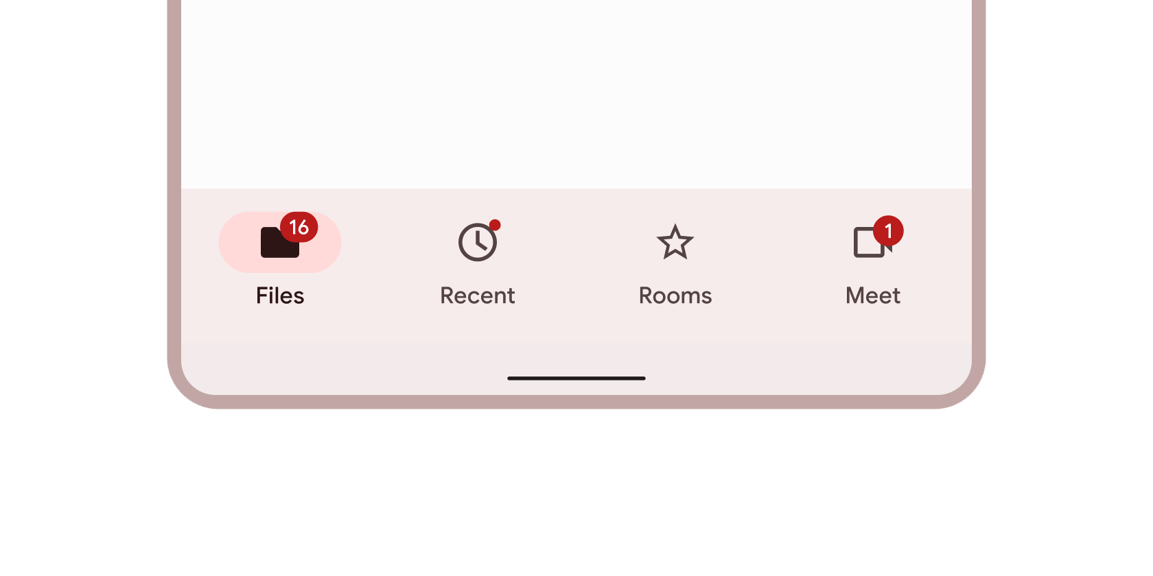
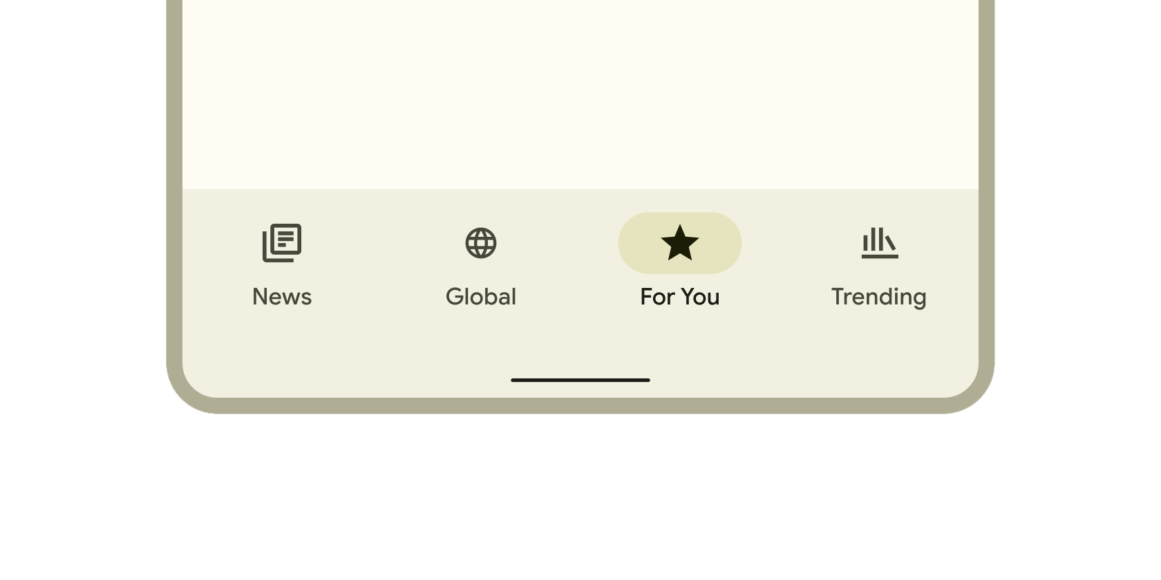
Container that displays navigation and key actions at the bottom of a screen.
Persistent container that enables switching between primary destinations in an app.
Container that slides from the leading edge of the app to navigate to other sections in an app.
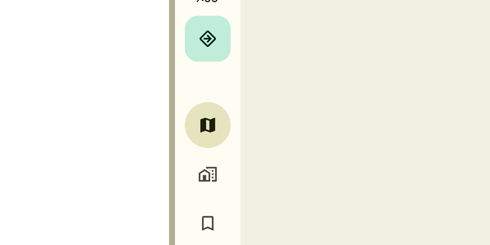
Persistent container on the leading edge of tablet and desktop screens to navigate to parts of an app.
Layered containers that organize content across different screens, data sets, and other interactions.
Selection
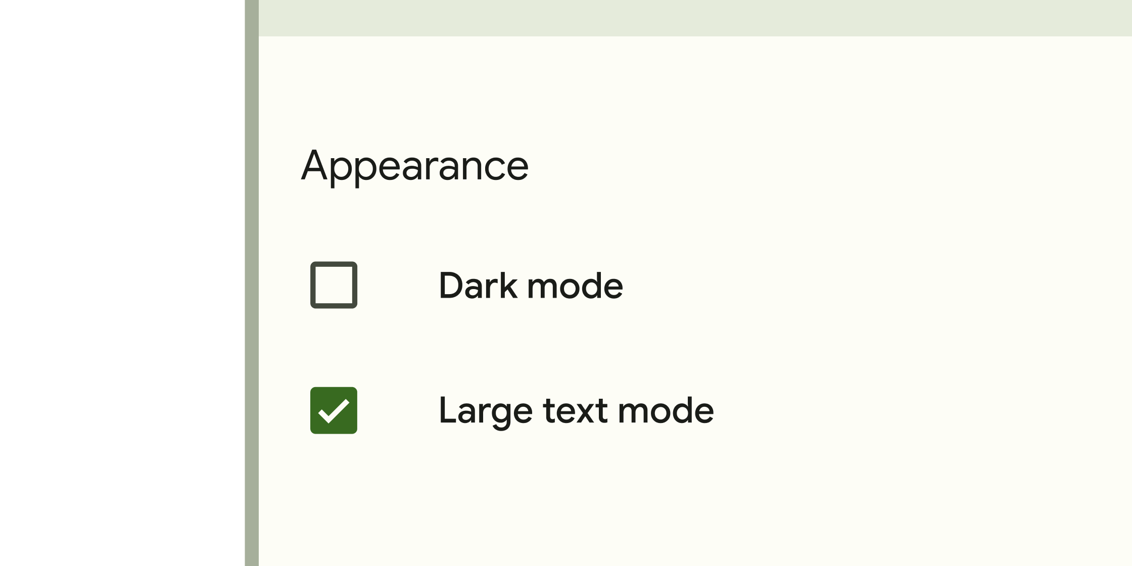
Form control that app users can set or clear to select one or more options from a set.
Small blocks that simplify entering information, making selections, filtering content, or triggering actions.
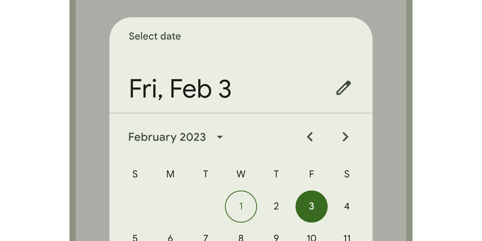
Calendar interface used to select a date or a range of dates.
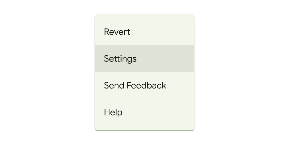
Container that displays a list of choices on a temporary surface.
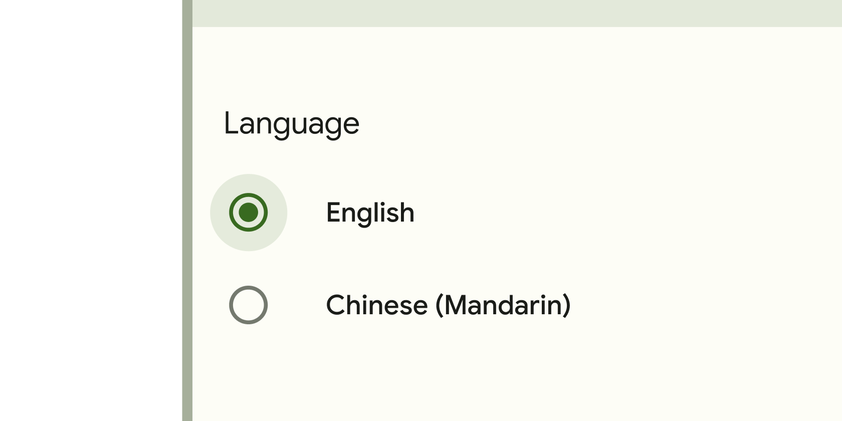
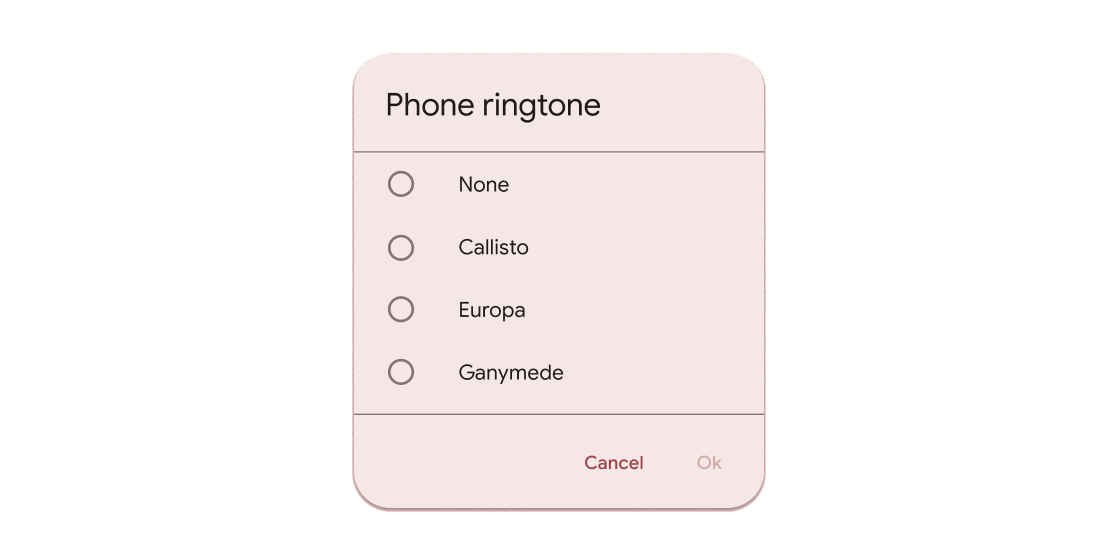
Form control that app users can set or clear to select only one option from a set.
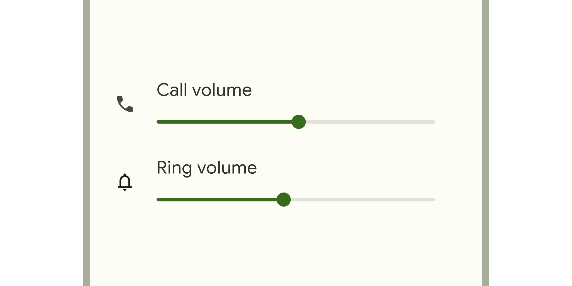
Form control that enables selecting a range of values.
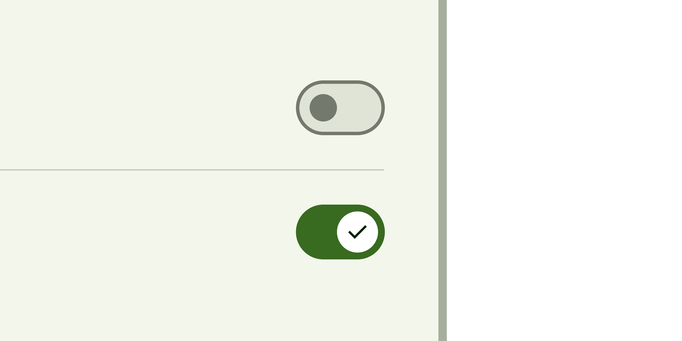
Toggle control that changes the state of a single item to on or off.
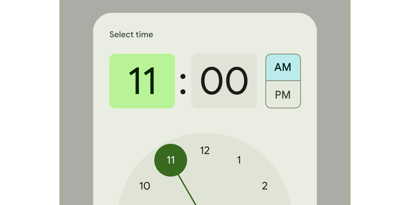
Clock interface used to select and set a specific time.
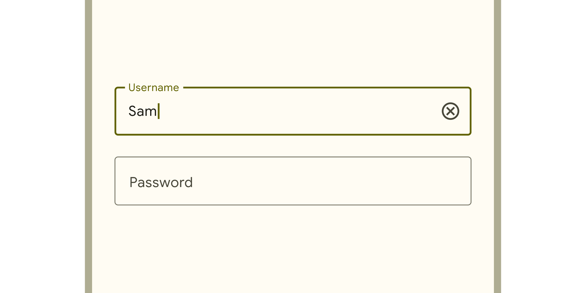
Text inputs
Find more widgets in the Material 2 widget catalog and other categories of the widget catalog.
Unless stated otherwise, the documentation on this site reflects Flutter 3.44.7. Page last updated on 2026-05-31. Report an issue.