UI design & styling
Information on Flutter's accessibility support.
To create an accessible app, design your UI with accessibility in mind. This page covers key aspects of accessible UI design and styling.
Large fonts
#Both Android and iOS contain system settings to configure the desired font sizes used by apps. Flutter text widgets respect this OS setting when determining font sizes.
Font sizes are calculated automatically by Flutter based on the OS setting. However, as a developer you should make sure your layout has enough room to render all its contents when the font sizes are increased. For example, you can test all parts of your app on a small-screen device configured to use the largest font setting.
To adjust font sizes: on iOS, go to Settings > Accessibility > Display & Text Size; on Android, go to Settings > Font size.
Example
#The following two screenshots show the standard Flutter app template rendered with the default iOS font setting, and with the largest font setting selected in iOS accessibility settings.
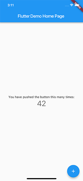
Default font setting
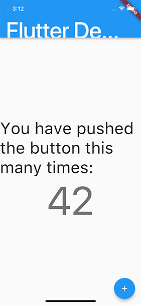
Largest accessibility font setting
Sufficient contrast
#Sufficient color contrast makes text and images easier to read. Along with benefitting users with various visual impairments, sufficient color contrast helps all users when viewing an interface on devices in extreme lighting conditions, such as when exposed to direct sunlight or on a display with low brightness.
The W3C recommends:
- At least 4.5:1 for small text (below 18 point regular or 14 point bold)
- At least 3.0:1 for large text (18 point and above regular or 14 point and above bold)
You can test contrast using Flutter's Accessibility Guideline API. For more details on testing, check out the accessibility testing page.
Tap target size
#Controls that are too small are hard for many people to interact with and select. Ensure that interactive elements have a large enough tap target to be easily pressed by users.
Both Android and iOS recommend a minimum tap target size of 48x48 dp and 44x44 pts respectively.
The W3C recommends a minimum target size of 44 by 44 CSS pixels.
You can test tap target size using Flutter's Accessibility Guideline API. For more details on testing, check out the accessibility testing page.
Other accessibility features
#You can check the AccessibilityFeatures class for additional accessibility features that may be enabled by the platform, such as bold text, high contrast, and inverted colors.
Unless stated otherwise, the documentation on this site reflects Flutter 3.44.7. Page last updated on 2026-05-05. View source or report an issue.