Create widgets
In this lesson, you'll create your own custom widget, and learn about some of the most common widgets included in the SDK.
Custom widgets allow you to reuse UI components across your app, organize complex UI code into manageable pieces, and create cleaner, more maintainable code. By the end of this lesson, you’ll have created your own custom Tile widget.
Anatomy of a stateless widget
#A Widget is a Dart class that extends one of the Flutter widget classes, in this case StatelessWidget.
Open your main.dart file and add this code below the MainApp class, which defines a new widget called Tile.
class Tile extends StatelessWidget {
  const Tile(this.letter, this.hitType, {super.key});

  final String letter;
  final HitType hitType;

  // ...
}
Constructor
#The Tile class has a constructor that defines what data needs to be passed into the widget to render the widget. Here, a String is passed in, which represents the guessed letter, and a HitType, which is an enum value defined in the flutter_gse package and used to determine the color of the tile. (For example HitType.hit results in a green tile). Passing data into the widget is at the core of making widgets reusable.
Build method
#Finally, there’s the all important build method, which must be defined on every widget, and will always return another widget.
class Tile extends StatelessWidget {
  const Tile(this.letter, this.hitType, {super.key});

  final String letter;
  final HitType hitType;

  @override
  Widget build(BuildContext context) {
	// TODO: Replace Containter with widgets.
	return Container();
  }
}
Use the custom widget
#When this app is finished, there will be 25 instances of this widget on screen. For now, though, display just one so you can see the updates as they’re made. In the MainApp.build method, replace the Text widget with the following:
class MainApp extends StatelessWidget {
  const MainApp({super.key});

 @override
  Widget build(BuildContext context) {
    return MaterialApp(
      home: Scaffold(
        body: Center(
          child: Tile('A', HitType.hit), // NEW
        ),
      ),
    );
  }
}
At the moment, your app will be blank, because the Tile widget returns an empty Container, which doesn’t display anything by default.
The Container widget
#The Tile widget consists of three of the most common basic widgets: Container, Center, and Text. Container is a convenience widget that wraps several basic styling widgets, like Padding, ColoredBox, SizedBox, DecoratedBox, and many more.
Because the finished UI contains 25 Tile widgets in neat columns and rows, it should have an explicit size. Set the width and height properties on the Container. (You could also do this with a SizedBox widget, but you’ll use more properties of the Container next.)
class Tile extends StatelessWidget {
  const Tile(this.letter, this.hitType, {super.key});

  final String letter;
  final HitType hitType;

  @override
  Widget build(BuildContext context) {
	// NEW
	  return Container(
       width: 60,
       height: 60,
       // TODO: Add needed widgets
    );
  }
}
BoxDecoration
#Next, add a Border to the box with the following code:
class Tile extends StatelessWidget {
  const Tile(required this.letter, required hitType, {super.key});

  final String letter;
  final HitType hitType;

  @override
  Widget build(BuildContext context) {
	// NEW
	return Container(
       width: 60,
       height: 60,
       decoration: BoxDecoration(
         border: Border.all(color: Colors.grey.shade300),
         // TODO: add background color
      ),
    );
  }
}
BoxDecoration is an object that knows how to add any number of decorations to a widget, from background color to borders to box shadows and more. In this case, you’ve added a border. When you hot reload, there should be a lightly colored border around the white square.
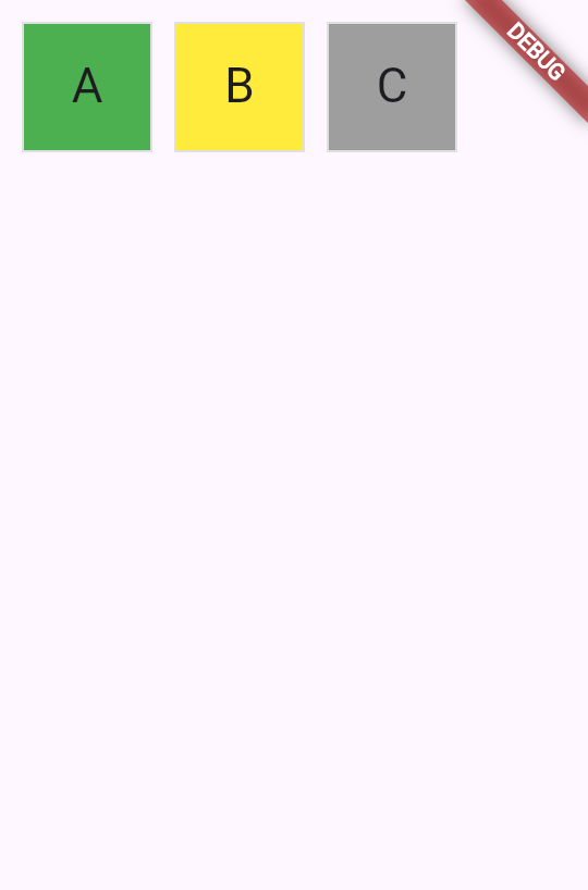
When this game is complete, the color of the tile will depend on the user’s guess. The tile will be green when the user has guessed correctly, yellow when the letter is correct but the position is incorrect, and gray if the guess is wrong on both axes.
The following figure shows all three possibilities.
To achieve this in UI, use a switch expression to set the color of the BoxDecoration.
class Tile extends StatelessWidget {
  const Tile(required this.letter, required hitType, {super.key});

  final String letter;
  final HitType hitType;

  @override
  Widget build(BuildContext context) {
	return Container(
       width: 60,
       height: 60,
       decoration: BoxDecoration(
         border: Border.all(color: Colors.grey.shade300),
         color: switch (hitType) {
           HitType.hit => Colors.green,
           HitType.partial => Colors.yellow,
           HitType.miss => Colors.grey,
           _ => Colors.white,
        },
        // TODO: add children
      ),
    );
  }
}
Child widgets
#Finally, add the Center and Text widgets to the Container.child property.
Most widgets in the Flutter SDK have a child or children property that’s meant to be passed a widget or a list of widgets, respectively. It's best practice to use the same naming convention in your own custom widgets.
class Tile extends StatelessWidget {
  const Tile(required this.letter, required hitType, {super.key});

  final String letter;
  final HitType hitType;

  @override
  Widget build(BuildContext context) {
	return Container(
       width: 60,
       height: 60,
       decoration: BoxDecoration(
          color: switch (hitType) {
          border: Border.all(color: Colors.grey.shade300),
           HitType.hit => Colors.green,
           HitType.partial => Colors.yellow,
           HitType.miss => Colors.grey,
           _ => Colors.white,
        },
        child: Center(
          child: Text(
            letter.char.toUpperCase(),
            style: Theme.of(context).textTheme.titleLarge,
          ),
        ),
      ),
    );
  }
}
Hot reload and a green box appears. To toggle the color, update and hot reload the HitType passed into the Tile you created:
// main.dart line ~16
// green
child: Tile('A', HitType.hit)
// grey
child: Tile('A', HitType.miss)
// yellow
child: Tile('A', HitType.partial)
Soon, this small box will be one of many widgets on the screen. In the next lesson, you’ll start building the game grid itself.
Unless stated otherwise, the documentation on this site reflects the latest stable version of Flutter. Page last updated on 2025-06-06. View source or report an issue.