Material 2 component widgets
A catalog of Flutter's material 2 component widgets. Widgets implementing the Material 2 design guidelines.
Flutter provides a variety of widgets that implement the Material 2 design guidelines, enabling you to create intuitive and beautiful apps.
Widgets implementing the Material 2 design guidelines.
App structure and navigation
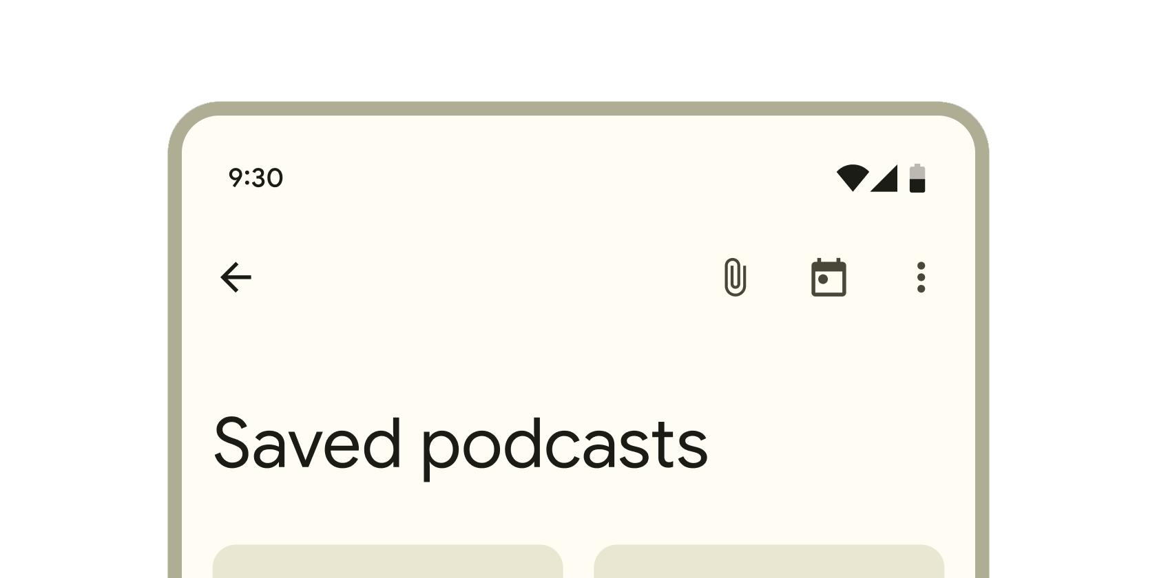
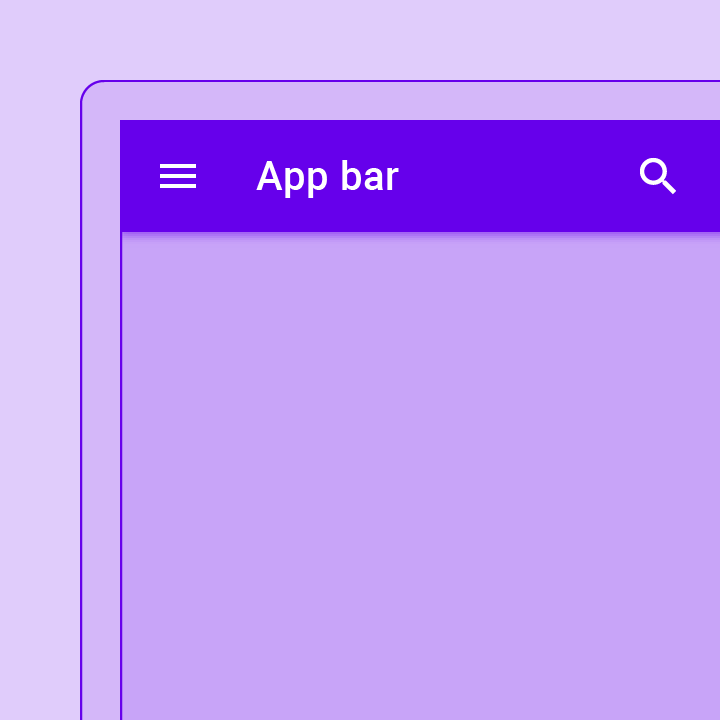
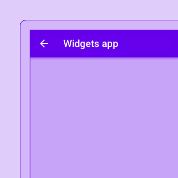
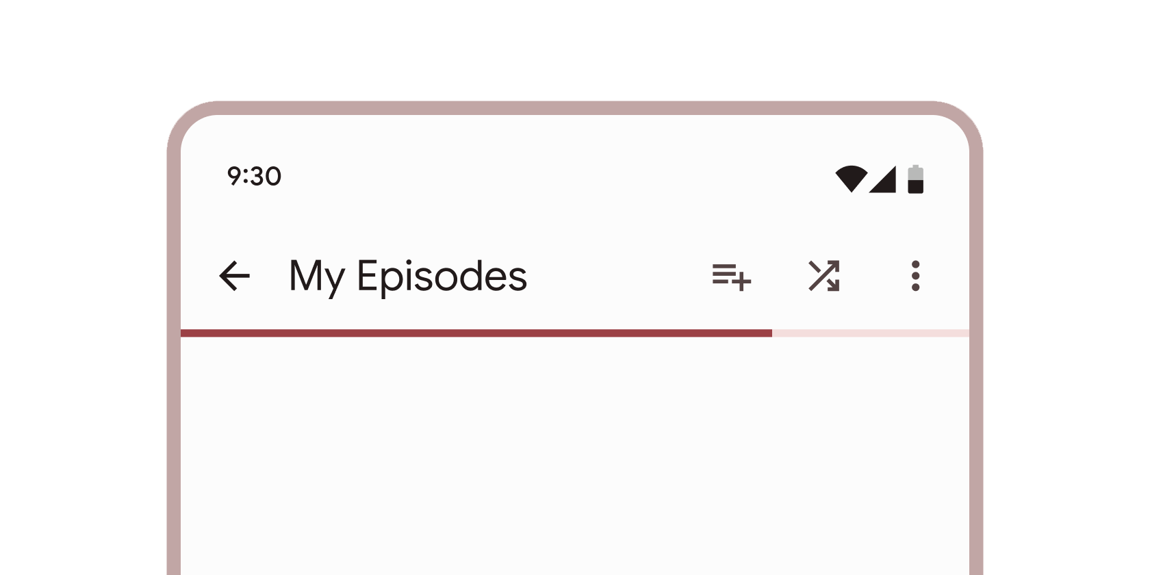
Container that displays content and actions at the top of a screen.
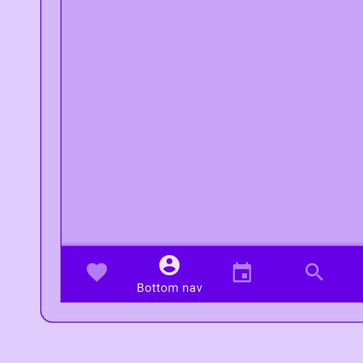
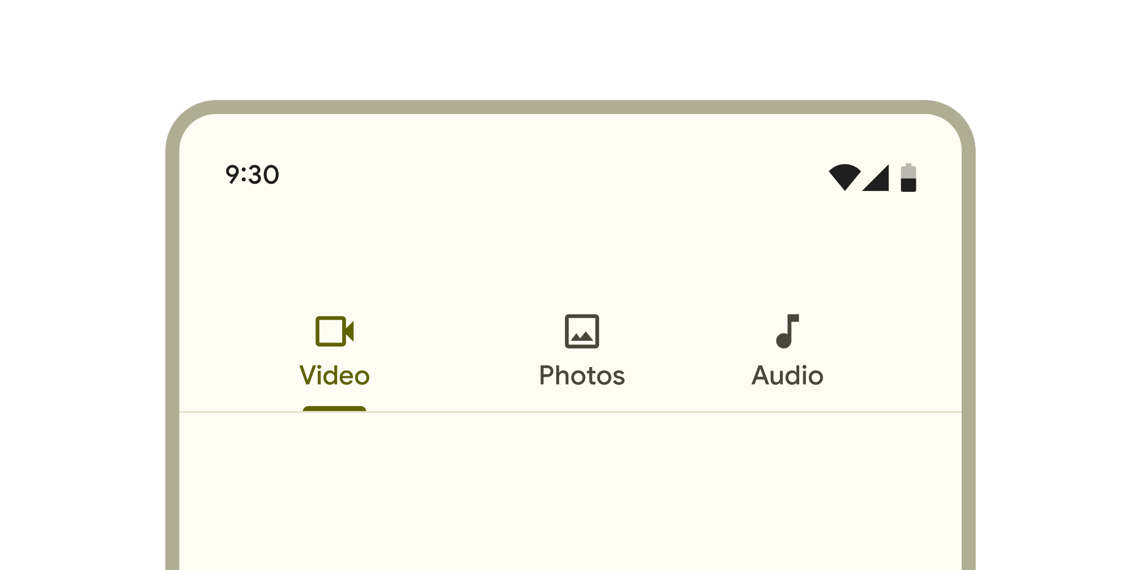
Container that includes tools to explore and switch between top-level views in a single tap.
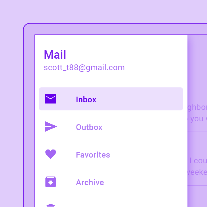
A Material Design panel that slides in horizontally from the edge of a Scaffold to show navigation links in an application.
A convenience widget that wraps a number of widgets that are commonly required for applications implementing Material Design.
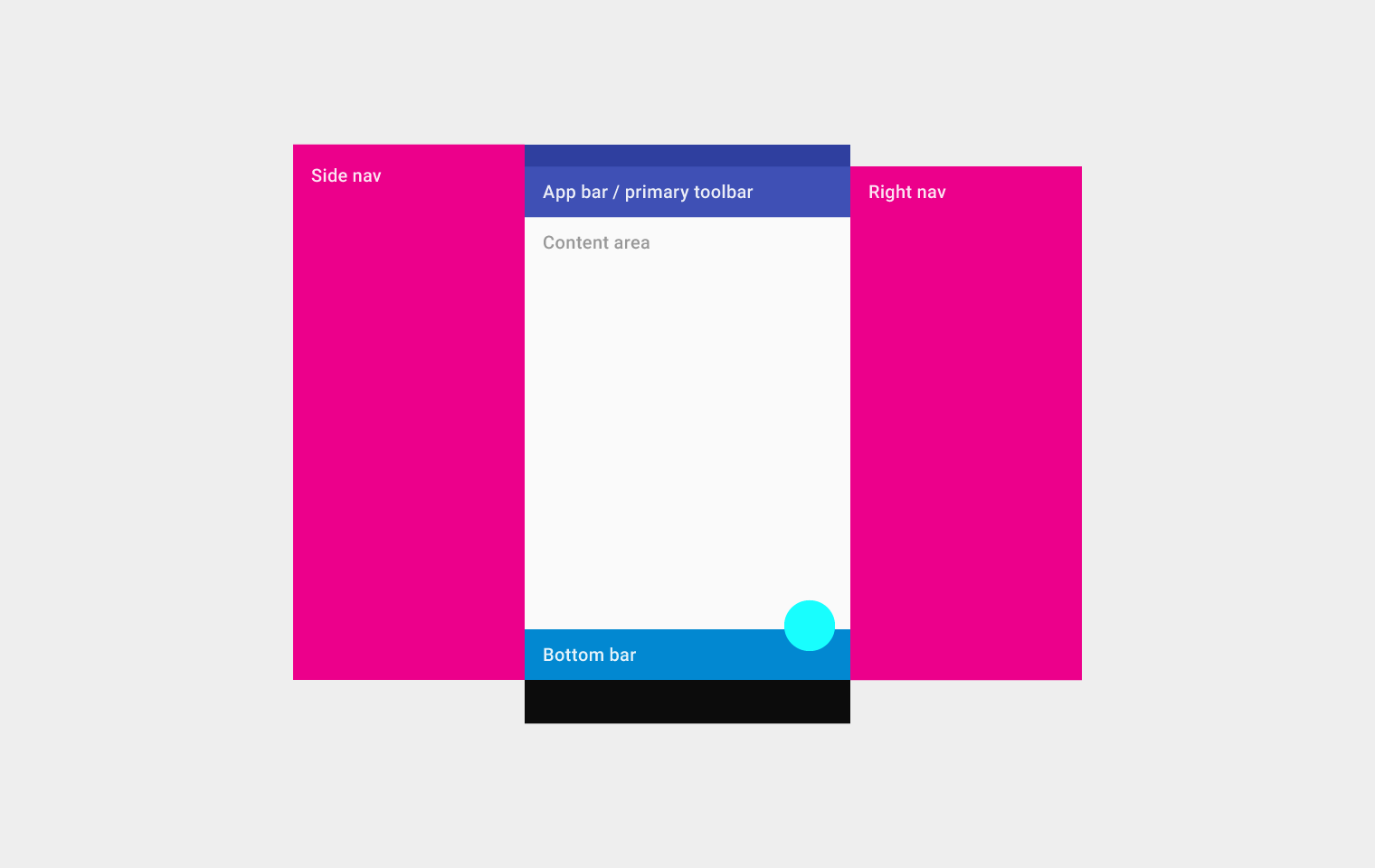
Implements the basic Material Design visual layout structure. This class provides APIs for showing drawers, snack bars, and bottom sheets.
A material design app bar that integrates with a CustomScrollView.
Layered containers that organize content across different screens, data sets, and other interactions.
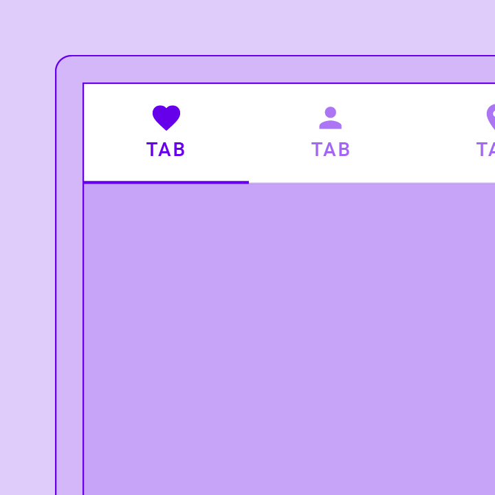
A page view that displays the widget which corresponds to the currently selected tab. Typically used in conjunction with a TabBar.
Coordinates tab selection between a TabBar and a TabBarView.
Displays a row of small circular indicators, one per tab. The selected tab's indicator is highlighted. Often used in conjunction with a TabBarView.
A convenience class that wraps a number of widgets that are commonly required for an application.
Buttons
Shows the currently selected item and an arrow that opens a menu for selecting another item.
A Material Design elevated button. A filled button whose material elevates when pressed.
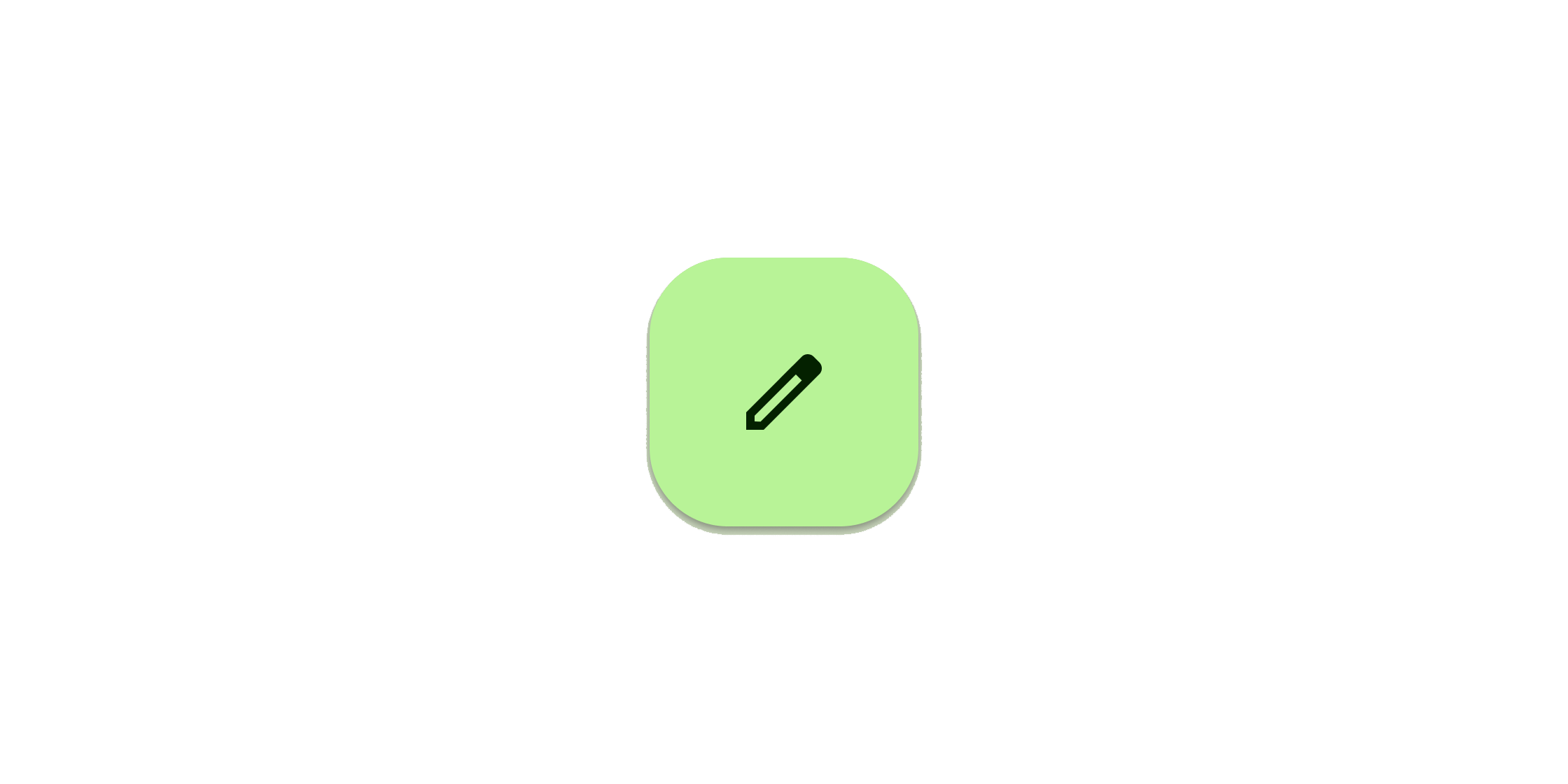
Clickable block containing an icon that keeps a key action always in reach.
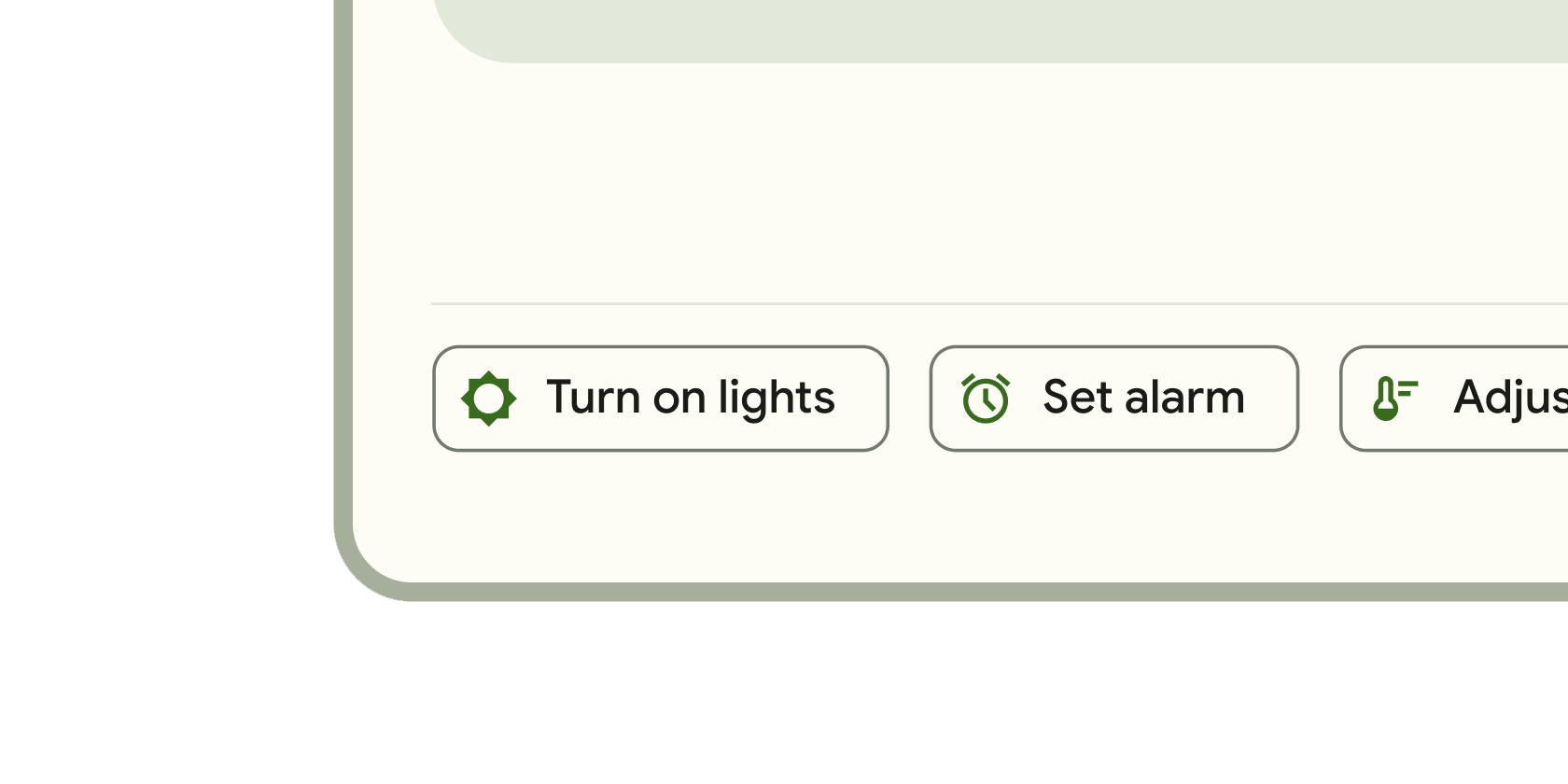
Clickable block that triggers an action. These wider blocks can fit a text label and provide a larger target area.
Clickable icons to prompt app users to take supplementary actions.
A Material Design outlined button, essentially a TextButton with an outlined border.
Displays a menu when pressed and calls onSelected when the menu is dismissed because an item was selected.
A Material Design text button. A simple flat button without a border outline.
Input and selections
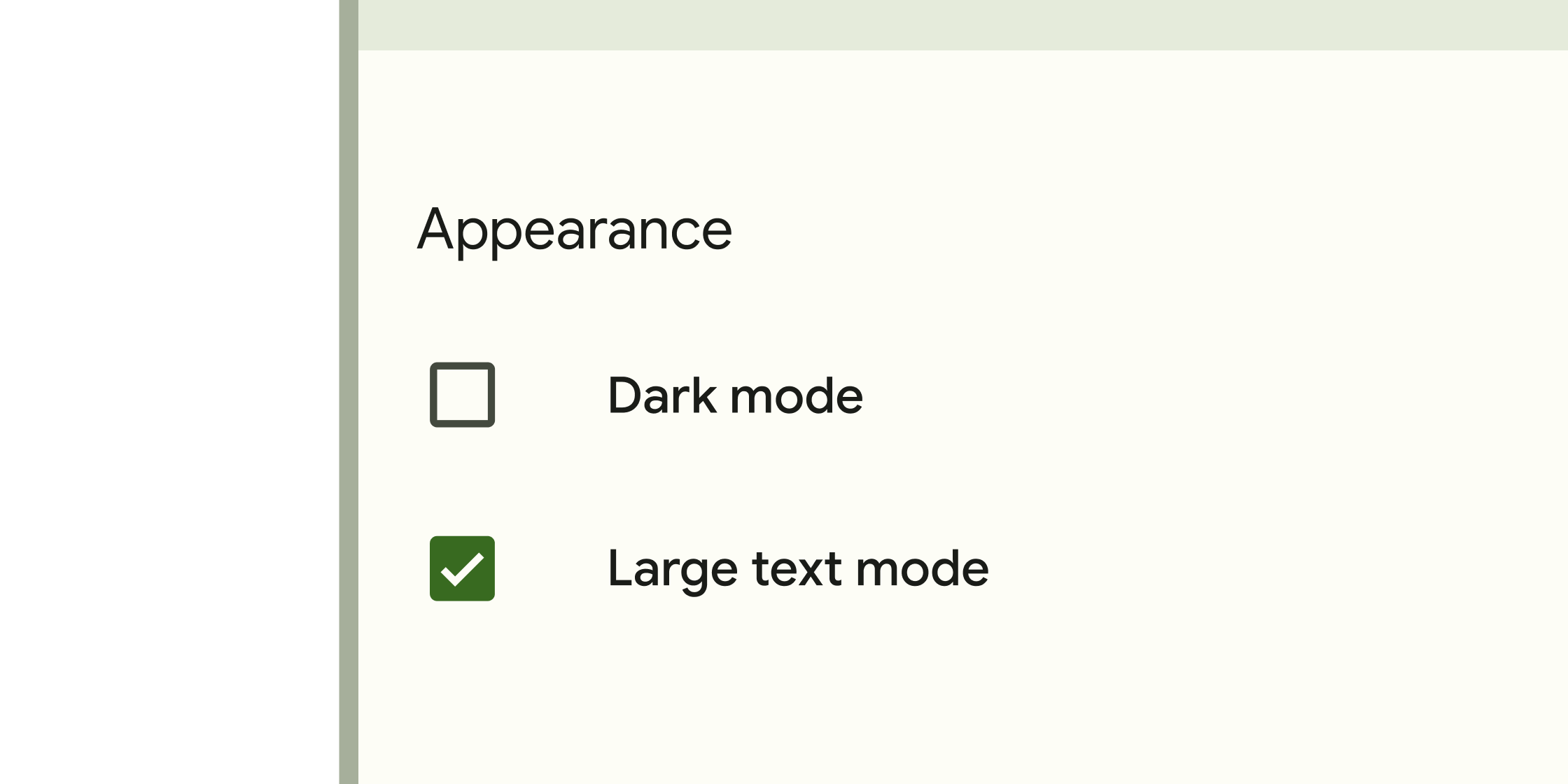
Form control that app users can set or clear to select one or more options from a set.
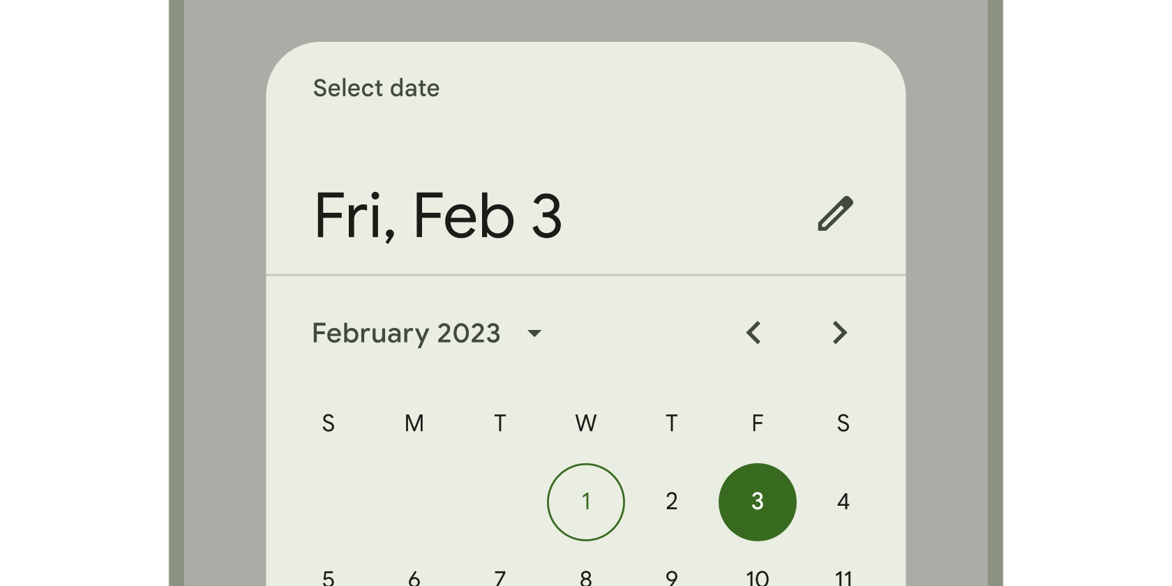
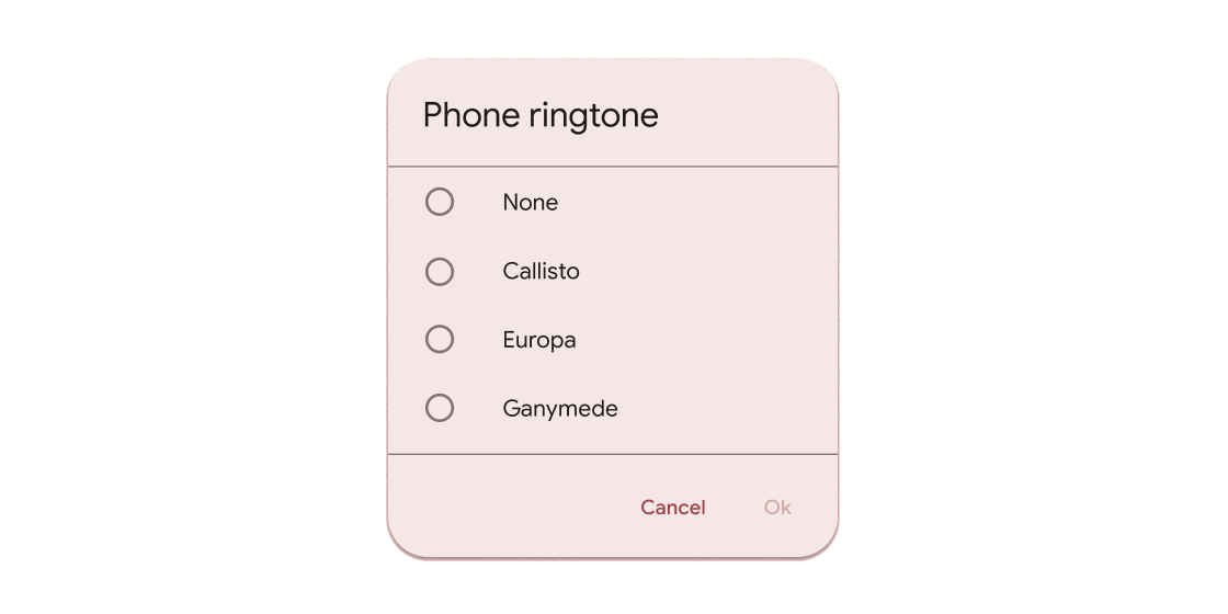
Calendar interface used to select a date or a range of dates.
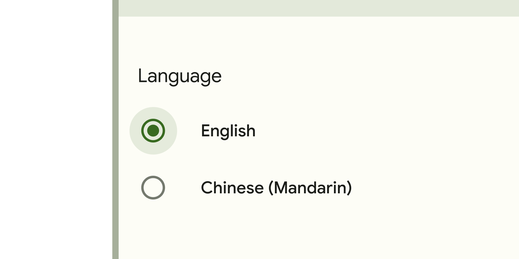
Form control that app users can set or clear to select only one option from a set.
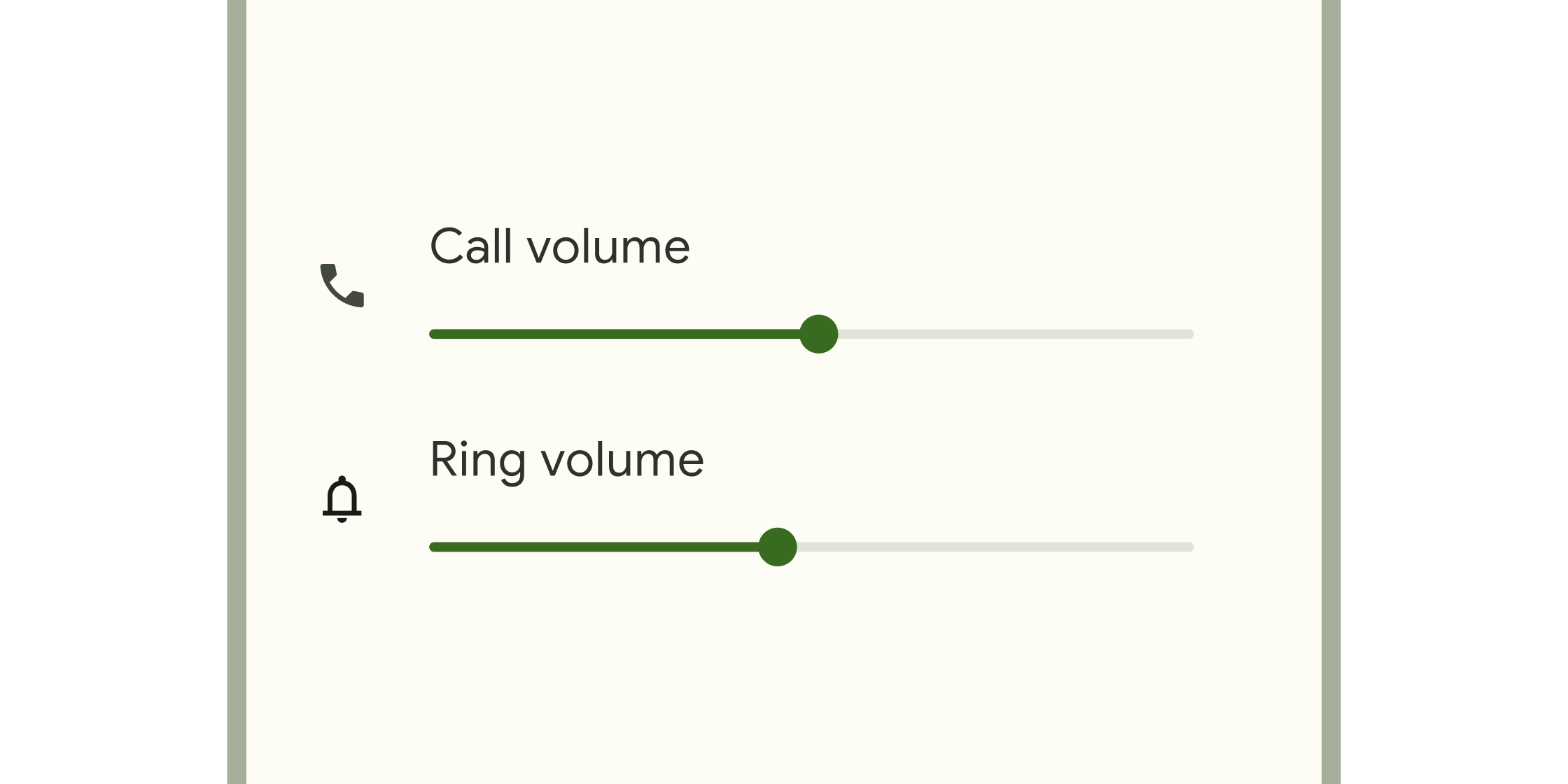
Form control that enables selecting a range of values.
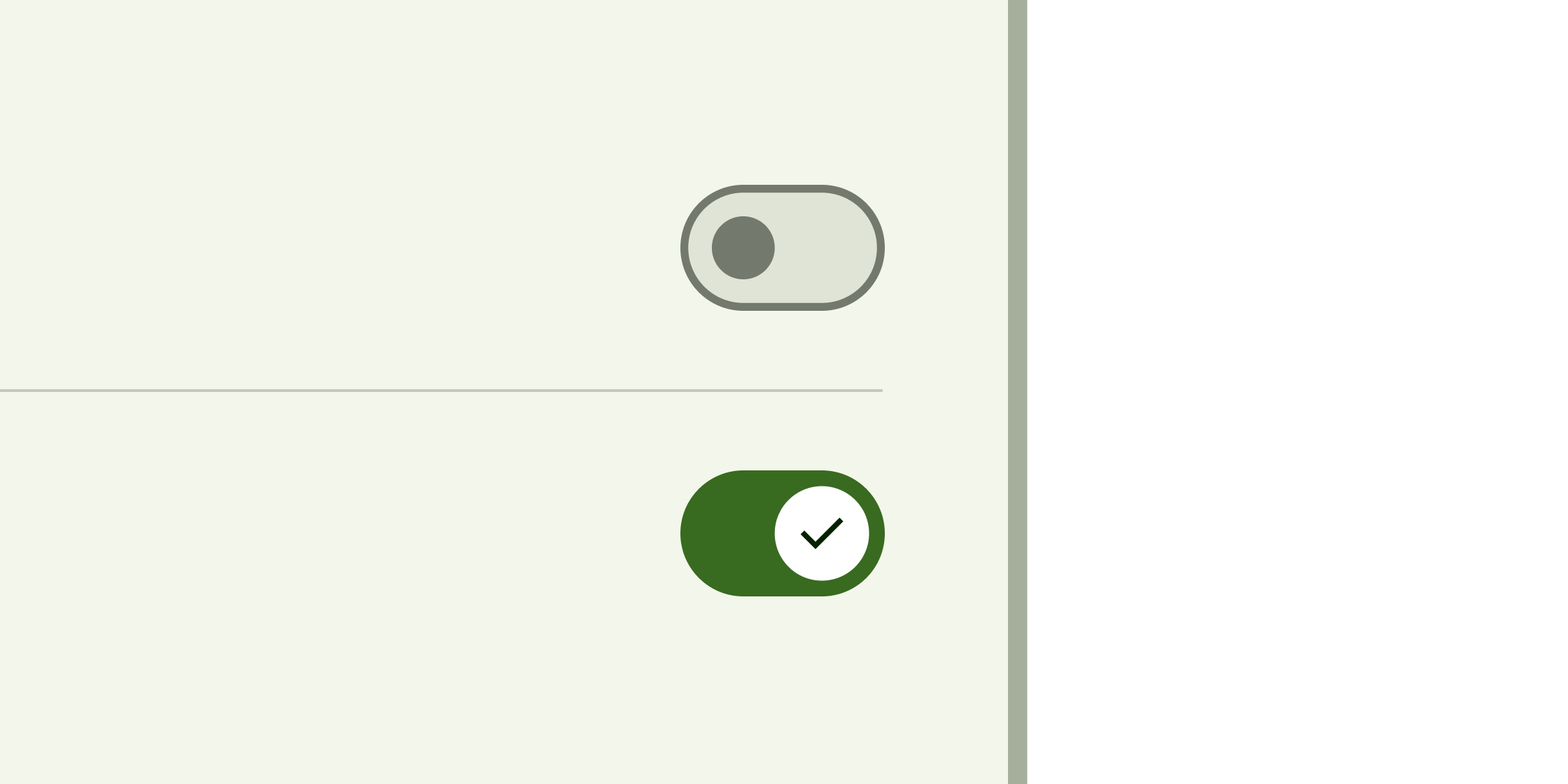
Toggle control that changes the state of a single item to on or off.
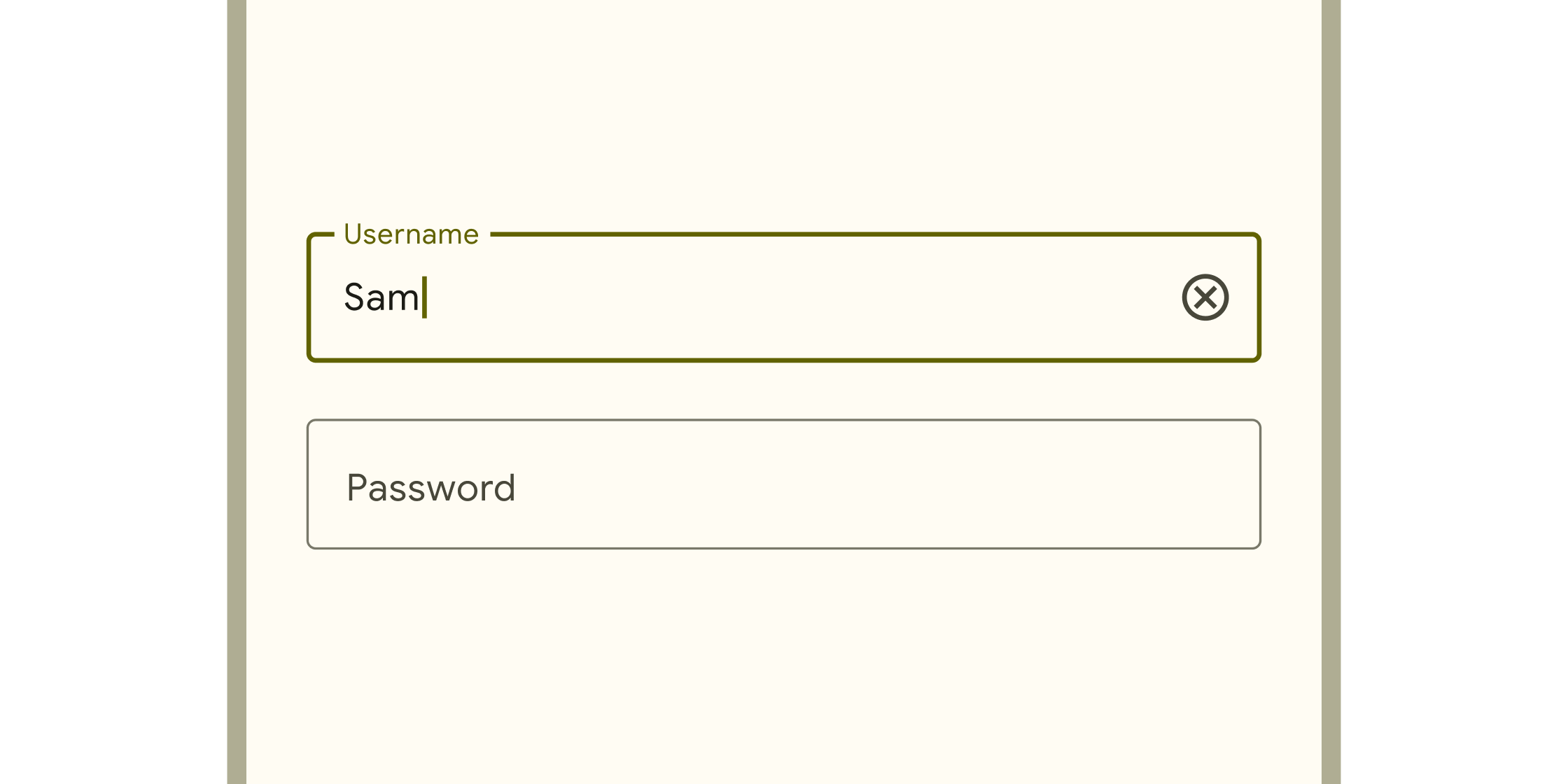
Box into which app users can enter text. They appear in forms and dialogs.
Dialogs, alerts, and panels
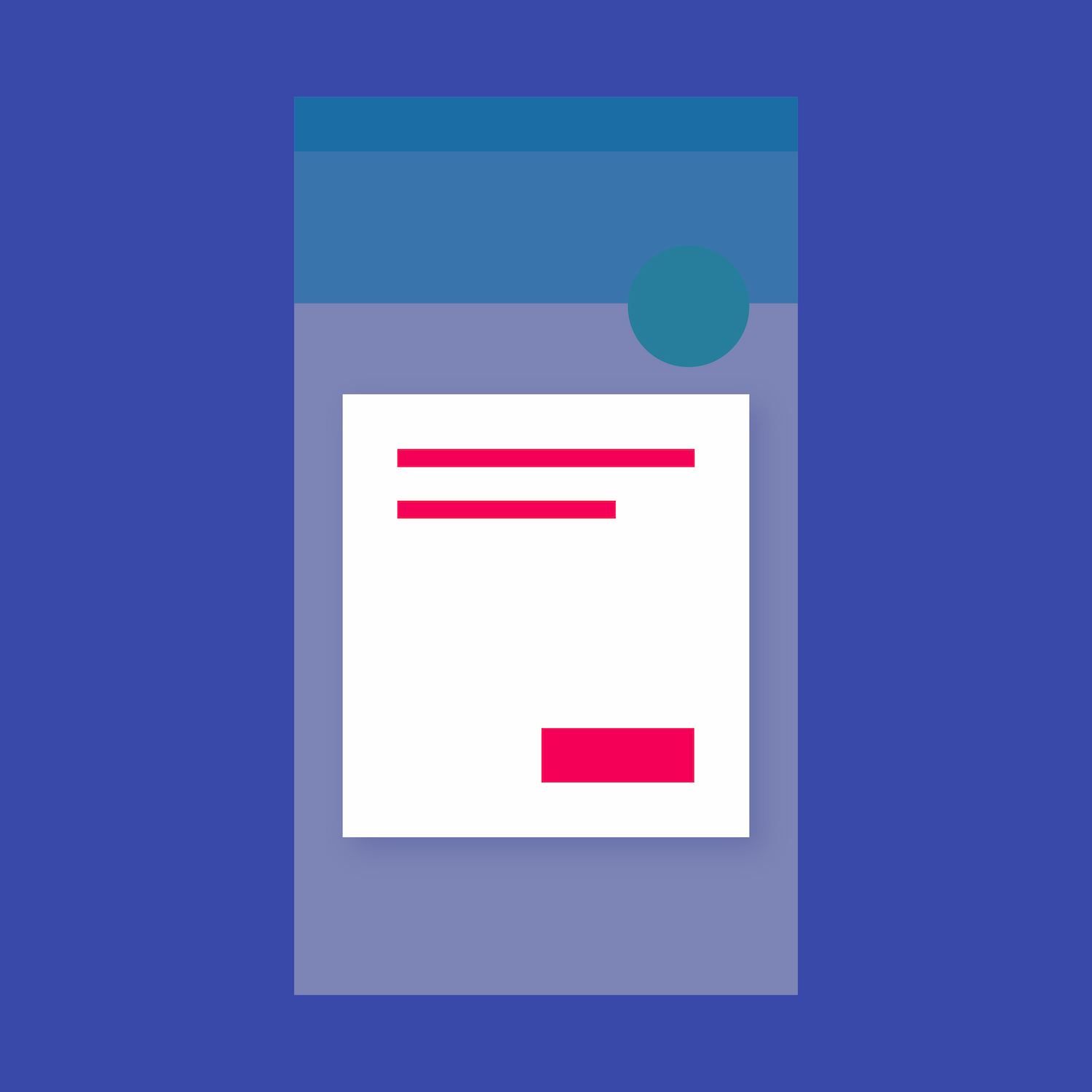
Hovering containers that prompt app users to provide more data or make a decision.
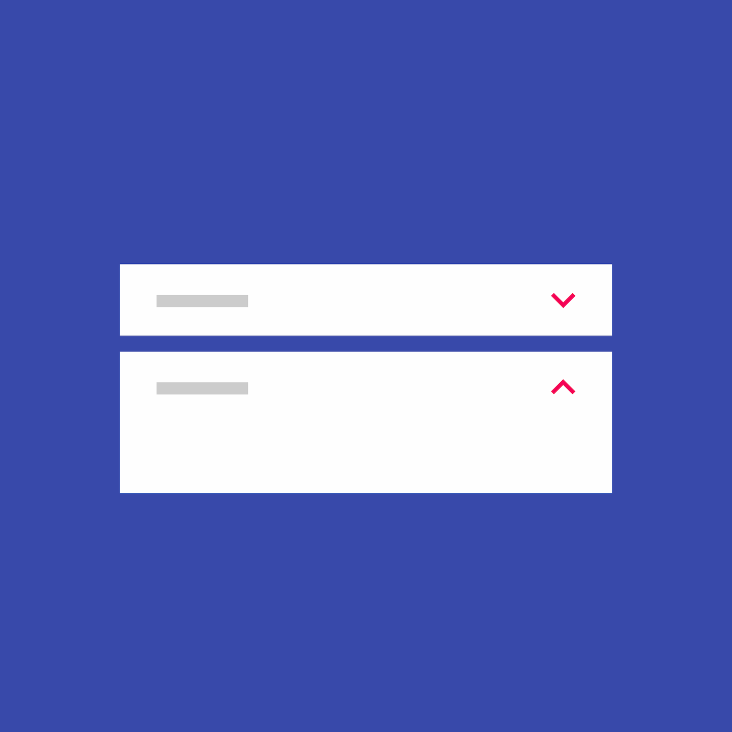
Expansion panels contain creation flows and allow lightweight editing of an element. The ExpansionPanel widget implements this component.
Simple dialogs can provide additional details or actions about a list item. For example they can display avatars icons clarifying subtext or orthogonal actions (such...
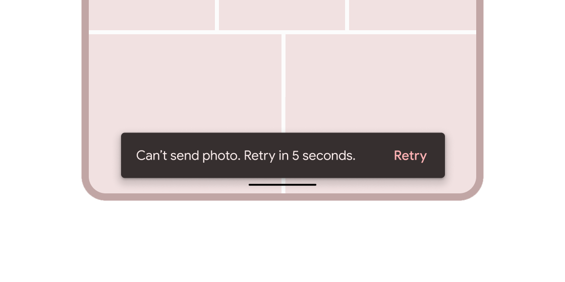
Brief messages about app processes that display at the bottom of the screen.
Information displays
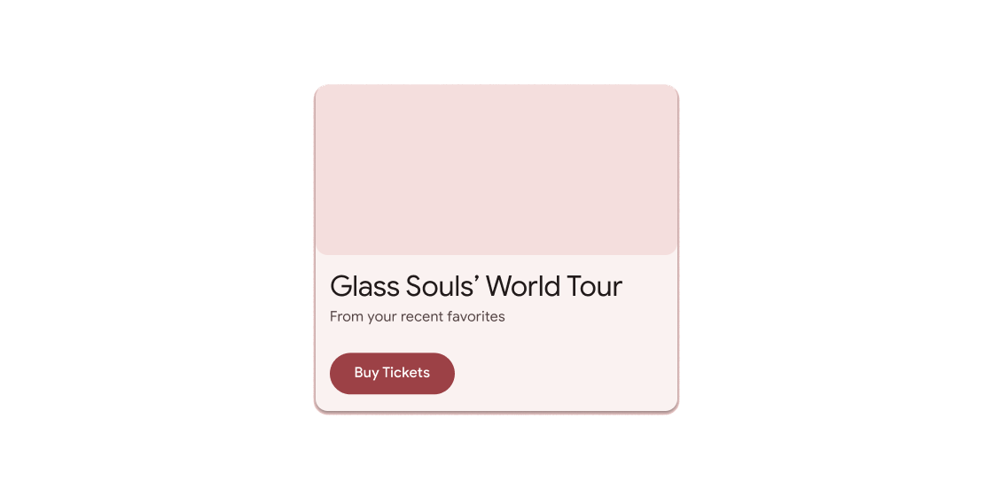
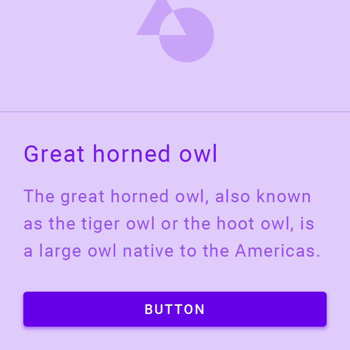
Container for short, related pieces of content displayed in a box with rounded corners and a drop shadow.
Small blocks that simplify entering information, making selections, filtering content, or triggering actions.

Circular progress indicator that spins to indicate a busy application.
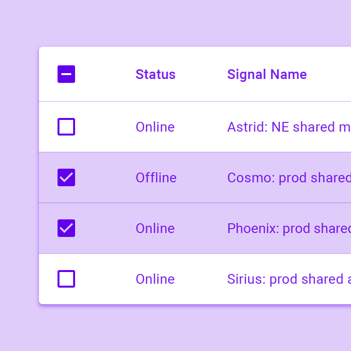
Data tables display sets of raw data. They usually appear in desktop enterprise products. The DataTable widget implements this component.
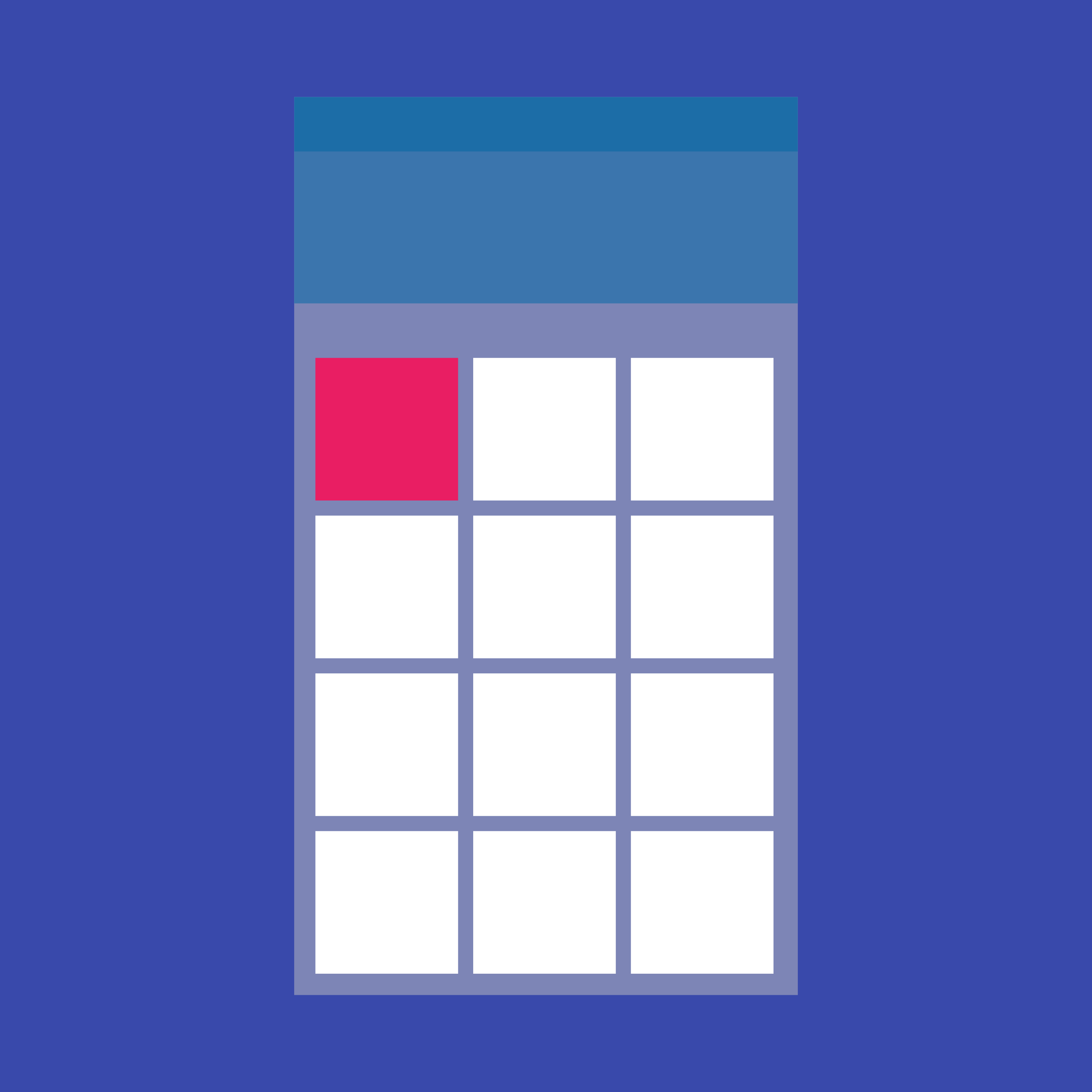
A grid list consists of a repeated pattern of cells arrayed in a vertical and horizontal layout. The GridView widget implements this component.
A Material Design icon.
A widget that displays an image.
Vertical line that changes color as an ongoing process, such as loading an app or submitting a form, completes.
Tooltips provide text labels that help explain the function of a button or other user interface action. Wrap the button in a Tooltip widget to...
Layout
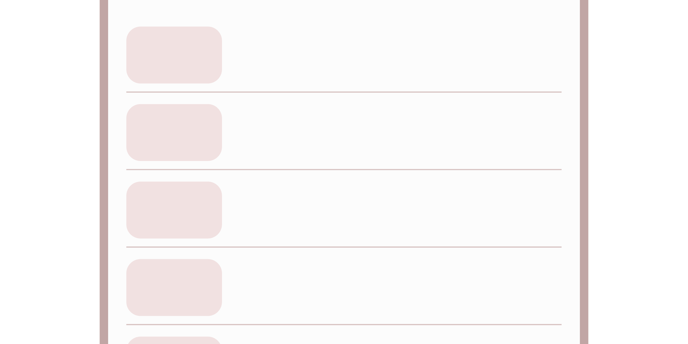
Thin line that groups content in lists and containers.
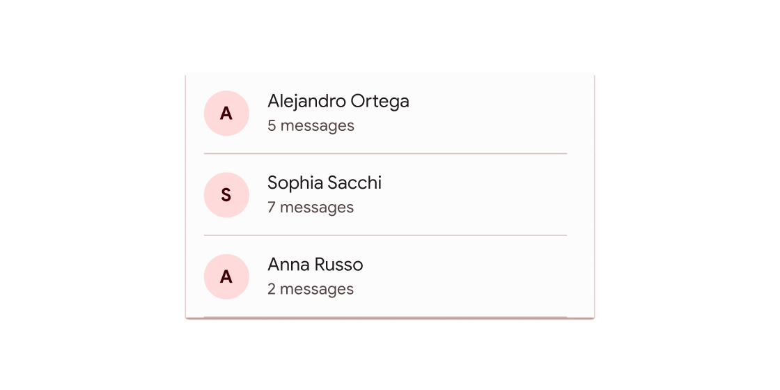
A single fixed-height row that typically contains some text as well as a leading or trailing icon.
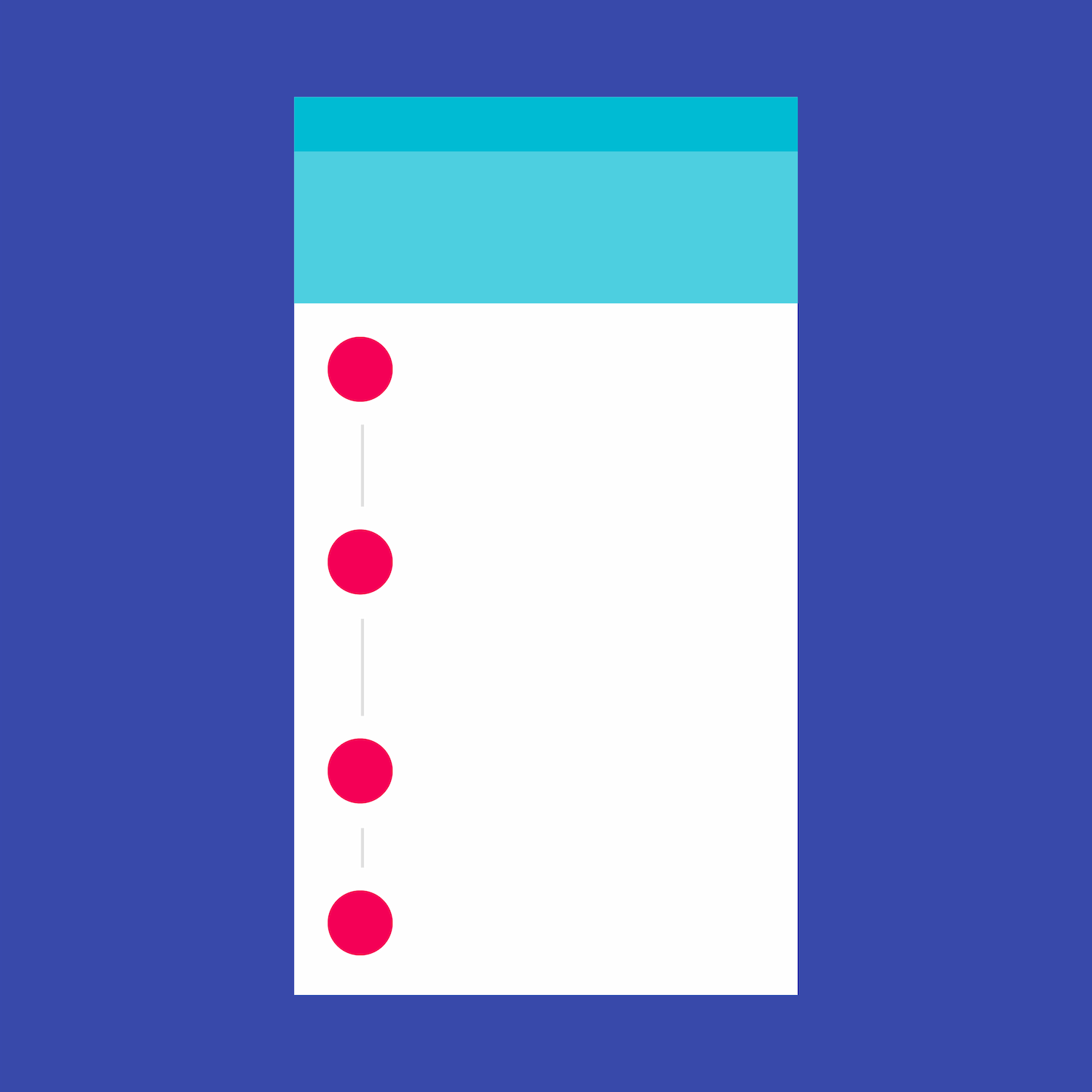
A Material Design stepper widget that displays progress through a sequence of steps.
Find more widgets in the widget catalog.
Unless stated otherwise, the documentation on this site reflects Flutter 3.44.0. Report an issue.