Adaptive and responsive design in Flutter
It's important to create an app, whether for mobile or web, that responds to size and orientation changes and maximizes the use of each platform.
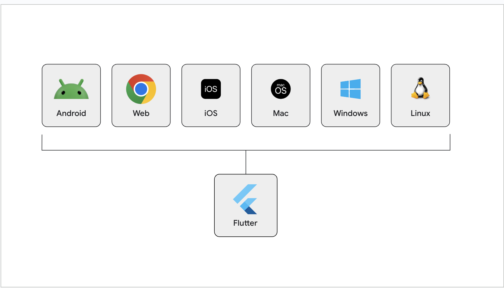
One of Flutter's primary goals is to create a framework that allows you to develop apps from a single codebase that look and feel great on any platform.
This means that your app might appear on screens of many different sizes, from a watch, to a foldable phone with two screens, to a high definition monitor. And your input device might be a physical or virtual keyboard, a mouse, a touchscreen, or any number of other devices.
Two terms that describe these design concepts are adaptive and responsive. Ideally, you'd want your app to be both but what, exactly, does this mean?
What is responsive vs adaptive?
#An easy way to think about it is that responsive design is about fitting the UI into the space and adaptive design is about the UI being usable in the space.
So, a responsive app adjusts the placement of design elements to fit the available space. And an adaptive app selects the appropriate layout and input devices to be usable in the available space. For example, should a tablet UI use bottom navigation or side-panel navigation?
This section covers various aspects of adaptive and responsive design:
Unless stated otherwise, the documentation on this site reflects Flutter 3.44.7. Page last updated on 2026-05-05. View source or report an issue.